WPC 1401 - Beginnings ANALYSIS
Jan 11, 2014 00:50:03 #

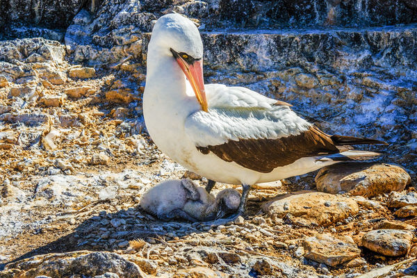
davefales has volunteered their WPC 1401 - Beginnings entry to the Photo Critique & Analysis Forum* to find out what they could have done to make it better. Be nice, but be honest as this will help everyone with their craft. Thank you davefales and thank you everyone!
From WPC 1401 - Beginnings RESULTS http://www.uglyhedgehog.com/photo_contest_ratings.jsp?pcnum=97
* If you are new to the Photo Critique & Analysis Forum please read the Section Rules http://www.uglyhedgehog.com/t-159520-1.html
From WPC 1401 - Beginnings RESULTS http://www.uglyhedgehog.com/photo_contest_ratings.jsp?pcnum=97
* If you are new to the Photo Critique & Analysis Forum please read the Section Rules http://www.uglyhedgehog.com/t-159520-1.html
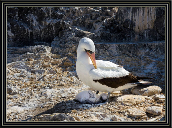
Galapagos Booby Chick Begins the Struggle
Jan 11, 2014 05:21:53 #

Taking into account the fact that I'm no wildlife photographer these are my thoughts. Looking at the EXIF I see that the focal length used was 38mm,this makes me think that the image has been cropped considerably which would account for the noise I see, not so much as to be a problem but more that I would expect at ISO 200. The plumage is not as pure white as I like to see, probably caused by the side of the bird being in shadow, but could be fixed (WB). Lots of artefacts in the dark wing feathers, easily cloned out. The composition could be improved by a little more headroom and positioning the birds eye more in accordance with the rule of thirds.
I now feel very guilty for criticising this fine picture.
Graham
I now feel very guilty for criticising this fine picture.
Graham
Jan 11, 2014 07:46:05 #
Thanks for your comments, Graham. I'm afraid that the image has been cropped only a little, meaning it was a composition error taking the photo. So I can learn: what do you mean by "cloned out"? (I'm not familiar with that terminology.) Do you mean using PS healing brushes?
Jan 11, 2014 07:58:06 #
davefales wrote:
Thanks for your comments, Graham. I'm afraid that the image has been cropped only a little, meaning it was a composition error taking the photo. So I can learn: what do you mean by "cloned out"? (I'm not familiar with that terminology.) Do you mean using PS healing brushes?
Yup, healing brushes . How much adjustment have you made to the image, if any?
Graham
Jan 11, 2014 08:21:18 #

Technical issues aside, what strikes me most is the fact that the two most important parts of the picture - the adult bird's face and the chick - are both in shadow. I know that asking the bird to kindly reposition itself wasn't an option, but I think a touch of Lighten Shadows would help. I also think that the highlights are just a touch too bright, so toning them down would be in order, to my eyes. Both of these could be achieved either using Levels or the sliders.
Story-wise the picture is fine - adult bird protectively taking care of the beginnings of life.
Story-wise the picture is fine - adult bird protectively taking care of the beginnings of life.
Jan 11, 2014 08:23:25 #

St3v3M wrote:
b davefales /b has volunteered their WPC 1401 - ... (show quote)
The photo appears sharp and detailed, and has a strong emotional appeal with the parent shielding the little one and attending to it. You've got the eye apparently sharp, which is a good thing. The composition places them smack in the middle which may not be such a good thing. My own view is that it is Ok because it is more portrait than not, but many folks more knowledgeable than myself avoid center placement like the plague. The worst enemy you have, it appears to me, is the extreme contrast with the bright sunlight and deep shadows. It looks like you may have attempted to mitigate that via processing, and processing maybe introduced noise and artifacts that may not be in the original. The rocks are too crunchy for my taste and the colors too saturated, with the shadowed areas unduly blue and the rocks unduly orange. I am wondering if you used plugins because I have fallen prey to these same color issues in photos where I've used Topaz in particular and some NIK plugins as well though Topaz is more cruel with color stuff. If you want to submit an unedited version of the photo, some of the great pp specialists in the forum can probably tell you how to get the most out of this engaging photo.
Jan 11, 2014 08:47:19 #
I worked the shadows and contrast from the NEF. I think I have become much better using ACR 7/8 for spot tuning since I tuned that one eleven months ago. I use PS primarily to add pop by using judicious amounts of soft light blend.
In fact, I just retuned it and wish I could re-submit the latest version. Many thanks for triggering that. Dave
In fact, I just retuned it and wish I could re-submit the latest version. Many thanks for triggering that. Dave
Jan 12, 2014 11:41:41 #

davefales wrote:
Thanks for your comments, Graham. I'm afraid that the image has been cropped only a little, meaning it was a composition error taking the photo. So I can learn: what do you mean by "cloned out"? (I'm not familiar with that terminology.) Do you mean using PS healing brushes?
Dave, would you allow someone to edit your photo then place the result online for comparison? That way you can see visually the results of suggested edits.
Jan 12, 2014 12:29:05 #
Sure, Bob - but I would also include my most recently edited version based on the constructive comments so far. I work PS on an 8GB Windows 7 machine, but I know my monitor is not pro quality. It's certainly possible that I am just not seeing things on my screen. Do you want the NEF without IMF file? And how do I get it to the right person? Thanks.
Jan 12, 2014 12:41:25 #
davefales wrote:
Sure, Bob - but I would also include my most recently edited version based on the constructive comments so far. I work PS on an 8GB Windows 7 machine, but I know my monitor is not pro quality. It's certainly possible that I am just not seeing things on my screen. Do you want the NEF without IMF file? And how do I get it to the right person? Thanks.
As Bob isn't online just now I will answer. Convert the NEF to jpg without any other editing and post the jpg in this thread, Bob will see it when he logs in.
Graham
Jan 12, 2014 13:42:08 #
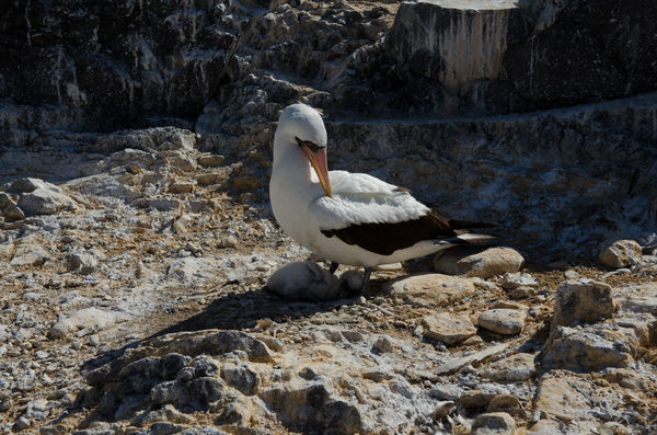
Following Graham's advice. Here is an untuned version (saved from ACR), plus my most recent tuned version after reading analysis. I look forward to your help. Dave
Jan 12, 2014 16:45:56 #
lighthouse
Loc: No Fixed Abode
Hey, someone told me that there were no photos of boobies allowed on this site. I could never understand why but just figured it was some weird sort of restriction that admin had put in place.
Regardless of that, my thoughts on this pic.
I love the shot and the way the detail has been brought out of the shadow allowing us to see the chick better.
The light has been able to be kept natural looking even though it is a combination of blue light and orange light.
There is one thing I would have done differently though.
In bringing out the shadows the black wingtips have been rendered orange.
I would have either done the adjustments selectively or would change the wingtips back to a much darker shade bordering on black now.
Jan 12, 2014 18:33:11 #
davefales wrote:
Sure, Bob - but I would also include my most recently edited version based on the constructive comments so far. I work PS on an 8GB Windows 7 machine, but I know my monitor is not pro quality. It's certainly possible that I am just not seeing things on my screen. Do you want the NEF without IMF file? And how do I get it to the right person? Thanks.
Dave, I do a lot of work in NIK software Viveza because I can set control points and work on very narrow selections, rather than make global changes. In this case, I wanted to brighten the chick and its parent without also brightening the background. In fact, from your edit, I wanted to darken the background considerably so the birds would "pop", although in a natural manner. I also brightened the birds eyes, and used a different crop than you did (selectively removing some bright tocks that looked like they were growing out of bird's head). Finally, I matted these Masked Boobies to give them a more finished look.
Variant on Beginnings ANALYSIS
Jan 13, 2014 09:02:43 #
Very nice, Bob. Thank you for taking the time to improve my work. This is my first time in the analysis forum, but I sense from everyone's comments that being candid is welcome.
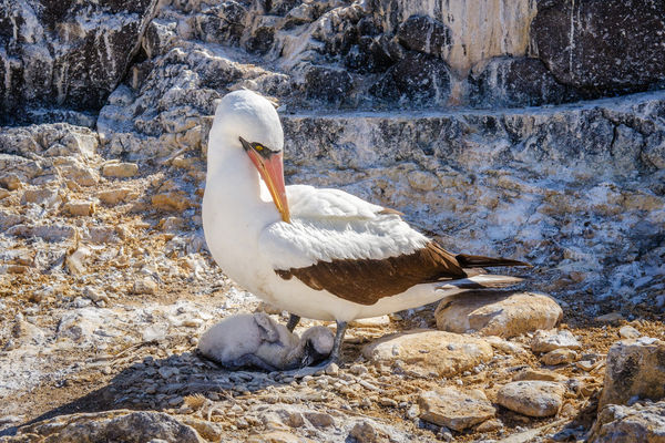
My thoughts: you have centered the mother's head and neck and the chick. In my recent re-tune, I placed her eye at the upper left "thirds" intersection. Cropping was probably my hardest decision because of the extreme sunlight blowing out the rock on the left. My placement reduced that a bit.
I have read that an important part of post-processing is remembering the actual natural color/lighting. I remember the bright sun blowing out the whites. I like the darker look of your version as "art", but your darkening takes it away from what I remember about the moment in nature. That probably is one of the great quandaries of photography.
Again, many thanks to all of you have taken the time to analyze.
Jan 13, 2014 09:27:23 #
Dave, the "Rule of Thirds" has been discussed in this forum many times, and we have pretty much agreed to lay it aside if the photo doesn't support its inclusion. When I cropped this photo, I noticed there was a very strong diagonal play of shadow and light (almost a yin and yang motif), which played very nicely into another technique we like to use called "leading lines' - it serves to draw the eye to the main subject. In this particular instance, I thought the leading line trumped the rule of thirds.
My personal take on this edit is that it still falls within the realm of photorealistic as opposed to "art" (which usually entails converting to a painterly or sketch effect, or adding swirling lines/unusual colorations). But I agree with you, the light balance is decidedly different. Most of us try to ameliorate "blown out" whites every chance we get. PP work is always subjective, and doesn't necessarily reflect "conditions as they were at the time the photograph was taken".
My personal take on this edit is that it still falls within the realm of photorealistic as opposed to "art" (which usually entails converting to a painterly or sketch effect, or adding swirling lines/unusual colorations). But I agree with you, the light balance is decidedly different. Most of us try to ameliorate "blown out" whites every chance we get. PP work is always subjective, and doesn't necessarily reflect "conditions as they were at the time the photograph was taken".
If you want to reply, then register here. Registration is free and your account is created instantly, so you can post right away.