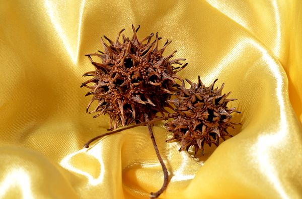
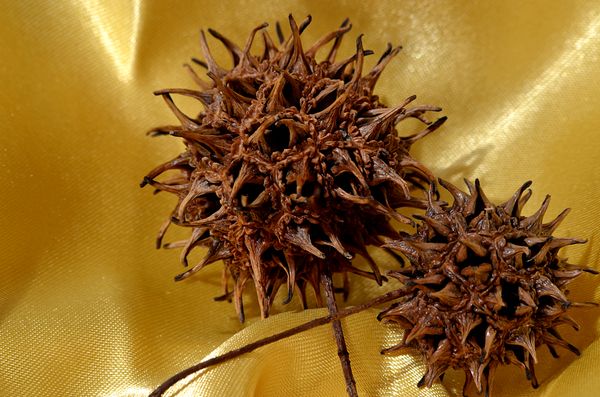
Study in Yellow & Brown
Jan 9, 2014 00:32:43 #

It was grey & cold with an intermittent drizzle all day. I did get a chance to take the dog for a walk during a break in the precipitation. I picked up a hand full of these spiked pods along the way. I decided to use them to try out the macro capability of my Sigma 70-300 mm. Shot using a tripod & cable release at ISO 100, aperture between f8 & f12 & relatively slow shutter speeds.
Jan 9, 2014 01:03:06 #

Why do you call it Macro?
Did you stick a Macro lens on the end of a 300 mm?
I do.
The end result is not the same.
That's a very large depth of field :-) How slow is relative I wonder (shutter speed) cause it like the pictures and I want one. :-P
Did you stick a Macro lens on the end of a 300 mm?
I do.
The end result is not the same.
That's a very large depth of field :-) How slow is relative I wonder (shutter speed) cause it like the pictures and I want one. :-P
Jan 9, 2014 01:08:20 #

A large wonderful shade source, but 1 terrible side, those nasty gum balls they litter the ground with.
Hard as a rock when green, so nasty when brown and littering the lawn.
Spent many a day raking them up from my grandparents yard and attempting to burn them.
Hard as a rock when green, so nasty when brown and littering the lawn.
Spent many a day raking them up from my grandparents yard and attempting to burn them.
Jan 9, 2014 01:33:19 #

Jan 9, 2014 02:16:17 #
Playing with a new lens is always such fun! :-) The Sigma 70-300 I have is advertised as having 'macro' capability but I don't consider it a true macro lens. I bought it for it's distance capability. It is able to get in tighter than my other lenses when switched to macro mode. It's the SDL DG model and is suppose to have 1-4.1 / 1-2 Macro capability. (it will only activate between 200 & 300 mm's) You can pick these up new on Amazon for less than 150.00 since they are the pre-image stabilization models. Designed for the DX format, it works perfectly with my D5100. DOF & aperture settings is always an interesting topic. I'm still trying to find the 'sweet spot' for particular applications with this lens. For this session I tried everything from f4 to f16. I seemed to get the best results for what I was trying to achieve around f8. Slow shutter speeds in this case meant 1 to 5 sec. I wanted a softened shadow effect and used low lighting levels. I actually had to use additional lighting to set my focus. I used manual and zoomed in with live view to try to get the maximum sharpness.
Jan 9, 2014 02:18:10 #
"Nice contrast between the rough pods and the smooth satin."
~~~~~~~~~~~~~~~~~~~
Hope I wasn't too obvious! :)
~~~~~~~~~~~~~~~~~~~
Hope I wasn't too obvious! :)
Jan 9, 2014 15:35:30 #
ajohnston3 wrote:
"Nice contrast between the rough pods and the smooth satin."
~~~~~~~~~~~~~~~~~~~
Hope I wasn't too obvious! :)
~~~~~~~~~~~~~~~~~~~
Hope I wasn't too obvious! :)
Oh, I didn't mean that at all. I just like the way it looks, the contrast adds another point of interest and the colors look well together. You not only have the smoothness of the satin and the roughness of the pods, there is dullness/shine contrast as well. Nice! If you wanted to make it more abstract you could also try a b&w or toned version.
Jan 9, 2014 18:09:46 #
Heirloom Tomato wrote:
Oh, I didn't mean that at all. I just like the way it looks, the contrast adds another point of interest and the colors look well together. You not only have the smoothness of the satin and the roughness of the pods, there is dullness/shine contrast as well. Nice! If you wanted to make it more abstract you could also try a b&w or toned version.
Actually, you are spot on... I often look at a shot like this as a study in light and shadow. The dichotomy between the Sycamore pods and the satin fabric working on multiple levels is something I did not see at 1st. You have a good eye! Trying a B&W version sounds like an excellent idea....
Jan 9, 2014 18:59:56 #
ajohnston3 wrote:
Actually, you are spot on... I often look at a shot like this as a study in light and shadow. The dichotomy between the Sycamore pods and the satin fabric working on multiple levels is something I did not see at 1st. You have a good eye! Trying a B&W version sounds like an excellent idea....
Thank you! Please post it if you come up with another version that you like. :-P
If you want to reply, then register here. Registration is free and your account is created instantly, so you can post right away.