Shooting Into The Sun
Jan 5, 2014 10:43:38 #

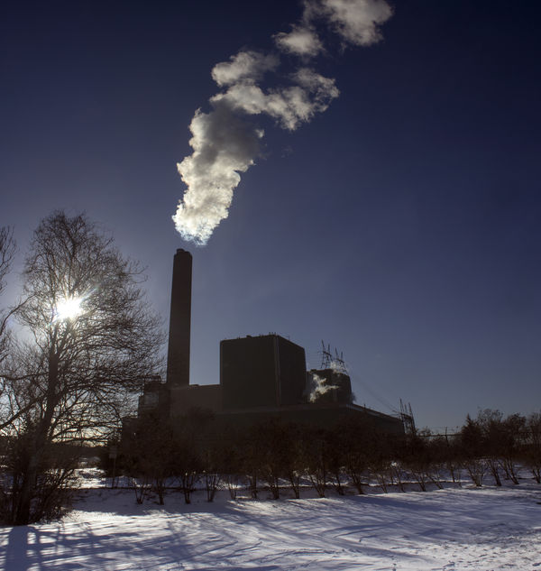
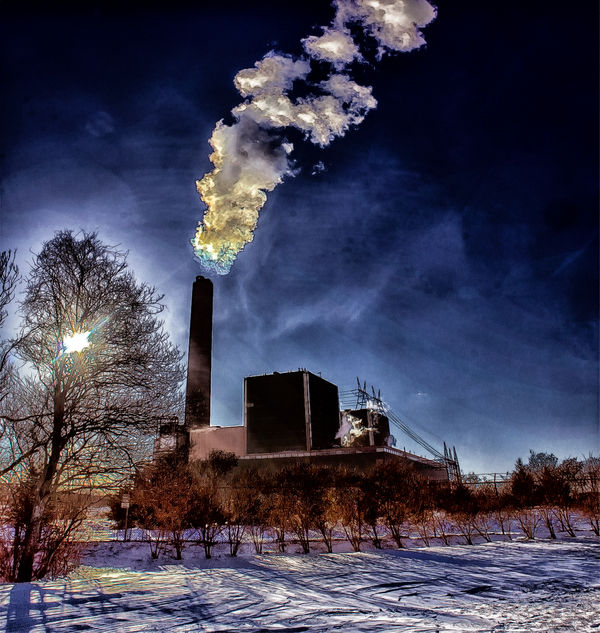
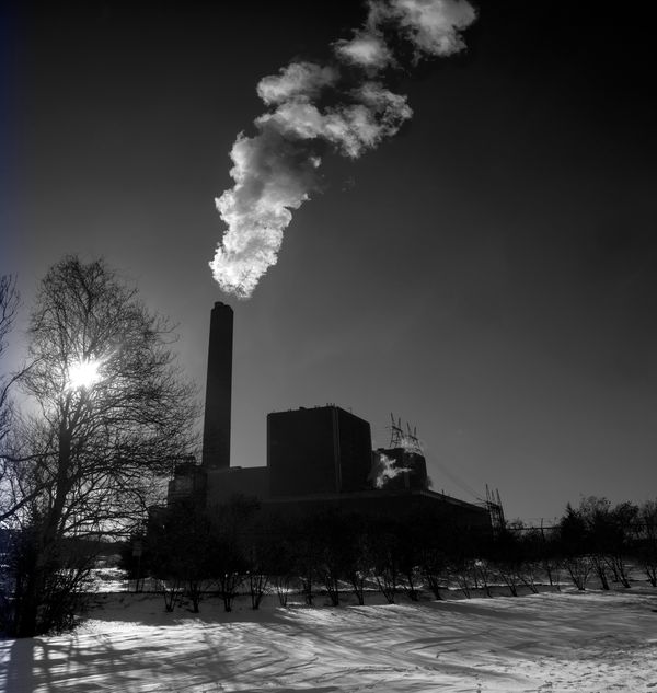
A photo merged composite of three successive vertically panned shots with a Cannon 60D -18 mm, 1/400, F14 iso 200. Originals processed in Adobe Raw and photoshop., Final after Color Effects Pro detail enhancement. Critique and suggestions welcome.
Jan 5, 2014 10:51:33 #
Very nice effect love the outcome, my question is not a critique but to learn, why three shots? was 1- 1+ and 1 at 0 for HDR?
Jan 5, 2014 10:54:16 #
Much more details in the second shot. The colors might be a tad oversaturated; but I think the overall effect is very good. I prefer it to the first photo. One thing is that my eye always goes right back to that sun in the trees. If you could tone that down, this shot would be perfect.
Jan 5, 2014 11:26:04 #
The three shots were to get the whole scene in- all the same exposure - bottom to top.- like a vertical panorama.
Jan 5, 2014 15:58:34 #

I really like your final results but I am confused on exactly what you did. It looks to me more like a composite than a pano, but I have been wrong before. Did you stitch them together? or layer them? Can you give us a mini tutorial on what you did?
Jan 5, 2014 16:57:24 #
lighthouse
Loc: No Fixed Abode
It has halos in the chimney and the smoke. It is pushed way too far. The colours are garish and unnatural. Your processing has blown areas of the smoke that weren't blown in the original.
Not a happy outcome.
Not a happy outcome.
Jan 5, 2014 19:46:50 #

Profg wrote:
A photo merged composite of three successive vertically panned shots with a Cannon 60D -18 mm, 1/400, F14 iso 200. Originals processed in Adobe Raw and photoshop., Final after Color Effects Pro detail enhancement. Critique and suggestions welcome.
I am very interested what you've done here. Is this 3 shots (top, middle and bottom) that are put together like a vertical panorama? Landscape orientation shots? if not, what? In photoshop? I have tried this with poor results - multiple problems, mostly from some things not lining up, and various distortion issues.
I like the resulting photo a lot, but am not a fan of the processing. You have plenty of detail in the silhouetted area. I like a version processed more traditionally, raising the shadows to get some detail in the darkest silhouette area, lightening the darkest areas of the sky, and sticking with the cool winter-tone color palette without the browns and oranges. The sun looks better with this approach, in my opinion. Another option would be a monochrome version.
Jan 5, 2014 22:29:59 #
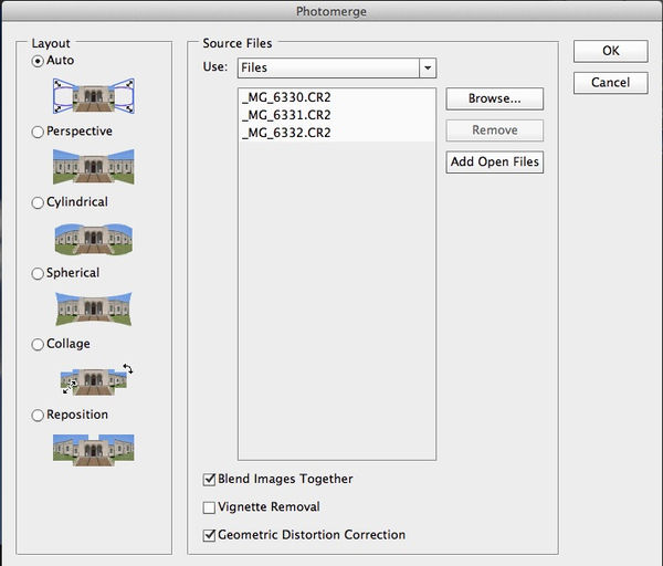
Originals were landscape shots- photomerged(located in Automate in the File Menu PS6)- straightened and cropped-
processed.
processed.
Jan 6, 2014 05:43:48 #
lighthouse wrote:
It has halos in the chimney and the smoke. It is pushed way too far. The colours are garish and unnatural. Your processing has blown areas of the smoke that weren't blown in the original.
Not a happy outcome.
Not a happy outcome.
I agree......
Jan 6, 2014 05:49:52 #

I agree with all that Lighthouse has said and will add that there is some very obvious banding in the sky caused by over processing.
Edit: Just wondering why you used 18mm? A standard to short telephoto lens will much less distortion when used for panoramas.
Graham
Edit: Just wondering why you used 18mm? A standard to short telephoto lens will much less distortion when used for panoramas.
Graham
Jan 6, 2014 06:06:16 #
lighthouse
Loc: No Fixed Abode
Graham Smith wrote:
I agree with all that Lighthouse has said and will add that there is some very obvious banding in the sky caused by over processing.
Edit: Just wondering why you used 18mm? A standard to short telephoto lens will much less distortion when used for panoramas.
Graham
Edit: Just wondering why you used 18mm? A standard to short telephoto lens will much less distortion when used for panoramas.
Graham
Graham,
regarding distortion, I would go totally the other way.
I would use a 10mm lens so that I could hold the camera sensor level with the subject, and the subject in the middle of the frame, which would keep the perspective under control and the uprights vertical.
The image wouldn't have as many pixels to play with but it also wouldn't have that falling over backward look.
It could then be cropped to whatever composition you desired.
Jan 6, 2014 07:29:45 #
lighthouse wrote:
Graham,
regarding distortion, I would go totally the other way.
I would use a 10mm lens so that I could hold the camera sensor level with the subject, and the subject in the middle of the frame, which would keep the perspective under control and the uprights vertical.
The image wouldn't have as many pixels to play with but it also wouldn't have that falling over backward look.
It could then be cropped to whatever composition you desired.
If the chimney were kept in the middle that would be the case, but you do lose a lot of quality in the correction process and the subsequent cropping. I guess that the image is cropped from the right and that the chimney is towards the left of the uncropped original thus accentuating the distortion. The camera/processing is already at the limit of what can be handled as can bee seen in Profg's edited version. I think that, and I will slightly modify my original statement, a focal length of between 28mm and short tele used from a greater distance would alleviate much of the distortion and the need for a lot of perspective correction. That's bearing in mind that it might not have been physically possible to move further back.
Graham
Jan 6, 2014 07:48:56 #

Of course do a prospective correction. Use the "over-processed" color and turn it into a b&w. Unrealistic? Sure, but it will have visual impact. Don't worry about the "banding" they are actually wisps of clouds and not imperfections.
Jan 6, 2014 10:32:56 #
Thanks for the thoughtful critiques. When I took the shots the temperature was 9 F. I only brought a basic 18-55 mm lens, did not use a tripod and did not spend a lot of time trying to find an optimal angle for the shots. I was basically attracted to the drama of the steam plume against the bright cold sky. (This is the Cape Cod Canal Power Plant- The stack is 600 ft.) At 18 mm I had to take three shots to get most of the plume. I agree that the color processing is over the top, but to me it represents the mood of the context of the photograph - at the end of a 2 day Noreaster - a contrast of warmth and bitter cold.
I think the black and white is fine but it doesnt bring me back to the bitter cold.
I think the black and white is fine but it doesnt bring me back to the bitter cold.
Jan 6, 2014 10:43:41 #

One thing that I really like about this image is the criss crossing lines of the shadows and the tracks in the snow. I think the color version (the second image posted) brings that out more. Although, I'm sure someone could bring that out in b&w as well.
If you want to reply, then register here. Registration is free and your account is created instantly, so you can post right away.