Making a Dull image more Vibrent
Jan 3, 2014 09:20:56 #
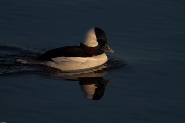
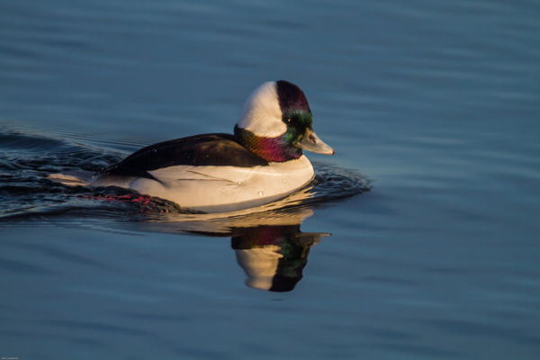
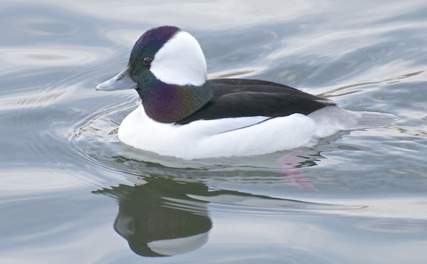
Looking at some Buffle Heads shots and being one of the hardest Birds to get detail I attached 3 images
1 untouched from the camera
2 fixed up to what I see as a good image
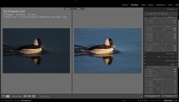
3 Lightroom settings of the fix up
This is an un-cropped image Canon 7D 400 2.8 with a 2x
feel free to download and improve I need to learn better editing techniques.
1 untouched from the camera
2 fixed up to what I see as a good image
3 Lightroom settings of the fix up
This is an un-cropped image Canon 7D 400 2.8 with a 2x
feel free to download and improve I need to learn better editing techniques.
Jan 3, 2014 11:55:16 #

cdvideo wrote:
Looking at some Buffle Heads shots and being one of the hardest Birds to get detail I attached 3 images
1 untouched from the camera
2 fixed up to what I see as a good image
3 Lightroom settings of the fix up
This is an un-cropped image Canon 7D 400 2.8 with a 2x
feel free to download and improve I need to learn better editing techniques.
1 untouched from the camera
2 fixed up to what I see as a good image
3 Lightroom settings of the fix up
This is an un-cropped image Canon 7D 400 2.8 with a 2x
feel free to download and improve I need to learn better editing techniques.
Yes, These are hard to get. Have you tried comparing a PP 2x crop without the extender? Also seems the original exposure is underexposed. Was this done to maintain the shorter shutter duration?
You have a great lens. I'm a Nikon guy-- but without the big time glass.
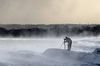
With the Winter light here in Oregon, I've had a tough time getting these done as well. May I post one of mine with a 70-300 zoom?
Thanks.
Jan 3, 2014 16:42:33 #
LoneRangeFinder wrote:
Yes, These are hard to get. Have you tried comparing a PP 2x crop without the extender? Also seems the original exposure is underexposed. Was this done to maintain the shorter shutter duration?
You have a great lens. I'm a Nikon guy-- but without the big time glass.
With the Winter light here in Oregon, I've had a tough time getting these done as well. May I post one of mine with a 70-300 zoom?
Thanks.
You have a great lens. I'm a Nikon guy-- but without the big time glass.
With the Winter light here in Oregon, I've had a tough time getting these done as well. May I post one of mine with a 70-300 zoom?
Thanks.
sure go for it post away
Jan 3, 2014 17:37:02 #
cdvideo wrote:
sure go for it post away
Totally different light. This was from a cropped image from my D300 with a 70-300 @ 300. My highlights look blown (to me) although someone on another forum said no. I'm new at this-- this was my third time out as I just got this lens a week ago.
Well here it is.
Jan 3, 2014 19:18:48 #
LoneRangeFinder wrote:
Yes, These are hard to get. Have you tried comparing a PP 2x crop without the extender? Also seems the original exposure is underexposed. Was this done to maintain the shorter shutter duration?
You have a great lens. I'm a Nikon guy-- but without the big time glass.
With the Winter light here in Oregon, I've had a tough time getting these done as well. May I post one of mine with a 70-300 zoom?
Thanks.
You have a great lens. I'm a Nikon guy-- but without the big time glass.
With the Winter light here in Oregon, I've had a tough time getting these done as well. May I post one of mine with a 70-300 zoom?
Thanks.
I had my camera setup for BIF that is why the higher shutter speed and I tend to underexpose a bit because of the white usually gets blown out.
I do crop with out the 2X, shooting without it depends on what I see that day, if they are far out I will 2X if not then lens alone. I think this was shot with the 7D so with the 2X and 400mm and 1.6 crop sensor it works out to 1280mm and I do not use IS or VR thus a min 1200 shutter speed.
Also that that day I had the RAW set to medium the 9 Meg file size.
I have quite a few Buffle Head shots and experiment at different exposure levels.
Jan 3, 2014 19:23:43 #
LoneRangeFinder wrote:
Totally different light. This was from a cropped image from my D300 with a 70-300 @ 300. My highlights look blown (to me) although someone on another forum said no. I'm new at this-- this was my third time out as I just got this lens a week ago.
Well here it is.
Well here it is.
The highlights are not blown out but like Birdpix stated the feathers are very fine and hard to show detail. I try to get a balance between the 2 which you can do in LR5 Using the gradient tool to light the blacks and then darken the whites.
Dan C
Jan 4, 2014 08:25:38 #
Looks very good to me and I shoot with the same equipment so I know how heavy it is to carry around, but it is worth it.
Jan 4, 2014 10:34:56 #
Looks very good to me and I shoot with the same equipment so I know how heavy it is to carry around, but it is worth it.
Jan 4, 2014 23:36:45 #
cdvideo wrote:
Looking at some Buffle Heads shots and being one of the hardest Birds to get detail I attached 3 images
1 untouched from the camera
2 fixed up to what I see as a good image
3 Lightroom settings of the fix up
This is an un-cropped image Canon 7D 400 2.8 with a 2x
feel free to download and improve I need to learn better editing techniques.
1 untouched from the camera
2 fixed up to what I see as a good image
3 Lightroom settings of the fix up
This is an un-cropped image Canon 7D 400 2.8 with a 2x
feel free to download and improve I need to learn better editing techniques.
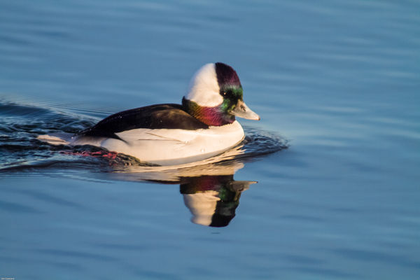
You've done a pretty good job on this photo and it follows what I do with these birds quite closely. As I described in another post, the extreme dynamic range creates an exposure problem and you really need to nail it so as not to blow out the highlights. In your example, you have underexposed by about 3 stops and have lost some detail in the black feathers.
Reducing the highlights (and sometimes the whites) and bringing up the shadows brings things back into range. The one adjustment that seems to help the iridescence most is the clarity slider. Clarity affects mid range contrast and really seems to bring out the various colors. In your example, you have reduced the Vibrance by 4 points which I would not do as it would reduce the intensity of the colors. If anything, I might increase this slider to around +10.
If you are wondering what the difference is between the Vibrance and Saturation sliders, here it is: Saturation is a blunt instrument. It increases the saturation of all colors the same amount. Colors that are already highly saturated get the same treatment as those that are not very saturated. Vibrance works differentially by increasing the saturation of less vibrant colors more than those that are already highly saturated. It tends to be a bit more balanced. Vibrance also tends to affect skin tones less than other colors so it is a better slider to use for portraits.
Here is my take on your photo: Exposure +3, Highlights -57, Shadows +8, Whites -37, Clarity +43, Vibrance +45. I also reduced the luminance of the blue water in the HSL panel a little.
Jan 5, 2014 00:30:06 #
It does look better :) I will have to play with the sliders a bit more. The one thing I find with Clarity it seems to add more noise to the the image. Also I tend to go more for under exposed than normal exposure.
I still have a lot to learn in LL and PS but am getting better as the days go. I find if I look at images the day I took them I tend not to like them much I guess I still have an image in my mind and think the camera should have done a better job. But if I look at them days or weeks later they seem to look better and then I can work with them.
Thanks for the tips on the Vibrance and saturation sliders I knew the vibrance was more for portraits because of the flesh tones so I would not move that one very much, but did not know that it only effected the lower saturated colours , will keep that in mind.
Thanks
Dan C
Jan 5, 2014 00:42:13 #
cdvideo wrote:
It does look better :) I will have to play with ... (show quote)
Sorry, I inadvertently added my copyright to your photo. I will correct it in the morning.
Jan 5, 2014 00:56:47 #
birdpix wrote:
Sorry, I inadvertently added my copyright to your photo. I will correct it in the morning.
I seen that, but hey i'm not worried I have the original :) Exif
No Problem
Dan C
If you want to reply, then register here. Registration is free and your account is created instantly, so you can post right away.