My People aren't Popping
Mar 29, 2014 23:06:25 #
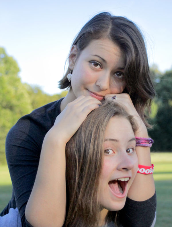
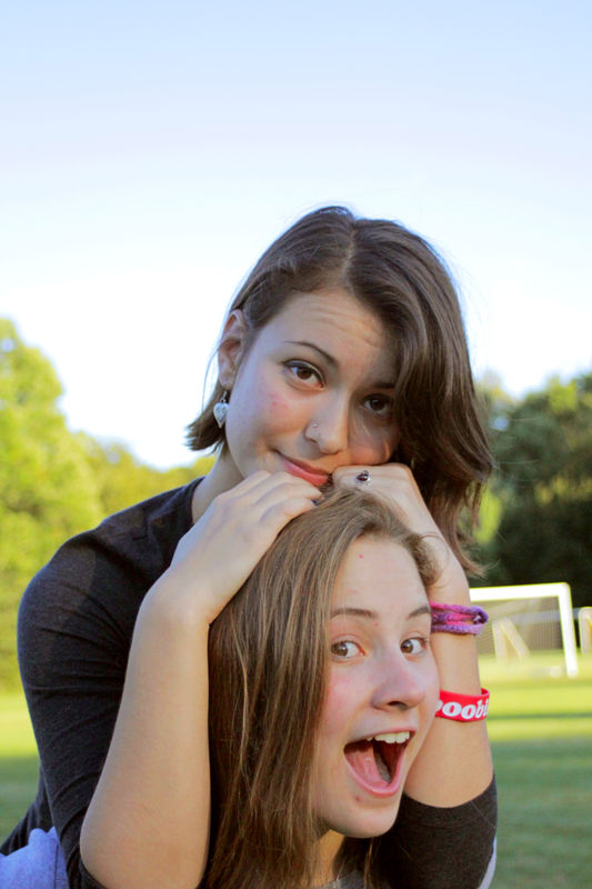
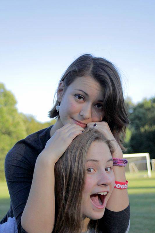
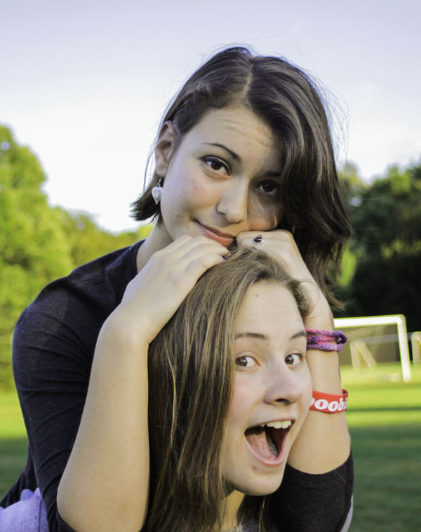
Hi - I came across this website and your post quite by accident. But, when I saw the image you posted, I was intrigued with your dilemma. So, what I have posted is an example of what can be achieved, even with the original image. The basic problem with your image is that the faces are underexposed. The high shutter speed is the basic problem. Also, the high iso causes higher noise, although that's not really an issue with this shot. I achieved what you see by employing features within Lightroom & Photoshop. Although, I don't use Gimp, I am confident that the same things can be done. I assume that your subjects are mom and daughter (who by the way, have very attractive & photogenic faces!). Both had the whites of their eyes lightened, along with mom's irises. Then, the exposure on their skin and hair was lightened. Next, the sky was darkened followed by the removal of the distracting soccer nets. Still further, distracting blemishes from both faces were removed. And finally, the image was cropped using the rule-of-thirds to frame the two faces. As you (and others on this post) have noted, it is critical to pause and check the camera settings. Then, you need to assess what choices you have: do you have a flash with an adjustment to just slightly brighten the faces OR do you have a reflector to throw more light - even someone with a white shirt or hold a white towel (just off camera left) to brighten things up OR perhaps turn them toward the light a little more. Always, try to shoot at the lowest iso possible, although with your 60D even 800 is probably OK in this situation. Your aperture was perfect for your subjects as far from the background as they were - which beautifully blurred the trees. It's been several months since you made this post; I hope you'll get to see what I've posted, as I like to know both what you and your subjects think!
Apr 6, 2014 09:01:43 #
MikeIrby wrote:
Ricardo, too cute...
nice job, what program did u use ?
most fixes on here are not that good but i do like this change very much
Apr 6, 2014 11:57:19 #
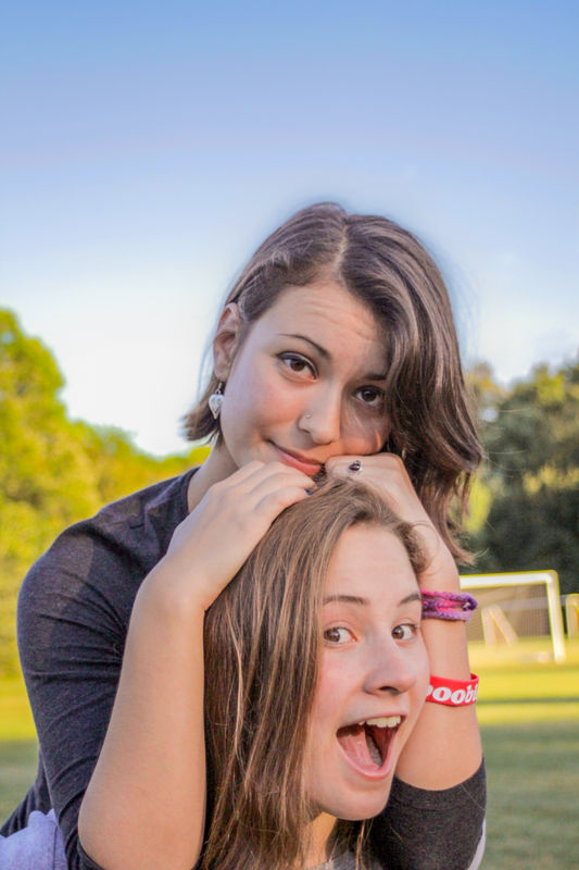
eospaddy - thanks for your reply and your compliments. What I posted was an example of salvaging this shot and making it "good" if not "great". (I was hoping to hear from the original poster, possibly with comments from his subjects, too... but maybe that'll still happen!).
As noted in my original comments, I used features within LR5 & PS-CS6 to re-touch this photo. Since I liked both the composition and the appealing faces, I wanted to see what I could do with this shot. Generally, my approach is to tweak until I see no additional benefit, which was the point where I posted my version.
In this case, I feel that most of the other posters did not appear to recognize that the basic problem was underexposure of the faces. Then, much of what was presented used adjustments to the entire image, not just to the areas that needed something. Finally of course, one needs to know how to used the LR & PS tools to apply adjustments on a selective basis.
The particular beauty of LR, is that it has tools that are specifically designed for photographic issues, whereas within PS, those same tasks require a deeper understanding of the tools and features. However, PS has other features for image manipulation, such as I used to remove the soccer nets.
Anyway, thanks for your reply!
Apr 15, 2014 19:23:29 #
MKPhoto wrote:
eospaddy - thanks for your reply and your complime... (show quote)
great explanation, great work !
Apr 15, 2014 22:34:21 #
Just more proof that if you post a picture of a couple of pretty girls here, the subject will last or months! LOL
May 2, 2014 00:48:35 #
May 2, 2014 00:54:56 #
Sorry for not asking permission to upload, but I'm new here. I couldn't resist this challenge.
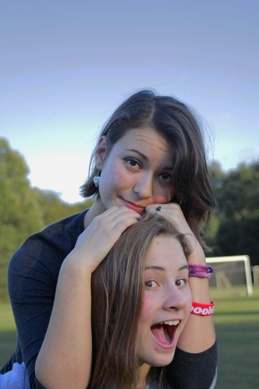
Between comparing your photo and the one I adjusted. It looks like a coloration imbalance issue. Your photo has a significant blue tint in all three areas (shadows, medium, and highlights). I discovered when I changed the coloration in these areas and increased the contrast I achieved a nice coloration balance and sharpness. I also brighten it a little bit using shadow/highlights and brightness features in PS, though I had to be real careful with brightening it, the blue sky in the background wanted to fade on me ;-)
Between comparing your photo and the one I adjusted. It looks like a coloration imbalance issue. Your photo has a significant blue tint in all three areas (shadows, medium, and highlights). I discovered when I changed the coloration in these areas and increased the contrast I achieved a nice coloration balance and sharpness. I also brighten it a little bit using shadow/highlights and brightness features in PS, though I had to be real careful with brightening it, the blue sky in the background wanted to fade on me ;-)
May 2, 2014 01:32:39 #
Ok, I wasn't sure about touching up the photo, but since several others have done it, I decided that my editing didn't seem complete without doing this, as well.

May 12, 2014 07:03:13 #
ricardolegraham wrote:
Looks great! Warmer WB and what else?
Hope you don't mind. It was such a nice picture I had a go in Paintshop.
May 12, 2014 19:53:34 #
Sorry for the hiatus there
MKPhoto, I love what you did with that. My attempts had all been with the image as a whole; I hadn't tried portions individually. (Duh!) I personally go for a bit more of a warmer tone for something like this - the face color in wholehearted's second post is pretty accurate - but the exposure fixes really did it! And the soccer net removal really smoothes things out.
By the way, everyone feel free to upload/download/do whatever with this one. I thought I mentioned it earlier, but a few posters were still asking.
May 22, 2014 17:59:04 #

ricardolegraham wrote:
So this is a photo that's been giving me a bit of ... (show quote)
I had to give it a try. I am working on a laptop so no guarantees.
May 26, 2014 09:22:08 #

No shortage of input on this one :-) . I think it's the fact that it's an unusual combination of circumstances that make it challenging. I also think that the high ISO has definitely put limits on what can be achieved.
Moving the WB away from blue created a whole new range of problems with colouring, and I'm not even sure if a dodgy WB setting was the problem. I think maybe the high ISO left the colouring a bit on the cold side, giving the impression that it's a WB problem.
Anyway, that was my starting point - move WB to the right a fair bit. Followed that with a lesser shift of the tint slider to the right. Then followed a long process of juggling colour luminance, saturation and hue in the HSR section of LR. Then did a lot of tidying up with the Adjustments brush and the Clone tool.
Any problems with noise and sharpening paled into insignificance when compared to the problems with colouring. So instead of trying to sharpen, I gave it some vividness with Clarity, Saturation and Contrast. After all that, I've convinced myself that only a deranged pixel-peeper would start nit-picking where sharpness is concerned (isn't sharpness a bit over-rated anyhoo? :mrgreen: ).
-
May 27, 2014 16:35:03 #

custom white balance.. people don't have blue skin. Took me a while to figure this one out.... Smile
May 30, 2014 18:15:20 #

Jul 29, 2014 13:57:01 #
If you want to reply, then register here. Registration is free and your account is created instantly, so you can post right away.