My People aren't Popping
Jan 5, 2014 23:21:11 #

toni-with-an-1 wrote:
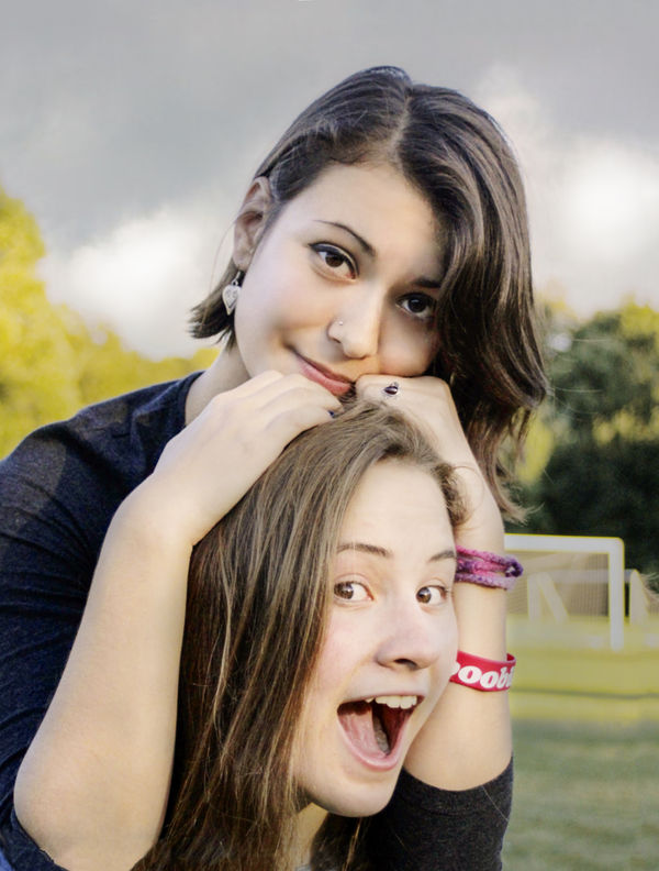
To my eye it seems the background is taking away from the subject. I took the liberty w/ this image in LR 5. Used the radial filter to brighten the subject and darken the background. desat'd the background a tad and add some saturation to the women
You have a halo around them both.
Jan 5, 2014 23:25:17 #
Yes I do. Noticed it after I posted. This was a quick fix and my objective was not to do a perfect retouch but to demonstrate what I saw as the main problem. This image should also be color corrected - which I didn't do
Jan 5, 2014 23:40:09 #
toni-with-an-1 wrote:
Yes I do.....
Interesting user name, ton1. Welcome to the forum. :)
Jan 6, 2014 05:28:35 #
....touch up (only top face) included fill lights for the shadows ...I would be very surprised if the young lady has wrinkles as prominent as shown on the forehead...softening shadows under her right eye (looked like KISS make up)...probably should be softened some more...removed blemishes...tried to raise the yellow and lower the magenta tonal values...added a texture layer for the sky and background...straightened the pic...the goal post were given a less attention getting tone...the picture was cropped on the left as much as possible to have open space on the right...the lower face and hands might need some additional touch up work...
Jan 6, 2014 05:49:21 #
lighthouse
Loc: No Fixed Abode
OK, this is a good exercise isn't it?
Many people have edited it.
And most of the edits are way overexposed in the face, many have colour cast of varying colours, some have inconsistent shadows, some have been turned into airbrush looking perfection that looks horrible, some are pasty.
(Yes, I include my own try in that description above)
Why can't anyone get it right on first try?
Jan 6, 2014 06:49:41 #
A few thoughts on that, lighthouse.
I've been watching this thread for almost a week, but have not submitted an attempt. Some of us, like me, have a hard time figuring out what skin tone should look like. A few have mentioned that there's too much blue (I agree) or the skin has too much or too little yellow or magenta. I just don't see those things.
Plus the fact that some people do have skin that is more yellow or orange or whatever. I usually pay attention to details like blemishes, wrinkles and stray hairs and then adjust lighting and don't mess with skin tone.
When I was briefly a department store portrait guy, shooting with film, even with standard lighting setup, there would be differences in the film batch or people would sit facing the lights at different angles and some people just had skin that didn't photograph well. We had one lady in the processing lab who could spend a few seconds on each setting and make everyone look good. I just don't have that ability.
Here's a one-click correction with Elements Enhance>Adjust Color>Adjust Skin Tone. Elements idea of what skin should look like.

Jan 6, 2014 14:34:14 #
...Hello OddJobber...I tend to agree with what you said... also went ahead and checked your picture and guess what...the yellow and magenta values have been reversed...so the auto function which you used did a good job on the subject's skin but in the process ( in your case a tiny) trade off appeared...the little blue band on the left background trees ( no big deal can be easily fixed) and the sky...the way I see it you may take out/change the background and or enhance the background and that moves into personal preference...but ultimately it is how the subjects view themselves and it would be interesting which pic they like...and yes it is a good exercise :{)
Jan 6, 2014 14:38:21 #
PS ...this might be a helpful ref. site when working with portraits....http://help.smugmug.com/customer/portal/articles/93363
Jan 6, 2014 15:42:19 #
lighthouse wrote:
OK, this is a good exercise isn't it?
Many people have edited it.
Why can't anyone get it right on first try?
Many people have edited it.
Why can't anyone get it right on first try?
hello lighthouse...to answer your question one needs to go back to the original request..."My People aren't Popping" ...when dissatisfied with a portrait I quite often turn it into a black and white with the background being white leaving in just enough details for the viewer to fill in the rest ...I like that effect...others might turn their nose up in disgust... so the answer is ...all of the submitters did think they got it right...some did hedge their bets and submitted multiple versions :{)
Jan 6, 2014 17:01:57 #
Here's my quick fix on your portrait to make the subjects pop. There is some banding in the sky but that can be easily fixed.
Jan 6, 2014 18:05:34 #
lighthouse wrote:
OK, this is a good exercise isn't it?
Many people have edited it.
And most of the edits are way overexposed in the face, many have colour cast of varying colours, some have inconsistent shadows, some have been turned into airbrush looking perfection that looks horrible, some are pasty.
(Yes, I include my own try in that description above)
Why can't anyone get it right on first try?
Unfortunately, they thought they did! Mine is the only one that's right! :twisted:
Jan 6, 2014 18:06:46 #
OddJobber wrote:
A few thoughts on that, lighthouse. br I've been w... (show quote)
That looks fairly natural to me except I think it needs a bit more contrast.
Jan 6, 2014 18:08:27 #
SteveL504 wrote:
Here's my quick fix on your portrait to make the subjects pop. There is some banding in the sky but that can be easily fixed.
I agree now that this has a blue tint to everything. Some of the others that were claimed to be blue weren't on my monitor.
Jan 6, 2014 18:32:33 #
Twardlow
Loc: Arkansas
SteveL504 wrote:
Here's my quick fix on your portrait to make the subjects pop. There is some banding in the sky but that can be easily fixed.
I like this one--the skin tone. Congratulations!
Jan 6, 2014 18:35:21 #

SteveL504 wrote:
Here's my quick fix on your portrait to make the subjects pop. There is some banding in the sky but that can be easily fixed.
Looks good. What did you use for PP?
If you want to reply, then register here. Registration is free and your account is created instantly, so you can post right away.