WPC 1350 - Freedom Redux ANALYSIS
Dec 20, 2013 23:39:04 #

Tom Hughes has graciously volunteered the WPC 1350 - Freedom Reduxentry for critique and analysis to find out what they could have done to make it better. Be nice, but be honest as this will help everyone with their craft. Thank you Tom and thank you everyone!
from WPC 1350 - Freedom Redux RESULTS http://www.uglyhedgehog.com/photo_contest_ratings.jsp?pcnum=94
from WPC 1350 - Freedom Redux RESULTS http://www.uglyhedgehog.com/photo_contest_ratings.jsp?pcnum=94
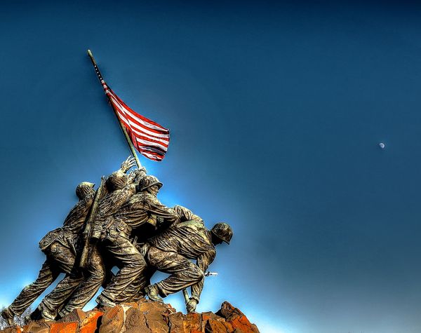
Marine Corp Memorial
Dec 20, 2013 23:44:25 #
As long as this has had some heavy PP, I would have cloned out the trees in the lower left and the airplane emerging from behind the statue on the left.
Dec 20, 2013 23:59:02 #

OddJobber wrote:
As long as this has had some heavy PP, I would have cloned out the trees in the lower left and the airplane emerging from behind the statue on the left.
I agree with OddJobber about cloning out the trees and the plane. This photo has a bit of a bas-relief look to it, but in this case I think that suits the subject and I like it.
Dec 21, 2013 04:51:04 #

I guess that's the moon in the upper right quadrant but IMO it is insignificant. Either make it bigger and recognizable or get rid of it. I really do not like the abrupt change to a lighter color surrounding the subject matter. To me it looks phony and it bothers my kinesthetic sense. Light usually dissipates very gradually and the daylight or twilight should remain uniformly parallel to the Earth's curvature, not to the subject. If you remove the highlighting and put them in a better uniform light changing as it ascends, I think you will like it better. Also, I would like you to light the Marines naturally. Whatever your light source is, the sun or the moon, it must hit everything on your subject from exactly the same direction. I see highlights on the left men coming from the upper right, yet the right most Marine hardly has any light from that direction. In addition, look at the face of the second Marine from the right who is looking up into the light source. His face needs to reflect the fact that he is looking into the light. Finally, the whole subject needs to be moved. It is very heavy and the photo wants to fall over on the left side. Either put something significantly weighty but not distracting like clouds in the upper right or move the whole group more to the right. I feel it will still be too stark. It needs something to lend it balance and scale.
That's the way I see it.
Moshe
That's the way I see it.
Moshe
Dec 21, 2013 11:08:08 #
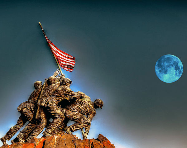
I agree with oddjober .. Here is my fix on it .. I removed the jet, trees and did a minor color alteration as well as some slight lighting adjustment and replaced the moon ..
The person who did the original editing to the photo stopped short I think. Almost got it but missed some details ..
The Moon dot on the right should have been removed or replaces as I did n this example. Having the trees in the photo at the feet and jet at the leg was a big oops that many people seem to miss when fixing a photo .. sorta like a tree branch coming out of a head in a family photos ..
Over all was a nice photo in my opinion just fell short a little on being finished.
Dec 21, 2013 15:03:19 #

OddJobber wrote:
As long as this has had some heavy PP, I would have cloned out the trees in the lower left and the airplane emerging from behind the statue on the left.
Agreed . . . and especially since that aircraft was from a different era.
Dec 21, 2013 15:44:03 #
That's better. The moon balances the memorial but was the original scene in moonlight? I don't think so. Do you want to take that liberty? I like the way you've graduated the light so that it darkens as it goes up. Much more natural. I see that you have toned down the halo effect around the Marines but you should remove it entirely. If you do that then the Marines will be lighter than the background and they will stand out better. Maybe I'm blind but I don't see any trees or airplanes. Add an "s" to Corp. Make it "United States Marine Corps"
MyPharo wrote:
I agree with oddjober .. Here is my fix on it .. I... (show quote)
Dec 21, 2013 15:47:42 #
While I found the composition and subject matter of this entry to be very pleasing, my personal opinion is that the highlights (or halo effect) around the statue is distracting. There is also a circular type effect around the flag that I find distracting to the main subject matter.
Dec 21, 2013 15:53:48 #
OK, I see you guys are coming at it from another direction so I'll shut up. Just one final comment. If you change the Marines to gold it looks more like a bronze statue. If you leave them in khaki it's more realistic. Just my opinion.
Moshe ben Avraham wrote:
That's better. The moon balances the memorial but... (show quote)
Dec 21, 2013 16:50:17 #

Was an HDR software used on this? I don't like the glow or halo around the statue. All the other comments on getting rid of the other distractions I'm in agreement with too.
Dec 21, 2013 22:30:33 #
The original has a jet and trees in it . I removed them .. it also had a moon .. very small and out of place . I did take editors licence and added a moon in about the same place. I did try to balance the photo also. I did not change the main image .
If you want to reply, then register here. Registration is free and your account is created instantly, so you can post right away.