Snow on grass
Dec 15, 2013 22:35:55 #


Dec 15, 2013 23:17:50 #

It's really brave to do a snowy object on a white background, but I love it. Very minimal. :-) I would like it to have more space.
Dec 15, 2013 23:31:03 #

What's not to love? I think you nailed it. Focus and exposure are perfect. Composition is fine. More white space would be fine, but I don't think it's needed.
Dec 16, 2013 00:05:56 #
Absolutely beautiful.
Some photographers love to crank up saturation and contrast on all their images, regardless of image content and subject matter. But I'm sure glad you didn't do that, as you would have diminished the feeling of delicateness and lightness of the subject - the very element that makes this image so effective and compelling. Well done, C-Mama!
Some photographers love to crank up saturation and contrast on all their images, regardless of image content and subject matter. But I'm sure glad you didn't do that, as you would have diminished the feeling of delicateness and lightness of the subject - the very element that makes this image so effective and compelling. Well done, C-Mama!
Dec 16, 2013 06:19:22 #

Possible cover shot for your next book on photographic minimalism, nicely done, but if I could see what was holding this feather up, however, I would probably be a more satisfied viewer.
Dec 16, 2013 07:29:30 #
Nightski wrote:
It's really brave to do a snowy object on a white background, but I love it. Very minimal. :-) I would like it to have more space.
Thank you. More space is easy with a white background. :)
This one was a reshoot as when I got back from the first one I didn't like the clutter in the background, so I went back with the objective of getting as much of the photo over snow and then painting or cloning out the rest. This was the results.
Dec 16, 2013 07:33:57 #
Heirloom Tomato wrote:
What's not to love? I think you nailed it. Focus and exposure are perfect. Composition is fine. More white space would be fine, but I don't think it's needed.
Thank you.
Dec 16, 2013 07:35:33 #
rook2c4 wrote:
Absolutely beautiful.
Some photographers love to crank up saturation and contrast on all their images, regardless of image content and subject matter. But I'm sure glad you didn't do that, as you would have diminished the feeling of delicateness and lightness of the subject - the very element that makes this image so effective and compelling. Well done, C-Mama!
Some photographers love to crank up saturation and contrast on all their images, regardless of image content and subject matter. But I'm sure glad you didn't do that, as you would have diminished the feeling of delicateness and lightness of the subject - the very element that makes this image so effective and compelling. Well done, C-Mama!
Thank you. I played with this one for quite awhile hoping I was getting it right.
Dec 16, 2013 07:37:50 #
jonsommer wrote:
Possible cover shot for your next book on photographic minimalism, nicely done, but if I could see what was holding this feather up, however, I would probably be a more satisfied viewer.
Thank you. It is a head of grass so what is holding it up is more of the same stem. Not too interesting. I guess I could have included some of the leaves, but they were pretty far down on the stem.
Dec 16, 2013 07:41:09 #

Nice image, it really works with the white (snow) background.
:thumbup: :thumbup:
:thumbup: :thumbup:
Dec 16, 2013 07:43:12 #
Dec 16, 2013 08:03:30 #

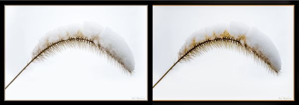
Country's Mama, I went into my tool bag and tried to mod the photo to look better. Frankly after using Topaz clarify the most I could do was to up the black and orange a bit.
I actually prefer the pale look of the original photo and would judge it be the better. Ya just can not improve on good chocolate cake can ya,,,, mmmmmm and mmmmm for your photos.
To do a side by side, I doubled the width of the canvas (Image>Canvas size) and put original on screen with Windows>Cascade then copy and paste then Move tool. Then Layers>Flatten
ORIGIONAL LEFT vs MOD RIGHT
Dec 16, 2013 08:40:18 #
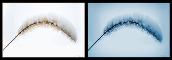
The more I looked at the snow, the colder I got. Cold turns us blue. This variation I went into Topaz B/W-2 and used Cyano. Combo comparison as previous. Thank you Mama for forcing me to exercise my brain as I sip cup of Java #2.
ORIGIONAL LEFT vs CYANO RIGHT
Dec 16, 2013 09:20:48 #

Country's Mama wrote:
While the leaf didn't come out any better today. How about this?
Like this one a lot, very minimalist. The balance of the stem arching across the frame lets you break the usual compositional rules with success, in my opinion. The snowy background is essential to the success with this one. Sharp, detailed, well framed, processed for impact. I would like it printed fairly small, matted simply, and in a barn wood frame.
It would also be good in black and white for a more stark moody version.
Dec 16, 2013 11:51:46 #

Simply Elegant! Graceful and Natural.
And yet, for all that, I would wish for "just a shade" darker background (and I mean infinitesimally subtle), probably grey, so I could see the snow better. I don't want the snow to "pop", just be discernible from the background. Whereas Russ is a master at black from black, you will soon be the master of white from white if you keep this up.
And yet, for all that, I would wish for "just a shade" darker background (and I mean infinitesimally subtle), probably grey, so I could see the snow better. I don't want the snow to "pop", just be discernible from the background. Whereas Russ is a master at black from black, you will soon be the master of white from white if you keep this up.
If you want to reply, then register here. Registration is free and your account is created instantly, so you can post right away.