WPC 1349 - Freedom ANALYSIS
Dec 13, 2013 23:37:43 #

DavidT has graciously volunteered the WPC 1349 - Freedom entry for critique and analysis to find out what they could have done to make it better. Be nice, but be honest as this will help everyone with their craft. Thank you DavidT and thank you everyone!
from WPC 1349 - Freedom RESULTS http://www.uglyhedgehog.com/photo_contest_ratings.jsp?pcnum=93
from WPC 1349 - Freedom RESULTS http://www.uglyhedgehog.com/photo_contest_ratings.jsp?pcnum=93
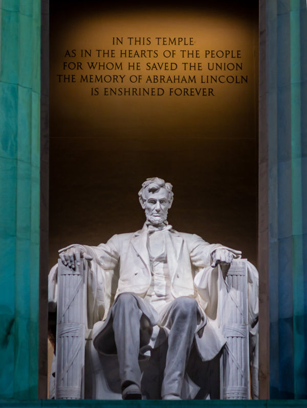
Gave Freedom to the South's African-Americans During the Civil War

Dec 14, 2013 00:27:26 #
greg vescuso
Loc: Ozark,Mo.
I thought this was the best image in the challenge and I really couldn't think of anything to make it better, so I down loaded your image and just cropped out the columns .Making your interest only being these powerful words above such a great figure. That is my only suggestion to remove the columns and see what you think.
Dec 14, 2013 06:24:35 #
greg vescuso wrote:
I thought this was the best image in the challenge and I really couldn't think of anything to make it better, so I down loaded your image and just cropped out the columns .Making your interest only being these powerful words above such a great figure. That is my only suggestion to remove the columns and see what you think.
First, thank you very much for your generous compliment and feedback. In taking this shot, I woke up early get to the Lincoln memorial around 6:30am before all the tourists arrive and right around sunrise when the lights were still on inside the memorial. I was looking for an effect with a mixture of lighting. I was trying to use the columns to frame the image and I thought the bluish cast from the early daylight on the columns complemented the yellowish tungsten lighting inside the monument. But, I agree with your suggestion to crop out the columns depending on what one wanted the image to convey.
Dec 14, 2013 07:48:29 #

I like the columns. They give the photo a more 'grand' appearance that is fitting for such a subject.
Dec 14, 2013 09:29:32 #

I like the columns too. It's difficult to shoot a much-viewed and photographed national treasure, and I think you did a great job with the composition and colors.
The whitest part of jacket bothers me a little: appears a bit out of focus - I checked exif but f/stop is not shown.
Or maybe it could just be darkened some in pp so doesn't distract from rest, which to me is exposed really nicely - showing details in the shadows and an overall pleasing look.
The whitest part of jacket bothers me a little: appears a bit out of focus - I checked exif but f/stop is not shown.
Or maybe it could just be darkened some in pp so doesn't distract from rest, which to me is exposed really nicely - showing details in the shadows and an overall pleasing look.
Dec 14, 2013 10:20:47 #
Linda From Maine wrote:
I like the columns too. It's difficult to shoot a much-viewed and photographed national treasure, and I think you did a great job with the composition and colors.
The whitest part of jacket bothers me a little: appears a bit out of focus - I checked exif but f/stop is not shown.
Or maybe it could just be darkened some in pp so doesn't distract from rest, which to me is exposed really nicely - showing details in the shadows and an overall pleasing look.
The whitest part of jacket bothers me a little: appears a bit out of focus - I checked exif but f/stop is not shown.
Or maybe it could just be darkened some in pp so doesn't distract from rest, which to me is exposed really nicely - showing details in the shadows and an overall pleasing look.
I used a Panasonic Lumix GX7 with a legacy Leica 135mm Tele-Elmar lens adapted to it (270mm equivalent). The aperture is selected manually, and I believe it was f8, but not positive. And, I used a tripod.
Dec 14, 2013 14:25:23 #

I agree with Linda, keep the columns they add to the shot, but maybe a bit more contrast between Abes face and legs.
Dec 14, 2013 16:57:53 #

St3v3M wrote:
DavidT has graciously volunteered the WPC 1349 - Freedom entry for critique and analysis to find out what they could have done to make it better. Be nice, but be honest as this will help everyone with their craft. Thank you DavidT and thank you everyone!
from WPC 1349 - Freedom RESULTS http://www.uglyhedgehog.com/photo_contest_ratings.jsp?pcnum=93
from WPC 1349 - Freedom RESULTS http://www.uglyhedgehog.com/photo_contest_ratings.jsp?pcnum=93
Should have been the winner in my humble opinion.
The only detraction is the jacket area needs a little adjustment on the exposure side.... I understand that this is the illumination from the lighting... but if it could just be toned down a bit.
Nice image and one that strongly supports the theme.
Dec 15, 2013 07:33:43 #
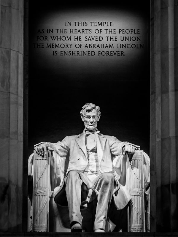
As Linda from Maine and LoneRangeFinder suggested, I toned down the whitest part of Abe's jacket...gives a more consistent exposure. Thanks for the suggestion!
With Jacket Highlights Toned Down
Dec 23, 2013 07:47:43 #
Looking over the entries, your image would be one of two images that I would vote for. I like it a lot. I like the framing with the columns and the colours. Cropping off the columns as suggested by others will make the image look cramp. I like how you have left sufficient dark areas at the top of the image, so that the spotlight effect on the words is a complete oval. In a similar vein, I would give more base at the bottom as the heavy statue might just fall through the bottom of the image! (Of course it wouldn't, but it is a perception). I do agree about toning down the brightness of the middle portion of the statue. I would go further and use the 'burn' tool set to 'shadows' around 4% and go over the statue from the head down, and the columns as well. This will bring out the contrast and texture in them. It seems like you have focused on the words and the statue and columns are a bit unsharp. So I would sharpen them a bit. Well done.
Dec 23, 2013 16:15:40 #
I really appreciate your comments. They are well-thought-out and reasonable. Sharpening the columns wouldn't help much though. They are actually about 30 ft in front of the statue I couldn't get sufficient depth-of-field (unless I used an extremely small aperture and corresponding shutter speed in minutes). Thank you again for taking the time to comment.
Dec 26, 2013 03:59:53 #
cmcnaught
Loc: Nampa, Idaho
I wonder if the image would be stronger as a monochrome. The colors are so vibrant, they distract me from the subject matter of the image - which for me is impact Lincoln had. On my screen, the colors look more like green and orange, which makes it a little Halloweeny.
I think the symmetry is perfect for this photo. It strengthens the balance of the image, and mirrors the balance of the man. I like the way the quote is floating above his head, almost as if he's contemplating the message. I like the symbolism of that.
I agree that the columns help frame the image. They provide some structure, and the vertical lines add energy. Their verticality reflects the vertical symbolism of Lincoln's thoughts, aspirations.
I played with it in LR5, converting it to B&W. I lightened the eyes a touch, and his legs, to balance the exposure. I might have been able to do more with a raw image, but it turned out decently.
You have a strong image here David.
Dec 26, 2013 11:37:19 #
cmcnaught wrote:
I wonder if the image would be stronger as a monoc... (show quote)
Thank you. If you would like to display your B&W version here, I certainly have no objections and would like to see your changes.
Dec 26, 2013 11:44:37 #
cmcnaught
Loc: Nampa, Idaho
Here's what I did. I can't say it's any better - just a different interpretation.
B&W Version of DavidT's Image
Dec 26, 2013 12:08:11 #
cmcnaught wrote:
Here's what I did. I can't say it's any better - just a different interpretation.
I like the B&W version. It gives the image a completely different perspective. I would have toned down the contrast a little...it gives Lincolns' eyes an eerie look to them.
If you want to reply, then register here. Registration is free and your account is created instantly, so you can post right away.