Frost Abstract
Nov 29, 2013 15:54:11 #

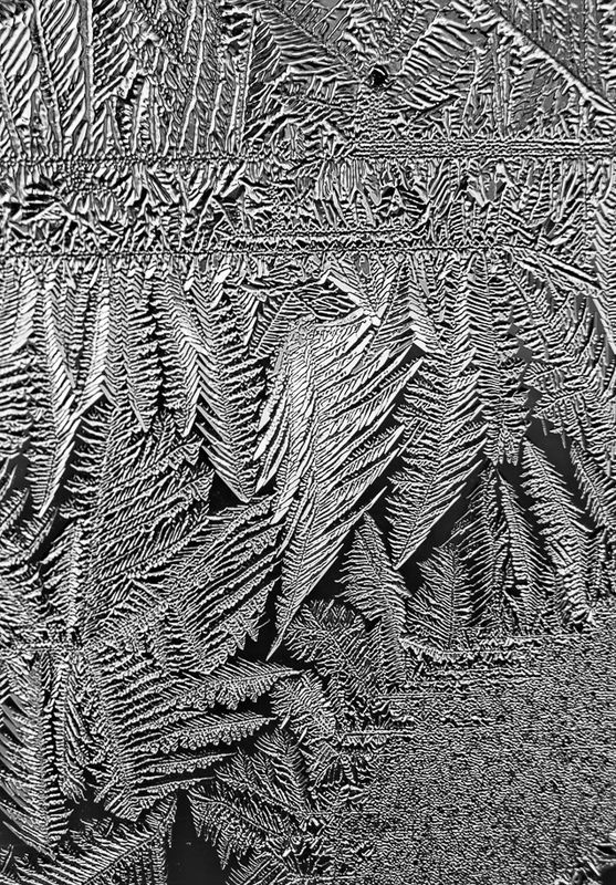
This morning I got out my really, really old extension tubes and pre-AF 50mm f/2 lens and put them on my D40. I needed the old lens because it has an aperture ring, unlike my 3 contemporary G lenses. This was manually focused, guided by the in-camera range finder. Exposure was f5.6 @ 1/100th on a tripod. I cropped the entire left half because it was out of focus. With a 20mm extension, I didn't have much depth of field and was finding it difficult to get the camera perfectly square to the subject. I processed this with LR5 and Topaz B&W Effects (both demo - trying a lot of software lately.) The subject was back lit by natural, northern ambient light.
Anyway, comments on the good, the bad, and the ugly desired.
Anyway, comments on the good, the bad, and the ugly desired.
Nov 29, 2013 16:03:07 #
lighthouse
Loc: No Fixed Abode
I like it.
I would be tempted to crop the top 30% off to crop it back to just the most interesting patterns.
That would leave it a square crop.
I'd be tempted to play with colour too.
I would be tempted to crop the top 30% off to crop it back to just the most interesting patterns.
That would leave it a square crop.
I'd be tempted to play with colour too.
Nov 29, 2013 16:12:50 #

lighthouse wrote:
I like it.
I would be tempted to crop the top 30% off to crop it back to just the most interesting patterns.
That would leave it a square crop.
I'd be tempted to play with colour too.
I would be tempted to crop the top 30% off to crop it back to just the most interesting patterns.
That would leave it a square crop.
I'd be tempted to play with colour too.
Lovely patterns. I agree with Lighthouse, but if you don't crop it it might look especially nice with a color gradient applied, different colors at the top than at the bottom. Just an idea.
Nov 29, 2013 16:15:40 #

My first impression: the stark black and white treatment probably removed a whole pastle of crystaline sparkle that got buried in the process. This almost looks "thick" to me, and I'm fully aware that frost facets are usually razor sharp. For me, it would have been more effective if you had included more tonal gradations in the processing flow.
That being said, I see a good dozen or more individual crops within this single photo, so you've presented a great wealth of source material.
That being said, I see a good dozen or more individual crops within this single photo, so you've presented a great wealth of source material.
Nov 29, 2013 16:21:32 #
Nov 29, 2013 16:27:13 #

Aside from any technical issues mentioned, I think it's a super-interesting composition and study of the details of frost. The horizontal line and the areas of dark that show off the "feathers" below make me think of an expensive tapestry :)
Nov 29, 2013 16:47:24 #

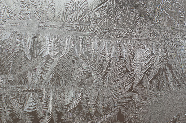
Oh, my! I REALLY like this one. I do wish we had frost here! Beautiful intricate feather patterns your eye can follow all over the place. I like it as a whole, but also, I agree with Lighthouse's suggested square crop. There's a whole lot of smaller crops- the top section by itself, with or without the horizontal band (which itself could be cropped like a pano) the left side, the right middle third. On and on. Color toning in blues would accentuate the cold, but gold would make it seem like sunrise. Just for fun, I put it through a series of color toners, and it looked great in all of them but the pink ones. Your processing can bring out the twinkly look of ice, or you can let it flatten into pattern like a paisley fabric.
The horizontal band appears a tiny bit off-level- that may be because it forms kind of hump/ doubling effect in the right half, but to my old eyes, it "felt" better leveled a tad.
Very beautiful.
The horizontal band appears a tiny bit off-level- that may be because it forms kind of hump/ doubling effect in the right half, but to my old eyes, it "felt" better leveled a tad.
Very beautiful.
Nov 29, 2013 16:51:39 #
Linda From Maine wrote:
Aside from any technical issues mentioned, I think it's a super-interesting composition and study of the details of frost. The horizontal line and the areas of dark that show off the "feathers" below make me think of an expensive tapestry :)
I was thinking of Indian Warbonnet. I'd love to see variations on this image.
Nov 29, 2013 17:47:48 #
lighthouse wrote:
Thank you.I like it.
Quote:
By color, do you mean tinting/toning or the original color version (which incidentally doesn't have much color). :|I would be tempted to crop the top 30% off to crop it back to just the most interesting patterns.
That would leave it a square crop.
I'd be tempted to play with colour too.
That would leave it a square crop.
I'd be tempted to play with colour too.
Heirloom Tomato wrote:
Lovely patterns. I agree with Lighthouse, but if you don't crop it it might look especially nice with a color gradient applied, different colors at the top than at the bottom. Just an idea.
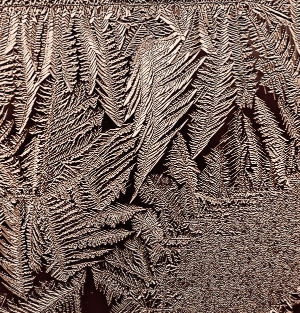
Here's a crop with hazelnut toning.
Nov 29, 2013 17:59:33 #
Bob Yankle wrote:
I tried to get more tonal range, but I think one issue is the lack of tones in the original. That, in addition to my need to improve my craftsmanship in image processing! I added the original - out of focus half and all - below. It's the raw image, input by LR5, and exported to jpg with no processing. The distant background is moderately thick deciduous woods (no leaves) lighted by northern overcast sky. Hence the pale grey upper left and pale brown tree trunk tone on the rest. All my other images are similar. Fortunately, this frost reforms throughout the winter, so I'll have the opportunity to try again.My first impression: the stark black and white treatment probably removed a whole pastle of crystaline sparkle that got buried in the process. This almost looks "thick" to me, and I'm fully aware that frost facets are usually razor sharp. For me, it would have been more effective if you had included more tonal gradations in the processing flow.
Quote:
Yes. There are all kinds of ideas in there.That being said, I see a good dozen or more individual crops within this single photo, so you've presented a great wealth of source material.
Nov 29, 2013 18:11:02 #
Macromad wrote:
Cool name for it. I always thought they looked like evergreen trees, but I think ferns makes more sense.From NZ this is what I call silver ferns.
Linda From Maine wrote:
Thank you. I see these frost patterns on this window every winter. Of course they're different every time. Right now, the weather is such that they disappear during the day and reform with a new pattern every morning. So I'll try some more macro practice over the winter.Aside from any technical issues mentioned, I think it's a super-interesting composition and study of the details of frost. The horizontal line and the areas of dark that show off the "feathers" below make me think of an expensive tapestry :)
Nov 29, 2013 18:19:48 #
minniev wrote:
Thank you. Frost is a great subject. When I see all the interesting little areas that could be cropped, it makes me have pixel envy. :-( As you and others have suggested, I'll play around with some colors. I just downloaded the Topaz bundle free trial yesterday; it's got some interesting artsy plugins I can try too.Oh, my! I REALLY like this one. I do wish we had f... (show quote)
Nov 29, 2013 18:45:08 #
Gauss wrote:
Thank you. Frost is a great subject. When I see all the interesting little areas that could be cropped, it makes me have pixel envy. :-( As you and others have suggested, I'll play around with some colors. I just downloaded the Topaz bundle free trial yesterday; it's got some interesting artsy plugins I can try too.
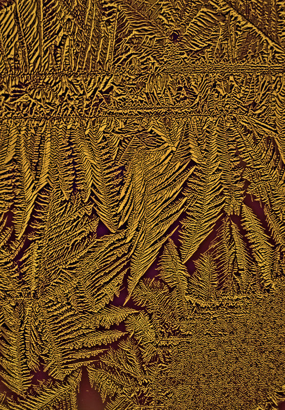
If you got the bundle, toss this one through Restyle. You'll have over 1000 choices of toning and you can remove colors that you think are distractions. This one looks good in a whole bunch of 'em, esp the blues/golds/grays. But even some of the ones with greens looked good, almost like abstract ferns.
Nov 29, 2013 19:19:07 #
Gauss wrote:
This morning I got out my really, really old exten... (show quote)
Here's a version in antique gold embroidery thread.
Nov 29, 2013 19:28:44 #
Heirloom Tomato wrote:
Here's a version in antique gold embroidery thread.
Yes, that's what I thought it would do. I tried about 20 toning presets on it and only found a couple that didn't look good. Nice gold brocade in this one.
If you want to reply, then register here. Registration is free and your account is created instantly, so you can post right away.