Sunset in Badlands, revisited
Nov 24, 2013 17:01:45 #

All the lovely photos from Badlands and discussion of that interesting place got me digging around in my old files. Mine can't compete with Dave's or Rudolf's but they were fun to revisit-comical too- I had just purchased my first copies of photoshop and photomatix, so you can imagine the dreadful garish things I thought were so wonderful at the time. Thankfully, I shot in RAW back then too, so I could backtrack through the day-glo versions to get some files to rework.
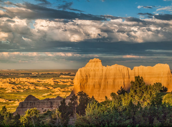
This one is not greatly composed (looking down from one of those hills), and I like it better in a vertical crop, losing a big chunk off the right side, but that crops out the moon. And I am a big scene person, I struggle to crop ANYTHING out.
So, what do you suggest for cropping/treatment? Reshoot isn't an option but I can apply those suggestions to other settings where I might be looking down one landscape into another. Any any sort of critique/analysis/edits you see fit to share...
Nov 24, 2013 17:10:01 #

I wouldn't crop this any differently. You have many levels of view that work for me. The horizontal crop works well also in that all the lines are also horizontal, the clouds, striations in the rock and even the mounds in the distant have a horizontal feel to them. I like how my eye sweeps up the light in the foreground moves to the rock formation up to the sky and down into the background.
Excellent choice in time of day to shoot.
Excellent choice in time of day to shoot.
Nov 24, 2013 17:18:29 #

I think the composition is fine and the lighting is spectacular and dramatic. The one suggestion I have (and wish I would remember for myself) is that you could have lowered your ISO significantly and still have been able to expose with a fast enough shudder to handhold while maintaining your aperture setting. You do have a bit of noise at 100%.
Thanks for posting this engrossing image for critique MinnieV. 8-)
Thanks for posting this engrossing image for critique MinnieV. 8-)
Nov 24, 2013 17:30:07 #

I don't believe you should crop this. There are interesting things to see on both edges of the photo, also in the foreground and background. You wouldn't want to lose the moon, or the far-away rocks near the left side horizon, nor would you want to lose the wide expanse of horizon and sky that show the width and depth of this scene. If it were mine, no changes at all.
Nov 24, 2013 17:30:51 #
Heirloom Tomato wrote:
I don't believe you should crop this. There are interesting things to see on both edges of the photo, also in the foreground and background. You wouldn't want to lose the moon, or the far-away rocks near the left side horizon, nor would you want to lose the wide expanse of horizon and sky that show the width and depth of this scene. If it were mine, no changes at all.
Forgot one thing. Get a good de-noise program if you don't have one and give it some de-noise treatment.
Nov 24, 2013 17:37:45 #
Bmac wrote:
I think the composition is fine and the lighting is spectacular and dramatic. The one suggestion I have (and wish I would remember for myself) is that you could have lowered your ISO significantly and still have been able to expose with a fast enough shudder to handhold while maintaining your aperture setting. You do have a bit of noise at 100%.
Thanks for posting this engrossing image for critique MinnieV. 8-)
Thanks for posting this engrossing image for critique MinnieV. 8-)
Yes, I could've got by with 400 ISO-the Oly was a noisy beast at 800. Don't remember if I shot that on purpose or if I had the ISO jacked up taking photos of all those cute rabbits hopping in the shadows and forgot (yes I do that a lot). But the shadows do block up badly on that camera, and I could've just had a black glob in the cedar stand at the bottom. The camera I have now would have been a better fit for such a high contrast scene.
Nov 24, 2013 17:45:30 #
Heirloom Tomato wrote:
Forgot one thing. Get a good de-noise program if you don't have one and give it some de-noise treatment.
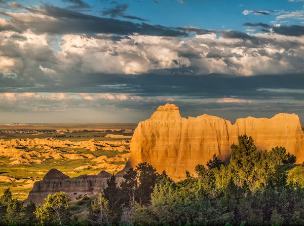
I had already tried that, and it ate up a lot of detail even with me manually working the noise removal. I'll have to try to some other tricks. Noise removal version attached (mush..) :cry:
Nov 24, 2013 17:55:11 #
minniev wrote:
I had already tried that, and it ate up a lot of detail even with me manually working the noise removal. I'll have to try to some other tricks. Noise removal version attached (mush..) :cry:
That looks OK on my monitor but I only made it full-screen and did not view at 100%. I have read that some de-noise programs work better than others. I have had no luck with the one in PSE. I guess it would depend on how many photos you have lurking around that you took with your old camera, and how much time and $ you want to spend to de-noise them. Newer cameras can do so much better in the noise department, thank goodness.
Nov 24, 2013 18:44:56 #

I love the image - there's just so much of interest to view + the light is spectacular. Your de-noised version made me think of "dreamy" and painted, so I tried more softening in Picasa. Did too much :) but I can see where it would be fun to play with this one!
Nov 24, 2013 19:17:48 #
I think it is a very good composition. The color is great. Light is perfect. A bit too much noise; but that can be fixed. Nice photograph.
Nov 24, 2013 19:47:25 #

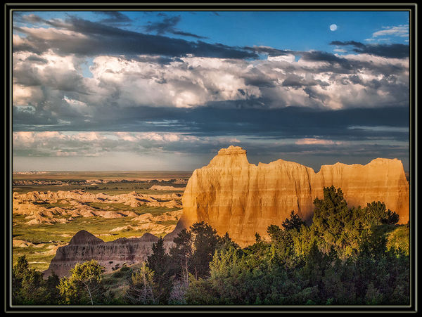
Ahhh, this is the Minniev we know and love. Thanks for a new landscape to work on ...... and as usual, they're not simple fixes, with nary a global fix in sight.
Changes:
- Changed the hue shining on the taller of the mounts, giving it a more golden hue (as opposed to yellowish). Upped the structure levels to make the striations more visible
- Boosted the light and contrast in the lower mounts to make them more visible
- Desaturated distant badlands, shifted hue, again to remove yellowish cast
- Removed clouds from around moon to isolate it and make it a more visible presence in the sky
- Changed white balance to remove color cast
- Added an off-center light source, fairly low, and just left of center, as that is where the light seemed to be coming from.
- Added a simple black matte.
Variation on Sunset at Badlands, revisited
Nov 24, 2013 21:07:19 #
Bob Yankle wrote:
Ahhh, this is the Minniev we know and love. Thank... (show quote)
That looks really beautiful, Bob. I love what you did.
Nov 25, 2013 08:41:41 #
Bob Yankle wrote:
Ahhh, this is the Minniev we know and love. Thank... (show quote)
Though the changes you made are subtle, they really improved this image IMHO. Especially the new low/left light source and the removal of the clouds near the moon. The light was creeping up the canyon-like structures from the left where the sun was setting. This one addition seemed to give the scene more depth/dimension and reversed the flattening of the layers somewhat.
Nov 25, 2013 09:18:15 #

Bob Yankle wrote:
Changes: br br - Changed the hue shining on the ... (show quote)
Other than the noise in the trees, the clouds over the moon was the biggest problem I saw. This makes a big difference.
Nov 25, 2013 09:30:45 #
Bloke wrote:
Other than the noise in the trees, the clouds over the moon was the biggest problem I saw. This makes a big difference.
I'm one of those guys who will accept noise over loss of detail just about every single time.
If you want to reply, then register here. Registration is free and your account is created instantly, so you can post right away.