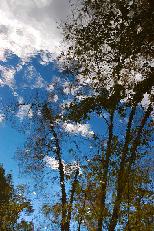
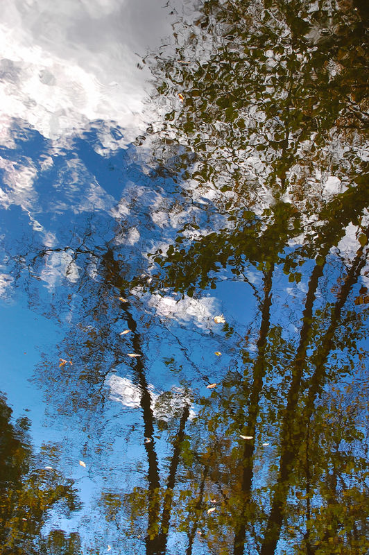
Water Color Reality
Nov 23, 2013 22:33:13 #
Nov 23, 2013 22:50:45 #

Very nice reflection photo. I like that there are a few leaves on the water to point out that this shot is all reflection. Good color and composition.
Nov 23, 2013 23:45:49 #

This reminds me of an oil painting, kind of a Monet quality, probably that's why I like so much.
Nov 23, 2013 23:56:30 #
Excellent! I can't find anything negative about it, only positive. Strong colors, but no unnecessary over-saturation. Heirloom Tomato summed it up well already. If this was one of my images, I'd not only be proud of it, but already thinking about what size I want the print to be!
Nov 24, 2013 00:51:38 #

I'm with Heirloom Tomato- those sharp leaves combined with the painterly reflection really lend a third dimension to the image that I really like. Nice!
Nov 24, 2013 02:27:33 #
That's just beautiful. Complete and finished. Now for some serious criticism and advice... Yep - I'm finished too.
Mike.
Mike.
Nov 24, 2013 09:50:01 #

Very interesting image where the eye wants to explore all the content. As mentioned, I think the color and composition, as well as your treatment, are all pleasing.
Nov 24, 2013 12:04:21 #
Thanks everyone for the positive feedback.
I'm glad the fallen leaves floating on the water aren't seen as a negative. The lighting is a little different in that the darkest part is at the top; other than the highlight clouds upper left, the sky gets lighter towards the bottom. Since it's all water, I rotated the original 180 degrees so the scene is reflected in its normal perspective.
I'm glad the fallen leaves floating on the water aren't seen as a negative. The lighting is a little different in that the darkest part is at the top; other than the highlight clouds upper left, the sky gets lighter towards the bottom. Since it's all water, I rotated the original 180 degrees so the scene is reflected in its normal perspective.
Nov 24, 2013 12:16:54 #
Gauss wrote:
Thanks everyone for the positive feedback.
I'm glad the fallen leaves floating on the water aren't seen as a negative. The lighting is a little different in that the darkest part is at the top; other than the highlight clouds upper left, the sky gets lighter towards the bottom. Since it's all water, I rotated the original 180 degrees so the scene is reflected in its normal perspective.
I'm glad the fallen leaves floating on the water aren't seen as a negative. The lighting is a little different in that the darkest part is at the top; other than the highlight clouds upper left, the sky gets lighter towards the bottom. Since it's all water, I rotated the original 180 degrees so the scene is reflected in its normal perspective.
I was wondering about that. Very clever of you to rotate it!
Nov 24, 2013 12:20:04 #

I too find it to be reminiscent of a Monet, to my inexperienced eye there is nothing to be critical of.
Nov 24, 2013 13:00:44 #
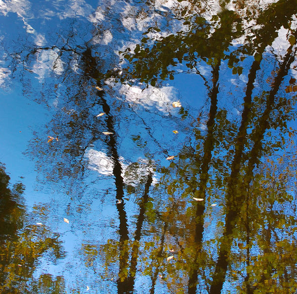
I very much like the colors and textures in the photo. They work well as a strong abstract. I think this could make a very nice large print. In looking at the general composition, I kept wondering if a crop might work better. The bottom of the image seems out of balance with the top, to my eye, possibly due to the large section of white, whereas there is little white in the bottom. The lesser interaction of the lights and darks in the lower half of the image make it "top heavy" in my mind. Hence, I find myself leaning to crop out a section of the bottom.
Here is a mockup of a cropping approach you might find interesting.
Here is a mockup of a cropping approach you might find interesting.

Nov 24, 2013 13:04:25 #
Photographer Jim wrote:
I very much like the colors and textures in the ph... (show quote)
Jim, I like the original photo, but what you did here looks so beautiful in that frame. Would you please give detailed directions on how to make that type of frame in a PM to me, or in another thread, or something? My framing efforts so far are not working out so well...
Nov 24, 2013 15:26:41 #
I like Jim's edit. The square format works well. A square format symbolizes truth. I would only suggest that there is not a point of interest to draw you into the photo. I think a small yellow, gold or red leaf in the lower left would add more interest.
imo
imo
Nov 24, 2013 22:03:47 #
Photographer Jim wrote:
... I kept wondering if a crop might work better. The bottom of the image seems out of balance with the top, to my eye, possibly due to the large section of white, whereas there is little white in the bottom. The lesser interaction of the lights and darks in the lower half of the image make it "top heavy" in my mind. ...
Yes, I see what you mean; thanks for the input. :thumbup: I wonder if opening up the shadows in the upper right helps the balance - not so dark and a little more color? I could also beef up the shadows in the lower half.
I like your crop and decided to try an alternate of the bottom half.
Lightened shadows upper right
Crop of lower half
If you want to reply, then register here. Registration is free and your account is created instantly, so you can post right away.