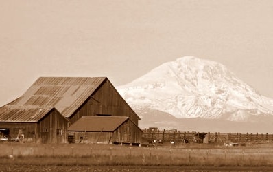
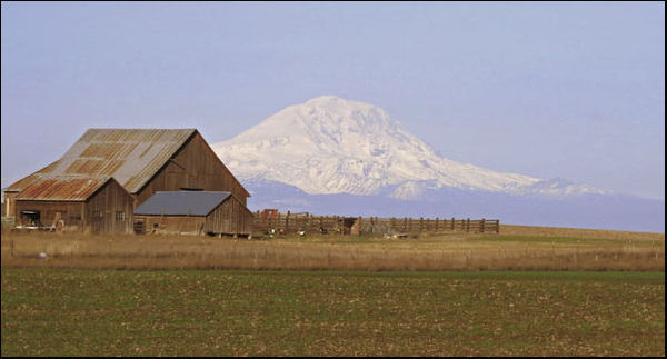
A ranch and Mount Adams
Nov 23, 2013 14:44:31 #

Do the two main elements compete or compliment each other? How do you decide? Any other issues of composition to address?
Please note that to the left of the barn was just an ugly outbuilding.
If you'd like to crop and re-post, feel free - but no pp requested at this time. THANKS!
Please note that to the left of the barn was just an ugly outbuilding.
If you'd like to crop and re-post, feel free - but no pp requested at this time. THANKS!
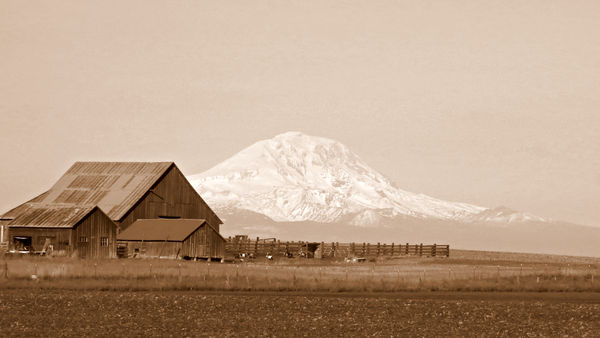
Less foreground than #2
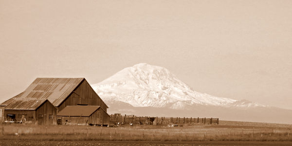
the original - more or less :)
Nov 23, 2013 15:15:26 #
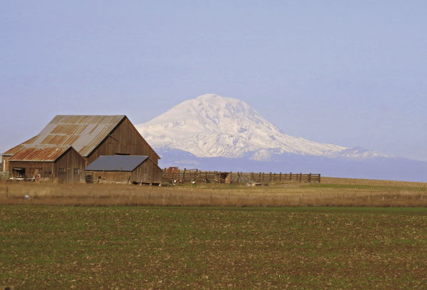
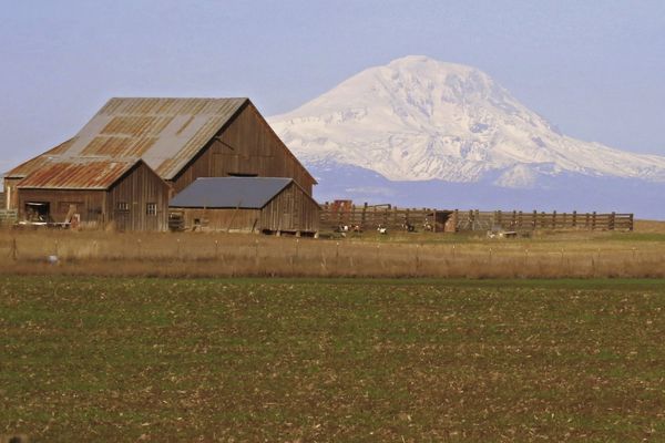
Seems there was a lot of haze that day. The farm is sharp but the mountain seems lost in the haze for some reason. I actually like the original in this case. Composition seems fine. I don't think the two elements compete.
Nov 23, 2013 15:31:55 #
ebrunner wrote:
Seems there was a lot of haze that day. The farm is sharp but the mountain seems lost in the haze for some reason. I actually like the original in this case. Composition seems fine. I don't think the two elements compete.
I like the toning. The barn and distant mountain work together fine.
My inclination is to crop a good deal. For me, the image is not balanced. Too much space in on the right and in the cloudless ski for my eye. Also, rather than have the left edge of the barn close to the frame, I would prefer the frame overlap the barn, to avoid a perception that it is being "squeezed in".
You requested no other pp other than cropping. I might suggest playing a bit with some small increases in contrast and a slight darkening in the sky along the top edge to lessen the flat tone throughout the sky.
My quick crop suggestion
Nov 23, 2013 15:41:06 #
I would have also shot the scene by moving (myself) to the right. It would separate the barn from the mountain. Just see if that works? Also, the tighter crop as mentioned by PhotographerJim works better for me.
Nov 23, 2013 15:50:09 #

A very nice image due to it's interest and composition, which I think is just fine Linda. Even though the mountain is large and light, I believe the the focal point is the brown barn due to it's sharpness. In any event, the mountain and barn compliment each other admirably in my subjective view. I prefer the third photograph and offer another crop which might please. Thanks for posting your picture for critique Linda. 8-)
Nov 23, 2013 15:58:34 #
Thank you all so much!
I had not considered cropping from the right side, so that is an interesting alternative which I appreciate having been presented.
The idea of cropping a bit more from left to avoid "squeezed-in" feel is a great point to remember.
As for moving more to the right to separate the barn from mountain, there is actually quite a bit of mountain still on the left that you can't see :) I understand the suggestion, though, and when I go down again, I'll look for a vantage point that offers that.
Thanks again! These are the kinds of insights and opinions I value and learn from - and that make this critique forum such a terrific resource.
:thumbup: :thumbup:
Nov 23, 2013 22:05:06 #
Wow! Thats a beauty. And no more than various shades of four colours in it!
All the elements are complimentary to each other and each is essential. And theres nothing ugly in the photo. Its a beautiful representation of what you saw. Or what I like to think you saw! And what is not shown is certainly suggested.
The crop is because I feel the picture needs more width than height to give a feeling of expansiveness to the scene. Cropped too high from the bottom leaves me feeling as though the buildings might be on a floating island and leaves the whole thing looking unreal. So Ive cropped enough to leave the scene intact and taken the same amount from the top to give it a wider feel. Every bit of the rest is too important to the scene to take any more out.
And any more editing than that would take something away from what you already have a beautiful photo! Congratulations.
Mike.
Nov 24, 2013 09:25:14 #
MIKE GALLAGHER wrote:
Wow! Thats a beauty. And no more than various sha... (show quote)
Thanks so much Mike. It looks like we now have every crop possible :)
I think I tend to leave bigger skies because that is what we see in so many parts of central WA - wide open skies and spaces. I appreciate your viewpoint and explanation.
Nov 24, 2013 19:57:18 #
Nov 24, 2013 21:08:28 #
treadwl wrote:
I like the less foreground crop.
Can you tell me why? :)
Nov 25, 2013 09:23:21 #
Linda From Maine wrote:
Can you tell me why? :)
I can tell yopu why I like it.
First, you may say that this image has a lot of negative space. I am not sure what definition is going around for negative space. However, negative space is productive emptiness. The original post seems to get lost in foreground and sky. Although my comments are based on my esthetics and my history, the real focus of the image is the barn and the mountain. The emptiness dilutes the visual focus, The crop simply emphasizes the areas of interest.
Nice picture, but the emphasis in the original is de-emphasized by the less significant content.
Nov 25, 2013 09:45:36 #
lightchime wrote:
I can tell yopu why I like it. br br First, you m... (show quote)
Thanks for taking the time to explain your viewpoint. I really appreciate it.
Nov 26, 2013 02:35:52 #

Linda From Maine wrote:
Thank you all so much! br br I had not considere... (show quote)
Hey Linda, wonderful photo and beautiful treatment to it!
Like where I usually ask, What Is The Story You Are Trying To Tell, there is a neat trick you can do with cropping. Crop out not in.
Have you ever read a book that is filled with too many words (a little like this) and you wish it got to the point? Images can be like that too. So the trick is not to crop in removing piece-by-piece, but rather to crop out adding what you like and stopping as soon as you see something that does not add to the story.
This is not exactly addressing your image, but rather your statement. Another issue too I find with artists is that they get too emotionally attached to their images and have a hard time letting anything go, but then again if we didn't love our work we probably shouldn't be doing it...
Nov 26, 2013 08:55:58 #
Thank you so very much, Steve. Excellent advice as always.
St3v3M wrote:
Hey Linda, wonderful photo and beautiful treatment... (show quote)
Nov 26, 2013 11:42:48 #

St3v3M wrote:
Crop out not in.
Have you ever read a book that is filled with too many words (a little like this) and you wish it got to the point? Images can be like that too. So the trick is not to crop in removing piece-by-piece, but rather to crop out adding what you like and stopping as soon as you see something that does not add to the story.
...
Great advice. I will be thinking about this method the next photo I try to crop!
If you want to reply, then register here. Registration is free and your account is created instantly, so you can post right away.