Over Saturated?
Nov 23, 2013 11:04:23 #
I'd like to get some feedback on this one. I tend to over saturate some of my images in post. I need to remember to use restraint when trying to improve a flat, low contrast image. I'm curious to know how others keep this in check (i.e. workflow).
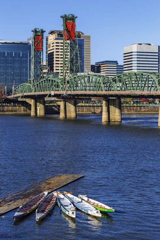
I realize this shot is over saturated, but I'd like to get an idea by how much. Please let me know from a scale of 1-10 how much over you "think" it is---with 1 being over just slightly, and 10 being way (looks completely phony) over. Of course, other comments about the image are welcome as well. Thanks. -Mark
I realize this shot is over saturated, but I'd like to get an idea by how much. Please let me know from a scale of 1-10 how much over you "think" it is---with 1 being over just slightly, and 10 being way (looks completely phony) over. Of course, other comments about the image are welcome as well. Thanks. -Mark
Canoe Bridge
Nov 23, 2013 11:08:50 #
mdorn wrote:
I'd like to get some feedback on this one. I tend ... (show quote)
Jeepers, I don't think it's oversaturated at all. It looks like an Ektachome. The one thing I see is blown whites in the canoes, but on the other hand the canoes (being the true center of interest) need to be bright to pull your eye down to them. They're not "ruined" bright, it's just that I'm a texture-in-the-highlights freak. I think it's fine. Scale=1 :thumbup:
Nov 23, 2013 11:17:16 #

mdorn wrote:
I'd like to get some feedback on this one. I tend ... (show quote)
I have to agree with Chuck. Every part, from the bridge structure on up to the sky looks terrific to me. I also feel that the canoe is just very slightly blown out, and that there is something about the river that just don't seem right, but I cannot put my finger on it yet. Great capture and HDR processing.
Nov 23, 2013 11:18:40 #
Chuck_893 wrote:
Jeepers, I don't think it's oversaturated at all. It looks like an Ektachome. The one thing I see is blown whites in the canoes, but on the other hand the canoes (being the true center of interest) need to be bright to pull your eye down to them. They're not "ruined" bright, it's just that I'm a texture-in-the-highlights freak. I think it's fine. Scale=1 :thumbup:
Thanks Chuck... If you looked at the EXIF data, you'll notice that I'm trying to expose to the right a little more. This is most likely why the canoes are blown a bit.
I posted this photo on another forum, and the majority said it was over saturated. I'm having a hard time seeing it too, but I've posted other photos and they've been over as well. Just trying to figure out if my monitor needs to be calibrated again, or are these folks looking at them from a retina display (ha ha... joke). -Mark
Nov 23, 2013 11:21:44 #
CajonPhotog wrote:
I have to agree with Chuck. Every part, from the bridge structure on up to the sky looks terrific to me. I also feel that the canoe is just very slightly blown out, and that there is something about the river that just don't seem right, but I cannot put my finger on it yet. Great capture and HDR processing.
Thanks Cajon. Yeah, something about the river! I agree. Perhaps I should lower the contrast a bit?
Nov 23, 2013 11:26:30 #

mdorn wrote:
Thanks Cajon. Yeah, something about the river! I agree. Perhaps I should lower the contrast a bit?
Or maybe the blue saturation...although I don't have a problem with it as it is.
Nov 23, 2013 11:35:00 #

mdorn wrote:
I'd like to get some feedback on this one. I tend ... (show quote)
Take my humble opinion with a grain of salt, especially since no two monitors see the same photo exactly alike.
I will have to agree with the folks who have rendered an opinion that there is some over saturation especially of the blues and less so of the reds. As a sometimes-recovering over- saturation addict, I sympathize with you. It is so easy to like rich colors!
The river is a little much to me. I downloaded it and hit what seemed more pleasing (to me on my monitor) and natural with a -12 saturation on the blues and a -5 on the reds (photoshop hue/sat adjustment layer). Then added a very slight curve adjustment layer to help compensate. The slightly blown boats don't bother me, could conceivably present problems for you in printing but not distracting on screen.
It's a very good photo, great composition, leading line, multiple shapes and colors that contrast with each other. Tack sharp on all the overlapping layers. I like it a lot!
Nov 23, 2013 11:41:36 #

mdorn wrote:
I'd like to get some feedback on this one. I tend ... (show quote)
It's not over saturated, the light looks natural.
Graham
Nov 23, 2013 11:44:03 #
minniev wrote:
Take my humble opinion with a grain of salt, espec... (show quote)
Thanks minniev! I'd love to see your rendition if you don't mind posting? Thanks for taking the time. -Mark
Nov 23, 2013 11:47:05 #
snails_pace
Loc: Utah
I like brighter colors and don't think "over cooked, too much, oversaturated etc" comments are justified (my opinion).
As already noted, it is easy to back off the color of the water a little.
Just for curiosity, I'd probably replace the sky with one that had some clouds and see how it looks. It would also reduce the total amount of "blue" in the photo. It might not be an improvement.
As already noted, it is easy to back off the color of the water a little.
Just for curiosity, I'd probably replace the sky with one that had some clouds and see how it looks. It would also reduce the total amount of "blue" in the photo. It might not be an improvement.
Nov 23, 2013 11:53:27 #
snails_pace wrote:
I like brighter colors and don't think "over cooked, too much, oversaturated etc" comments are justified (my opinion).
As already noted, it is easy to back off the color of the water a little.
Just for curiosity, I'd probably replace the sky with one that had some clouds and see how it looks. It would also reduce the total amount of "blue" in the photo. It might not be an improvement.
As already noted, it is easy to back off the color of the water a little.
Just for curiosity, I'd probably replace the sky with one that had some clouds and see how it looks. It would also reduce the total amount of "blue" in the photo. It might not be an improvement.
Thanks snails... Although I do use PS, I'm not big into changing what I saw in the photo (i.e. clouds). My goal is always to recreate not only the image but the feeling. Since images right out of the camera don't provide the tonal range our eyes do, I like to compensate for this in post. Of course, sometimes I go too far. Just trying to strike a balance. Thanks.
Nov 23, 2013 11:55:09 #
Mdorn, I tend think it is a touch over saturated. When I look at the buildings, to me should be alum, to silver in color, there is a touch of blue, And the glass in the windows seems to be blue also.
Nov 23, 2013 11:56:13 #
Bill Houghton wrote:
Mdorn, I tend think it is a touch over saturated. When I look at the buildings, to me should be alum, to silver in color, there is a touch of blue, And the glass in the windows seems to be blue also.
A white balance issue then you think?
Nov 23, 2013 11:57:50 #
mdorn wrote:
Thanks minniev! I'd love to see your rendition if you don't mind posting? Thanks for taking the time. -Mark
The difference is subtle, but it appears to take the blue into a less purply tone. That could just be monitors though so beware..

Nov 23, 2013 11:58:15 #
Bill Houghton wrote:
Mdorn, I tend think it is a touch over saturated. When I look at the buildings, to me should be alum, to silver in color, there is a touch of blue, And the glass in the windows seems to be blue also.
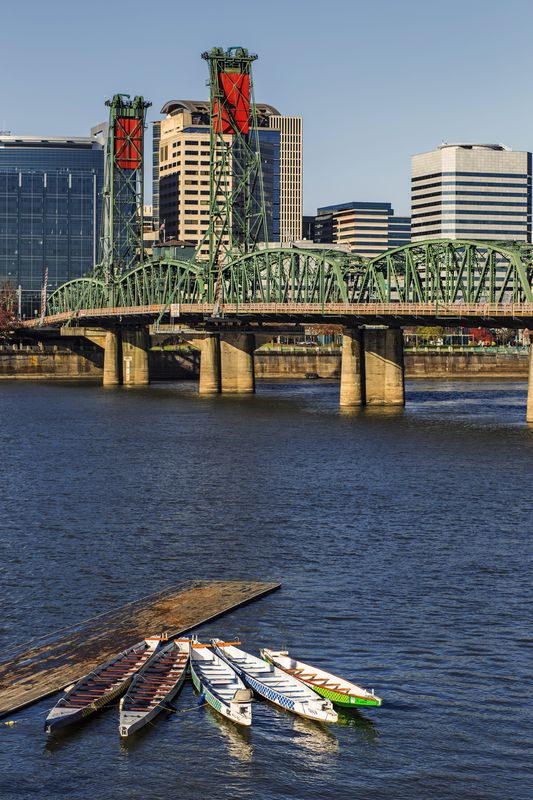
This perhaps?
Canoe View v2
If you want to reply, then register here. Registration is free and your account is created instantly, so you can post right away.