(Young) Lady in Red
Nov 21, 2013 17:32:24 #

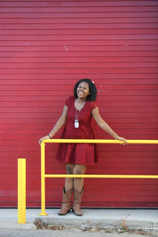
I'm finally getting the hang of PP for people photography! Just look at this lovely young lady:
(C & C welcome, as always)
(C & C welcome, as always)
Before
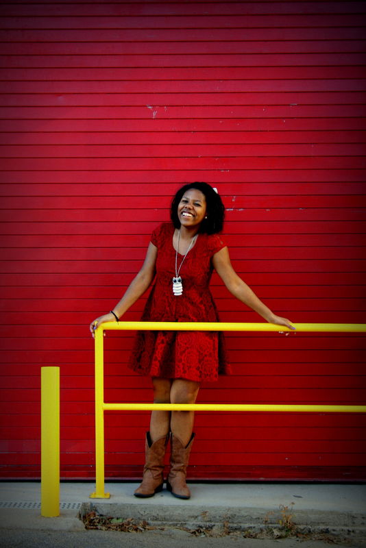
After
Nov 22, 2013 00:16:13 #

Definitely gotta go with AFTER. The brightening of the environment colors compliment her skintones and the vignetting in the wall tone focuses attention on her smile.
Nov 22, 2013 06:16:21 #

I might crop out that yellow bollard, which would do two things.., reduce the competition, my eyes keep going to the bollard, and it doesn't IMO add anything to the photo. also it would shift the subject off center...
Nov 22, 2013 07:30:14 #

Way to much saturation for my taste, her skin is turning yellow, and the railing unless they just painted it is way too yellow. I would have also put her on a different background so her red dress would stand out a little more.
Nov 22, 2013 09:19:37 #
LLucas wrote:
I'm finally getting the hang of PP for people photography! Just look at this lovely young lady:
(C & C welcome, as always)
(C & C welcome, as always)
LLucas,
Nice picture, and the second is much better than the first. But, I definitely agree with jjester. I think there is too much red, so I would make changes with the red background - not enough separation between the gal and the background for my taste or, actually, for a preferred composed shot. The bright yellow railing is also distracting because the viewer's eyes are trained to first go to the brightest spot in a photograph, and then elsewhere (the gal in the picture). Nice concept, but could use a little work. I would also do some cropping and haven't quite decided on the weeds in the bottom foreground.
What program(s) are you using for PP'ing?
Tom :)
Nov 22, 2013 10:15:30 #

My personal opinion is that the red on red works. There is enough of a difference to make her dress stand out.
I do agree with the others about the yellow, though. If your PP program has color replacement you may want to consider turning the railing red.
I'd crop out the weeds, remove the posts and turn the railing red. I'd also lower the saturation a couple of ticks.
I am by no means an expert, but I did download this image and gave it a try, just for fun and practice. Let me know if you would like to see my suggestions.
Nov 22, 2013 13:32:07 #
OnDSnap wrote:
I might crop out that yellow bollard, ...
Bollard? 8-) The things we learn on UHH. But I totally agree with that. Also :thumbup: to cloning out the leaves at the bottom and decreasing the amount of overhead door/wall.
Nov 22, 2013 16:31:24 #
Thanks for the suggestions, everyone! I would love to see your rendition, hlmichel.
I always tend to over saturate. It looks great at the time, and then as I revisit, it hurts the eyes. Still working on that. Oh, I'm using Picassa now, so not sure I can change the color of the railing with that...? The only reason I reluctantly decided to keep in the leaves at the bottom is to add to the "street" vibe... not working? Please feel free to mess with it and post it for me to see.
I always tend to over saturate. It looks great at the time, and then as I revisit, it hurts the eyes. Still working on that. Oh, I'm using Picassa now, so not sure I can change the color of the railing with that...? The only reason I reluctantly decided to keep in the leaves at the bottom is to add to the "street" vibe... not working? Please feel free to mess with it and post it for me to see.
Nov 22, 2013 16:40:13 #
LLucas wrote:
Thanks for the suggestions, everyone! I would love to see your rendition, hlmichel.
I always tend to over saturate. It looks great at the time, and then as I revisit, it hurts the eyes. Still working on that. Oh, I'm using Picassa now, so not sure I can change the color of the railing with that...? The only reason I reluctantly decided to keep in the leaves at the bottom is to add to the "street" vibe... not working? Please feel free to mess with it and post it for me to see.
I always tend to over saturate. It looks great at the time, and then as I revisit, it hurts the eyes. Still working on that. Oh, I'm using Picassa now, so not sure I can change the color of the railing with that...? The only reason I reluctantly decided to keep in the leaves at the bottom is to add to the "street" vibe... not working? Please feel free to mess with it and post it for me to see.
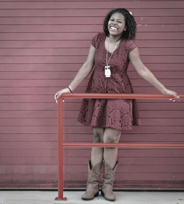
I tend to prefer my colors toned down to the point that only the stronger colors remain.
But here is my edit.
Nov 22, 2013 16:44:12 #
I really like your crop-job. Thanks for the suggestion! Now... must work on her knees!
And the bar going from yellow to red is a BIG improvement. THANK YOU.
And the bar going from yellow to red is a BIG improvement. THANK YOU.
Nov 23, 2013 05:36:25 #
OddJobber wrote:
Bollard? 8-) The things we learn on UHH. But I totally agree with that. Also :thumbup: to cloning out the leaves at the bottom and decreasing the amount of overhead door/wall.
Actually I was going to suggest that also, (the leave) but it didn't bother me as much as the "bollard" :)
Nov 23, 2013 08:07:34 #

the damaged paint just right of her head is also a distraction, but the toning down of the colors is a great improvement
If you want to reply, then register here. Registration is free and your account is created instantly, so you can post right away.