Night falling
Nov 21, 2013 10:05:10 #

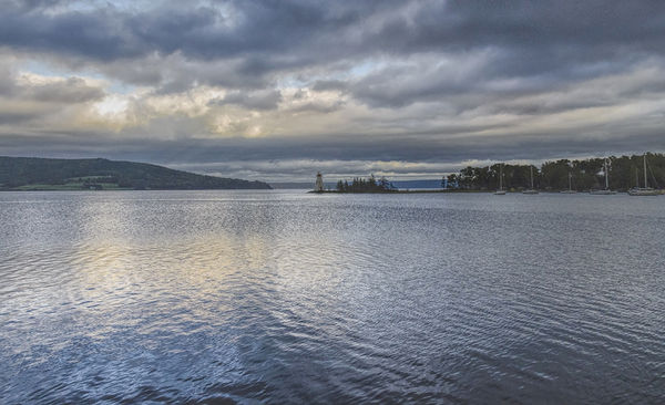
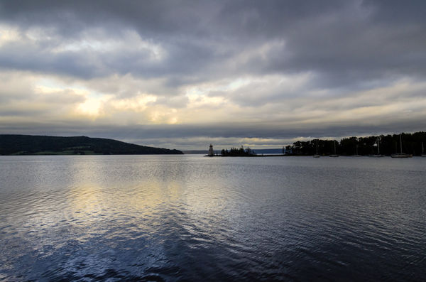
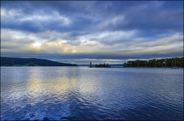
I have been working this for awhile.
I would like some suggestions on how to improve this photo
I think I am to close to it
Thank you for your time and effort
PS -- It is obvious I still do not know what I am doing in this site. Sorry for the mess up.
I would like some suggestions on how to improve this photo
I think I am to close to it
Thank you for your time and effort
PS -- It is obvious I still do not know what I am doing in this site. Sorry for the mess up.

Nov 21, 2013 10:16:42 #

dave sproul wrote:
I have been working this for awhile.
I would like some suggestions on how to improve this photo
I think I am to close to it
Thank you for your time and effort
I would like some suggestions on how to improve this photo
I think I am to close to it
Thank you for your time and effort
Hi Dave, perhaps you could post a jpeg conversion?, these were both .nef. More folks will be able to view it and give advice.
Graham
Nov 21, 2013 11:04:13 #

dave sproul wrote:
I have been working this for awhile.
I would like some suggestions on how to improve this photo
I think I am to close to it
Thank you for your time and effort
PS -- It is obvious I still do not know what I am doing in this site. Sorry for the mess up.
I would like some suggestions on how to improve this photo
I think I am to close to it
Thank you for your time and effort
PS -- It is obvious I still do not know what I am doing in this site. Sorry for the mess up.
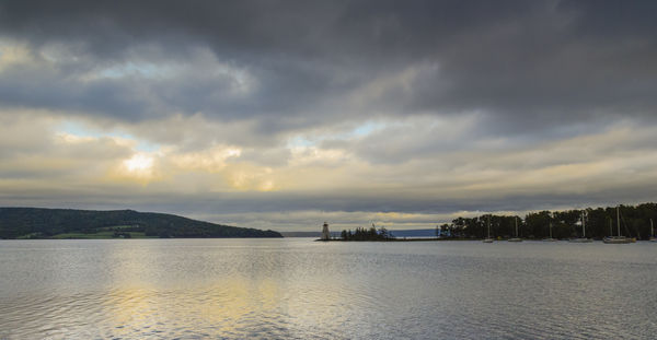
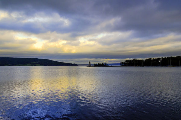
In my humble opinion it is a very lovely photo that captures the special beauty of the cloudy seascapes in that location. It is fine just like it is. It is your image, so only you really know what you want it to look like, so any suggestions any of us make should be carefully weighed by you before you make changes. My advice is to make yourself a bunch of versions and try out things till you find your best approach.
I am assuming that by storing the original you have given us implied permission to edit a possible rendition, so I did so, partly for selfish reasons- to try out my brand new version of photoshop on a file not familiar to me. What I was trying to do was lighten the boats and lighthouse just a bit and increase contrast to bring them out in more detail,& to increase the drama in the clouds with clarity/contrast/saturation without losing the cool tone overall. I did a little crop from the top and left side but make no pretense that it's the best crop, someone else will suggest better (I left horizon almost in middle). If you wanted more emphasis on sky, you could crop from the water instead, but I tried to emphasize the texture and vastness of the water so wanted to keep all of it.
This is just one of many viable interpretations - a little less dark, a little more detail. The wonderful thing about having a great capture like this to start with is that you have so many variations you can work with. I bet it would be a fine photo in black and white as well.
Thanks for sharing!
Nov 21, 2013 11:06:52 #
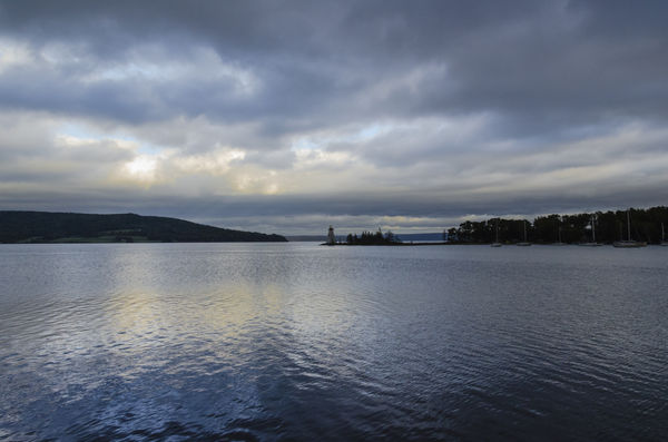
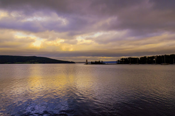
Here's my take on the subject, I cropped it so the horizon wasn't quite as centered, I lightened the shadow areas, reduced the blue slightly, darkened the top part of the sky and increased the saturation slightly.
Like I said this is just my personal preference, all in all this is a pretty nice image you have here.
Like I said this is just my personal preference, all in all this is a pretty nice image you have here.
Nov 21, 2013 11:32:27 #

minniev wrote:
In my humble opinion it is a very lovely photo tha... (show quote)
I like the subtle changes you applied to this fine photo, Minniev. Your gentle enhancements look just right.
Nov 21, 2013 17:54:11 #

I love what you have done with the water in this one, Minnie. I wish I could see it on the download.
Nov 21, 2013 18:04:36 #

I appears as if there are two parallel lines running through the water just left of the lighthouse. They look somewhat out of place, and might look more natural if blended in to the rest of the water.
Nov 22, 2013 04:28:19 #

dave sproul wrote:
...
PS -- It is obvious I still do not know what I am doing in this site. Sorry for the mess up.
PS -- It is obvious I still do not know what I am doing in this site. Sorry for the mess up.
I think you are doing great. Keep posting.
Original
Contrast & Color Corrected
Added Saturation
Added Saturation & Warmth
Nov 22, 2013 09:31:43 #
Thank you everyone for your comments. It has helped.
I tend to get in a "rut" or get "brain cramps" sometimes and cannot move on to see the additional possibilities .
This is a great site and topic area for learning & seeing the possibilities.
Thank you again everyone.
I tend to get in a "rut" or get "brain cramps" sometimes and cannot move on to see the additional possibilities .
This is a great site and topic area for learning & seeing the possibilities.
Thank you again everyone.
Nov 22, 2013 15:49:53 #
dave sproul wrote:
I have been working this for awhile.
I would like some suggestions on how to improve this photo
I think I am to close to it
Thank you for your time and effort
PS -- It is obvious I still do not know what I am doing in this site. Sorry for the mess up.
I would like some suggestions on how to improve this photo
I think I am to close to it
Thank you for your time and effort
PS -- It is obvious I still do not know what I am doing in this site. Sorry for the mess up.
Beauty is in the eyes . . . .
. . . so here's my take. I tend to like a bit more "pop".
The original is a nice shot!
. . with a little more "pop"
If you want to reply, then register here. Registration is free and your account is created instantly, so you can post right away.