Childs Cello
Nov 19, 2013 17:16:42 #

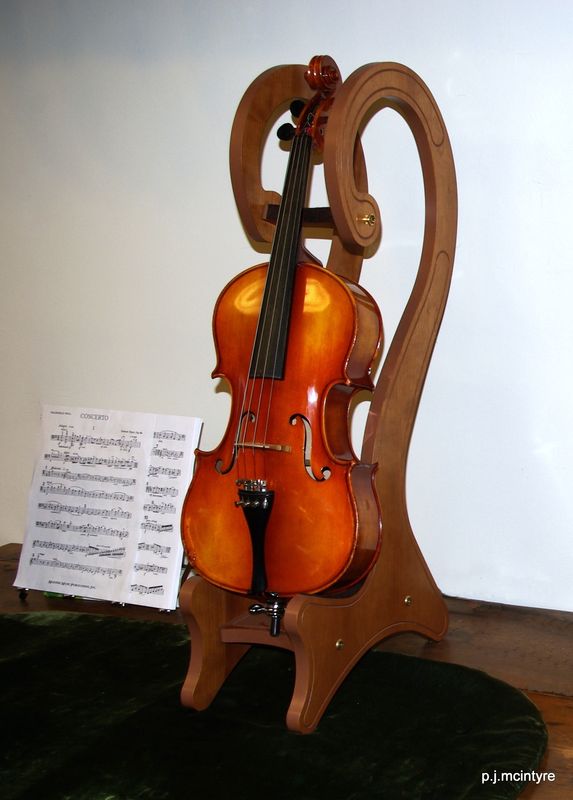
1/10 scale cello; suitable for a young child; was taken at Christian Eggert Violins during the Duluth International Photo Walk. I would appreciate your c&c. One lesson already learned is that extraneous items are easier to eliminate while composing than cloning out in pp.
1/10 Scale Cello
Nov 19, 2013 17:19:40 #

Scale - the device holding the instrument makes it look more the size of a violin or viola.
Nov 19, 2013 17:36:23 #
Bob Yankle wrote:
Scale - the device holding the instrument makes it look more the size of a violin or viola.
I agree, I had originally called it a violin and someone said it was a viola. Went back to the store and they said a 1/10 scale cello.
Nov 19, 2013 23:06:51 #

Your brain/eye sees detail in a quite wide contrast scale, but not so film nor digital sensors. Therefore very light colors will appear closer to white, and very dark colors will appear closer to black. It is near-impossible to retain subtle detail in black and/or white subjects, when both are in the same image. Areas of your white background are burned-out, and areas of your black tabletop are blocked-up.
Choosing manageable background colors can make printing/image processing much easier.
Choosing manageable background colors can make printing/image processing much easier.
Nov 20, 2013 09:58:51 #
Nikonian72 wrote:
It is near-impossible to retain subtle detail in black and/or white subjects, when both are in the same image. Areas of your white background are burned-out, and areas of your black tabletop are blocked-up.
Choosing manageable background colors can make printing/image processing much easier.
Choosing manageable background colors can make printing/image processing much easier.
Thank you for your insight and suggestion. Since the background was what it was, would it have helped if I had 'bounced' or diffused the flash?
Nov 20, 2013 12:28:42 #

Next time, you might be better off with everything shifting your point of view more towards the right. You have a brightly lit dead space behind the stand, which pulls the eye to it. There isn't much space on the left , where the cello and music are facing, and it seems cramped to the left of the music. This shot might be better if you tried cropping a little off the right. If you want to retain the aspect ratio, there's not much going on at the bottom of the picture.
Nov 20, 2013 12:42:13 #
snails_pace
Loc: Utah
When I first saw this picture, my thought was "wow ... what a great subject for an HDR image". I know some people don't like much PP, but bracketed photos would bring out detail in the shadows and contain the highlights. Also, it might bring out more of the rich color of the wood.
Nov 20, 2013 13:20:38 #
RMM wrote:
Next time, you might be better off with everything shifting your point of view more towards the right. You have a brightly lit dead space behind the stand, which pulls the eye to it. There isn't much space on the left , where the cello and music are facing, and it seems cramped to the left of the music. This shot might be better if you tried cropping a little off the right. If you want to retain the aspect ratio, there's not much going on at the bottom of the picture.
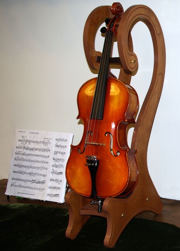
Thanks for the input. Here's a cropped copy, was this what yo had in mind?
Cropped w/ same ratio.
Nov 20, 2013 13:22:41 #
snails_pace wrote:
When I first saw this picture, my thought was "wow ... what a great subject for an HDR image". I know some people don't like much PP, but bracketed photos would bring out detail in the shadows and contain the highlights. Also, it might bring out more of the rich color of the wood.
snails_pace; I am one of those people who not big on a lot of PP; however if you'd like to take a crack at HDR please be my guest.
Nov 20, 2013 14:37:38 #
pelirrojo wrote:
Thanks for the input. Here's a cropped copy, was this what yo had in mind?
That's pretty much what I had in mind. To me, it's a better-balanced picture, with less distraction with that bright light off to the right. If anything, I might not have come in quite so close, but that's strictly a matter of personal taste.
Nov 20, 2013 14:52:37 #
RMM wrote:
That's pretty much what I had in mind. To me, it's a better-balanced picture, with less distraction with that bright light off to the right. If anything, I might not have come in quite so close, but that's strictly a matter of personal taste.
Thanks, appreciate your input.
Nov 21, 2013 01:59:15 #
RMM wrote:
This shot might be better if you tried cropping a little off the right . . . (and) the bottom of the picture.
pelirrojo wrote:
Excellent idea! And well executed.Thanks for the input. Here's a cropped copy, was this what yo had in mind?
Nov 21, 2013 07:10:51 #

pelirrojo wrote:
1/10 scale cello; suitable for a young child; was taken at Christian Eggert Violins during the Duluth International Photo Walk. I would appreciate your c&c. One lesson already learned is that extraneous items are easier to eliminate while composing than cloning out in pp.
The hues and tones somehow evoke, for me, a 17th Century oil painting. the combinations and interactions of the complex curves might better have been unified a bit with a lower perspective.
...and lose the sheet music until a hand-written one on old paper or parchment can be found.
Had it been possible to adjust the lighting a single source of light from the right might have permitted some interesting modeling as well as a more intimate feel to the scene.
it's an interesting ...maybe even fascinating combination of shapes, hues, and tones offering a variety of possible interpretations!
Dave in SD
Nov 21, 2013 09:45:18 #
Uuglypher wrote:
The hues and tones somehow evoke, for me, a 17th Century oil painting. the combinations and interactions of the complex curves might better have been unified a bit with a lower perspective.
Dave in SD
Dave in SD
Thanks Dave, from all the comments so far I think I need to get back for a re-shoot.
Nov 22, 2013 02:48:55 #


If you want to reply, then register here. Registration is free and your account is created instantly, so you can post right away.