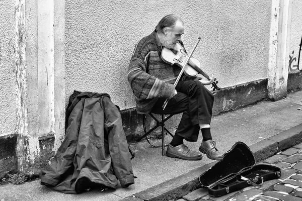
Glasgow Street Performer
Nov 19, 2013 15:32:15 #

Photographed on Ashton Street, Glasgow Scotland. All critique is appreciated, but especially based on the guidelines offered within the section's rules:
1) Is there a clear center of interest?
2) Is the image composed well?
3) Is the focus crisp and is the exposure appropriate?
4) Does the lighting enhance the subject and message?
5) Is the approach creative?
6) Does the photo tell a story?
Settings were: ISO 125, 51mm, f/4, 1/100 second with early afternoon light
Recommendations regarding post processing are welcomed but kindly request permission prior to editing. Thanks 8-)

Nov 19, 2013 15:42:58 #

Yes to all the questions. However, I do think the background is a little bit bright. Some falloff in the corners might make the image easier on the eyes and help maintain attention on the subject.
Nov 19, 2013 15:52:23 #
Bmac wrote:
Photographed on Ashton Street, Glasgow Scotland. A... (show quote)
I think this is very nice. One thought--almost everything is "upright"--the man, fiddle/violin, bow, columns, even the jacket and its wrinkles. Yet the orientation is landscape. I wonder what it might look like if you cropped it in from the left and switched to portrait mode to reflect the overall positioning and posture of the subject? Make any sense?
Nov 19, 2013 16:52:16 #

Yes on all counts. I did edit to see what I could do. I also tried what doduce suggested, vertical, and it did not seem as lonely.
In my edit I took out the coat because I felt it was taking away from the man. Not sure if that improved it though. I added vingnetting because I agree with HT, that the brightness took away from the man.
In my edit I took out the coat because I felt it was taking away from the man. Not sure if that improved it though. I added vingnetting because I agree with HT, that the brightness took away from the man.
Nov 19, 2013 17:03:34 #

Hello Bmac, I commented elsewhere so I will only say that I think you stood in the wrong place, you should have moved to the right so that you were photographing into his face, got down to a low angle and used spot or centre weighted on his face. A couple of coins thrown into his case and he would have looked up for you while you shot as many as you wanted.
Graham
Graham
Nov 19, 2013 21:30:17 #

I will make some comments but please understand that we are all different and we all have different visions.
A b&w rendition in my humble opinion is more appropriate to this type of subject, which is considered street photography.
I would have brought the camera down to level of his face while positioning the subject more to the right of the frame.
I am not implying this composition is not adequate and I am only saying that for my taste I would have placed him more to the right for impact.
Regardless, it is a great shot.
Nov 20, 2013 10:06:39 #
Heirloom Tomato wrote:
Yes to all the questions. However, I do think the background is a little bit bright. Some falloff in the corners might make the image easier on the eyes and help maintain attention on the subject.
You may be right HT, perhaps I will add a slight vignette. Thank you for your critique. 8-)
Nov 20, 2013 10:10:57 #
doduce wrote:
I think this is very nice. One thought--almost everything is "upright"--the man, fiddle/violin, bow, columns, even the jacket and its wrinkles. Yet the orientation is landscape. I wonder what it might look like if you cropped it in from the left and switched to portrait mode to reflect the overall positioning and posture of the subject? Make any sense?
Thanks Doduce. Yes, your suggestion does make sense and in fact I did take photographs of him in a portrait orientation. In this particular shot though, I was attempting to get as much of his environment in the image and to frame him with the coat and the instrument case. 8-)
Nov 20, 2013 10:17:20 #
Graham Smith wrote:
Hello Bmac, I commented elsewhere so I will only say that I think you stood in the wrong place, you should have moved to the right so that you were photographing into his face, got down to a low angle and used spot or centre weighted on his face. A couple of coins thrown into his case and he would have looked up for you while you shot as many as you wanted. Graham
Thanks again Graham as your suggestions and points are well taken. As for those coins, after this song I gave him a note, which he pocketed and then thanked me. :)
Nov 20, 2013 10:26:00 #
camerapapi wrote:
I will make some comments but please understand th... (show quote)
Thank you William for your critique and opinion. I had posted this photo in the Gallery with a B&W version which I will now post below. Subjectively, I tend to like most everything in color, excepting some such as the outstanding work down by Graham and Pale Pictures which I can never hope to emulate.
Others have also suggested that I should have shot at a lower angle which I will keep in mind while taking similar photographs. 8-)
Nov 20, 2013 10:48:47 #
Bmac wrote:
Thank you William for your critique and opinion. I had posted this photo in the Gallery with a B&W version which I will now post below. Subjectively, I tend to like most everything in color, excepting some such as the outstanding work down by Graham and Pale Pictures which I can never hope to emulate.
Others have also suggested that I should have shot at a lower angle which I will keep in mind while taking similar photographs. 8-)
Others have also suggested that I should have shot at a lower angle which I will keep in mind while taking similar photographs. 8-)
I think that if you go for an angle other than the "standing there looking at" viewpoint you get a much stronger image.
Graham
Nov 20, 2013 10:56:59 #
Graham Smith wrote:
I think that if you go for an angle other than the "standing there looking at" viewpoint you get a much stronger image.
Graham
Graham
I agree and will keep that in mind with similar photos. 8-)
If you want to reply, then register here. Registration is free and your account is created instantly, so you can post right away.