I finally, finally got a fairly good one
Nov 17, 2013 21:47:30 #

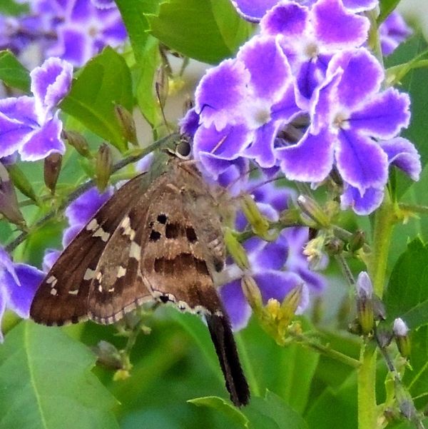
I have had a lot of trouble remembering what is where and how to get to it. But I think I finally got a butterfly that's recognizable. I am looking for a good critique and if you want to try your hand at it, go for it.

Nov 17, 2013 23:45:04 #
Jerry Brown wrote:
I have had a lot of trouble remembering what is where and how to get to it. But I think I finally got a butterfly that's recognizable. I am looking for a good critique and if you want to try your hand at it, go for it.
I am looking at this at work on a very old monitor which does nothing for visual things, but your shot looks pretty reasonable from here. :thumbup:
Nov 17, 2013 23:58:31 #

Jerry Brown wrote:
I have had a lot of trouble remembering what is where and how to get to it. But I think I finally got a butterfly that's recognizable. I am looking for a good critique and if you want to try your hand at it, go for it.
Here's a version with the highlights adjusted down, midtones adjusted up, and then, because the colors looked pretty bright, I desaturated the color a little bit. Done in PSE12. Your photo is lovely the way you shot it. This version just deepens colors out of the pastel range.

Nov 18, 2013 00:12:20 #
I have added a bit of contrast & color saturation, and subtracted a bit of highlight & gamma (exposure).
I prefer the square crop.
I prefer the square crop.

Nov 18, 2013 00:19:40 #

Heirloom Tomato wrote:
Here's a version with the highlights adjusted down, midtones adjusted up, and then, because the colors looked pretty bright, I desaturated the color a little bit. Done in PSE12. Your photo is lovely the way you shot it. This version just deepens colors out of the pastel range.
I like H.T.'s treatment especially because among its effects was to increase contrast in the butterfly's pattern and that helps better separate it from the flowers. In the original image I thought the butterfly was a bit difficult to delineate from the adjacent flowers because both were of almost identical value; even the white in the wings was identical in value to the white petal margins. To my eye this image is improved primarily because the butterfly is more discretely visible.
Dave in SD
Nov 18, 2013 07:26:36 #

Jerry Brown wrote:
I have had a lot of trouble remembering what is where and how to get to it. But I think I finally got a butterfly that's recognizable. I am looking for a good critique and if you want to try your hand at it, go for it.
It looks soft to me--as if you missed the focus. Look on a straight line to the leaves on the right of the butterfly. They are not as soft and appear to be closer than the butterfly and flowers.
Nov 18, 2013 11:42:43 #
Jerry Brown wrote:
I have had a lot of trouble remembering what is where and how to get to it. But I think I finally got a butterfly that's recognizable. I am looking for a good critique and if you want to try your hand at it, go for it.
...and that black fuzzy thing...caterpillar? ... is a serious distractor.
Dave in SD
Nov 18, 2013 13:27:52 #

I got lost looking a the flowers as they seem to in focus and take up more space in the image. My suggestion is about composition--to make the butterfly in focus and allow it to take up the most space in the image.
Nov 18, 2013 13:31:44 #
Uuglypher wrote:
...and that black fuzzy thing...caterpillar? ... is a serious distractor.
Dave in SD
Dave in SD
I think that is part of the insect.
Nov 18, 2013 13:57:37 #

I like the look of this slightly under exposed, high key treatment. It has a delicate look that I think is more appropriate than a more saturated edit. If I wanted to emphasize the butterfly, I might add a little clarity or saturation to just that, but careful not to over do it.
Nov 18, 2013 13:59:56 #
photoninja1 wrote:
I like the look of this slightly under exposed, high key treatment. It has a delicate look that I think is more appropriate than a more saturated edit. If I wanted to emphasize the butterfly, I might add a little clarity or saturation to just that, but careful not to over do it.
I agree. The background is busy and bright colors compete more with the butterfly.
Nov 18, 2013 15:27:21 #
Uuglypher wrote:
Dorantes Longtail (Urbanus dorantes): http://www.rlephoto.com/skippers%20SW%201/longtail_dorantes01.htm...and that black fuzzy thing...caterpillar? ... is a serious distractor.
Nov 18, 2013 15:29:46 #
photoninja1 wrote:
Under-exposed would be dark, just the opposite of high key lighting.I like the look of this slightly under exposed, high key treatment.
Nov 18, 2013 16:03:17 #


Nov 18, 2013 16:37:34 #
Nikonian72 wrote:
I have added a bit of contrast & color saturation, and subtracted a bit of highlight & gamma (exposure).
I prefer the square crop.
I prefer the square crop.
I agree, it brings the butterfly out more, Thanks for all you have done for me.
If you want to reply, then register here. Registration is free and your account is created instantly, so you can post right away.