A Norwegian Village
Nov 15, 2013 13:23:15 #

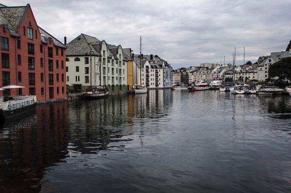
I love the water and reflections in this photograph. I am tempted to not do a thing to it but thought I would get input from you all. I know what I am seeing.....just don't know what I might NOT be seeing. Thanks everyone.
Nov 15, 2013 13:37:02 #

charryl wrote:
I love the water and reflections in this photograph. I am tempted to not do a thing to it but thought I would get input from you all. I know what I am seeing.....just don't know what I might NOT be seeing. Thanks everyone.
Lovely image!
my first...and so far only thought was to crop a bit of the FG water...but realized that woud not be a good thing given that the reflection of the red stone/brick bldg continues to the lower left corner and contributes productively to the compy. May have more when I get back.
Dave in SD
Nov 15, 2013 13:41:48 #
Uuglypher wrote:
Lovely image!
my first...and so far only thought was to crop a bit of the FG water...but realized that woud not be a good thing given that the reflection of the red stone/brick bldg continues to the lower left corner and contributes productively to the compy. May have more when I get back.
Dave in SD
my first...and so far only thought was to crop a bit of the FG water...but realized that woud not be a good thing given that the reflection of the red stone/brick bldg continues to the lower left corner and contributes productively to the compy. May have more when I get back.
Dave in SD
That was my initial thought, too, but had the same issues after the crop. The reflections and the shadows work to make a better picture. If I had any wishes it would be that the bright white boat to the left margin of the image would not be there....ahh, if it were only a perfect world every time. LOL.
PS Love your avatar
Nov 15, 2013 13:58:48 #

charryl wrote:
I love the water and reflections in this photograph. I am tempted to not do a thing to it but thought I would get input from you all. I know what I am seeing.....just don't know what I might NOT be seeing. Thanks everyone.
Every thing in perfect focus, nice leading lines, great content. Charryl, what's not to love about this photo?
Nov 15, 2013 14:32:48 #

charryl, to bring out the reflections more and make the image stand out more I would have lightened the shadows, brought the shadows out as the left hand bottom side it is to dark and all the way along that side where the good reflections are would be transformed and you would get more detail in some of the boats, they would be brought out more. Don't touch the sky as it looks like it wasn't a very sunny day but I bet in kelvins terms it would have been between 7/9000's k.
Dave.
Dave.
Nov 15, 2013 15:00:08 #

charryl wrote:
If I had any wishes it would be that the bright white boat to the left margin of the image would not be there....ahh, if it were only a perfect world every time. LOL.
Charryl, are you referring to what appears to be white chairs and an umbrella on the left edge? If so, I think that is only a minor distraction as the size of the white buildings on both sides and the leading line of the canal (?) are more than enough to pull the eyes along. An interesting well composed photograph that might be improved, to taste, if brightness and contrast were raised just a wee bit. Any photo can be post processed to subjective values however.
Something else I see in your image is a very nice (to me) picture within your photograph. If you were to crop to the left of the second set of windows on the white building to the right of the red building, and the sky to just above the tallest mast, I think you would have another fine photograph. Keep in mine I am not saying that cropped photo would be better than the one you have, only that you may find it interesting enough to keep also. 8-)
Nov 15, 2013 15:11:06 #

Charryl, it's a beautiful photo. Quite serene and melancholy at the same time. I noticed that the horizon was a bit off, so I straightened it and did some enhancing of the red building and the water, and a little to the sky. Would you like to see it?
Nov 15, 2013 15:50:58 #

Granddad wrote:
charryl, to bring out the reflections more and make the image stand out more I would have lightened the shadows, brought the shadows out as the left hand bottom side it is to dark and all the way along that side where the good reflections are would be transformed and you would get more detail in some of the boats, they would be brought out more. Don't touch the sky as it looks like it wasn't a very sunny day but I bet in kelvins terms it would have been between 7/9000's k.
Dave.
Dave.
I agree. The sky - and the reflection of the sky - are very bright, giving the impression that the picture is bright. But the buildings (and their reflections) are actually quite dark. And since there aren't any garish colours in the shot, you could get away with upping the saturation a touch to make the buildings stand out a bit more.
Nov 15, 2013 17:46:19 #
One small idea that would require a little work . try to remove the modern building just right of centre., just think this monster takes a little away from the overall shot.
Nov 15, 2013 17:54:30 #

charryl wrote:
I love the water and reflections in this photograph. I am tempted to not do a thing to it but thought I would get input from you all. I know what I am seeing.....just don't know what I might NOT be seeing. Thanks everyone.
I like this as is but agree with the idea to clone out the modern building in the background. That would give a more timeless feel to the photo. It is a bit dark, but this is Norway! Darkness is quite appropriate that far north of the equator. You could try lightening and brightening but that would probably spoil the mood. I think all the boats are fine as they are. They are integral to this beautiful village and water scene.
Nov 15, 2013 17:59:28 #
charryl wrote:
I love the water and reflections in this photograph. I am tempted to not do a thing to it but thought I would get input from you all. I know what I am seeing.....just don't know what I might NOT be seeing. Thanks everyone.
Just out of curiosity, I downloaded and applied "auto fix" brightness/contrast in PSE11. It brightened the scene a small amount and did not spoil the mood. Might be worth a try to see if you like it.
Nov 15, 2013 19:56:16 #
Wendy2 wrote:
Charryl, it's a beautiful photo. Quite serene and melancholy at the same time. I noticed that the horizon was a bit off, so I straightened it and did some enhancing of the red building and the water, and a little to the sky. Would you like to see it?
Sure. Would love to see it.
Nov 15, 2013 20:00:28 #
Nightski wrote:
Every thing in perfect focus, nice leading lines, great content. Charryl, what's not to love about this photo?
Thanks, Nightski. I really like it, too, but will be interested in seeing what others see.
Nov 15, 2013 20:02:17 #
Bmac wrote:
Charryl, are you referring to what appears to be w... (show quote)
I'll try your picture within a picture idea. Interesting.
Nov 15, 2013 20:03:54 #
Macromad wrote:
One small idea that would require a little work . try to remove the modern building just right of centre., just think this monster takes a little away from the overall shot.
And here's an example of what I didn't see. Never saw the modern building in the background. I'll try to work it out.....we'll see how good my skills are on this.
If you want to reply, then register here. Registration is free and your account is created instantly, so you can post right away.