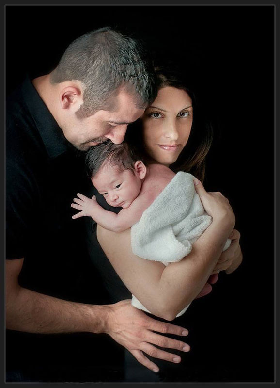
New grandson. What do you think about photo
Nov 15, 2013 07:51:51 #


Nov 15, 2013 08:02:02 #
lighthouse
Loc: No Fixed Abode
Only meant to post one image per thread Jerry.
Love the first one, I think its really really good.
The second one is good to ... but ... the mothers face looks over processed and disembodied.
Love the first one, I think its really really good.
The second one is good to ... but ... the mothers face looks over processed and disembodied.
Nov 15, 2013 08:07:45 #

jerryg wrote:
A critique of the two pics would be nice
Lighthouse has a point on #2. I have a few other suggestions: lose the towel and with the mother's hand on baby's back, you have a triad of hands with spread fingers....
Nov 15, 2013 08:23:12 #

lighthouse wrote:
Only meant to post one image per thread Jerry.
Love the first one, I think its really really good.
The second one is good to ... but ... the mothers face looks over processed and disembodied.
Love the first one, I think its really really good.
The second one is good to ... but ... the mothers face looks over processed and disembodied.
I like the first one very much; all but the dark 'mass' on the baby's head which make's me think it looks like the baby has a toupee on. If it was me, I'd suggest cloning it out or make it disappear somehow in post processing.
I think the mother's face appears to be 'floating' with no real anchor, so it seems somewhat unreal or surreal. I also question the little sprague/piece of her hair of the mother's on her left side, peeking through in the black background. Maybe a little backlighting for separation would help just a tad.
Nov 15, 2013 09:30:43 #
lighthouse wrote:
Only meant to post one image per thread Jerry.
Love the first one, I think its really really good.
The second one is good to ... but ... the mothers face looks over processed and disembodied.
Love the first one, I think its really really good.
The second one is good to ... but ... the mothers face looks over processed and disembodied.
It says: You can attach up to 3 files at once. If you need to attach more, then submit the post and use the "Add New Attachment" link.
Nov 15, 2013 09:36:42 #
jerryg wrote:
It says: You can attach up to 3 files at once. If you need to attach more, then submit the post and use the "Add New Attachment" link.
Not in this forum..... See #2 below
Welcome to the Photo Critique & Analysis Forum
1) By submitting a photo you are automatically asking for critique and advice on how to improve. Checking the (store original) box gives permission for others to edit your photo and or may make it easier for them to critique. If you do not want others to edit your photos you must clearly specify this. If someone edits without permission please send a Private Message (PM) to Nightski or Country's Mama.
Nightski http://www.uglyhedgehog.com/user_profile.jsp?usernum=28288
Country's Mama http://www.uglyhedgehog.com/user_profile.jsp?usernum=411
2) One photo is allowed per thread. If you initially post more than one photo, the post will be deleted. The one exception to this rule is if you have two versions of the same photo for comparison purposes.
3) Improved versions of the first photo are permitted to be posted in the same thread following advice given through critique.
4) Sample photos from those critiquing may be posted after the Original Poster (OP) gives permission. Please (PM) Nightski or Country's Mama if someone posts a photo without permission.
5) Checking the (store original) check box is strongly encouraged. It is expected that the copyright of the photographer will be respected per the rules of this site.
Terms of Use http://www.uglyhedgehog.com/terms_of_use.jsp
6) Critique others as you would have them critique you. Be honest & courteous. Take time to read the critique guidelines and keep your comments and criticism confined to the photo. Extraneous comments may be removed.
7) Personal insults will not be tolerated. Any posts that are deemed insulting will be removed. Any comments linked to the insults will be removed. Any remarks that are inflammatory will be removed. Moderators of the section will determine what is insulting and inflammatory. Stay on topic, keep it friendly, and there will not be a problem. Thank you and have fun
Nov 15, 2013 10:25:43 #

jerryg wrote:
A critique of the two pics would be nice
first image: I keep wanting to put a wee pillow or some othe support behind the lovely infant's head!
second image: a bit more light on mother's hair over her left shoulder...
othrwise it's effect is to gently cause my blood pressure to drop ten points!
Beyond that...Compsition? Technique? ....I hadn't noticed...so they must have been more than adequately addressed. In his case impact impact is all!
Dave in SD
Nov 15, 2013 10:41:33 #

jerryg wrote:
A critique of the two pics would be nice
I'm going to give you "new grandchild permit" here Jerry. The rule is one photo, but I understand.
Both photos are beautifully framed, good focus, nice lighting. You've caught nice facial expressions on both photos. The mom's bare arm is too prominent. That would be a consideration for future photo. Maybe you could tone down the light on it for this one.
Nov 17, 2013 12:22:11 #
I have to apologize for allowing both photos. It was a weak moment for me, and I made a mistake. Please PM your complaints to me, not to Country's Mama. It was not her fault.
One photo is the rule. I will stick to it like glue from now on, even if it does involve babies. My sincere apologies to anyone that I have offended or left confused.
One photo is the rule. I will stick to it like glue from now on, even if it does involve babies. My sincere apologies to anyone that I have offended or left confused.
Nov 17, 2013 13:03:51 #
Nightski wrote:
I have to apologize for allowing both photos. It was a weak moment for me, and I made a mistake. Please PM your complaints to me, not to Country's Mama. It was not her fault.
One photo is the rule. I will stick to it like glue from now on, even if it does involve babies. My sincere apologies to anyone that I have offended or left confused.
One photo is the rule. I will stick to it like glue from now on, even if it does involve babies. My sincere apologies to anyone that I have offended or left confused.
I'll let you slide on this one, they are great photos.
Nov 17, 2013 13:08:58 #

Nov 18, 2013 14:12:42 #
Congrats!! beautiful baby and family!!
In both photos the posing is awkward..In #1 creases in the falsework is distracting and baby looks uncomfortable..with infant portraits head and arm placement is important. Actually with all portraits.
#2 white towel is out of place, moms arm and dads hand are taking center stage..mom could definately use a hair light for some background separation and some light bounced back up into her face on the right..the shadow under her mouth makes it look like she took a mean right hook.
Luckily you have this gorgeous family to play with!! your ideas are great. a little tweaking on poses and lighting will make all the difference. and watch hand placement..hands should be relaxed and natural..curving around loved ones. The hard splay says stiff and awkward.
Nov 18, 2013 14:27:13 #
sixshooter wrote:
Congrats!! beautiful baby and family!! br br In b... (show quote)
Totally agree with leaving out the towel. Babies are the one time you get a "nudity pass" as they are all beautiful. Wish I had more of my own who are now 19 & 23.
I'll repeat my earlier observation: this would have been a stellar shot with a triad of open hands with spread fingers. If you lose the towel and have mom's hand on the baby's back in would be a unifying motif of open hands.
Three, in a sense, is a perfect number and triangles are often useful in art....
Nov 18, 2013 17:12:23 #
LoneRangeFinder wrote:
Totally agree with leaving out the towel. Babies ... (show quote)
http://www.uglyhedgehog.com/compose_reply.jsp?topicnum=163218&postnum=2769091#
If you want to reply, then register here. Registration is free and your account is created instantly, so you can post right away.