Unbalanced
Nov 14, 2013 13:17:52 #
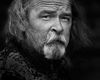
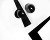
One of those street portraits that just didn't make my portfolio.
I liked it but not as good as some of my other stuff.
Composed off center with a menacing look contributed to the name.
Do not edit this photo but feel free to critique away. I provided the download.
The photo was done in my Dark Portraiture style. I have another photo called "Drifter" that beat this out and did make my portfolio.
Russ
Unbalanced
Nov 14, 2013 13:24:58 #

The light shadowing around his head?
I would rather see the rest of his head.
I'm guessing Russ. I hope you will tell us at the end.
I would rather see the rest of his head.
I'm guessing Russ. I hope you will tell us at the end.
Nov 14, 2013 13:30:20 #
Nightski wrote:
The light shadowing around his head?
I would rather see the rest of his head.
I'm guessing Russ. I hope you will tell us at the end.
I would rather see the rest of his head.
I'm guessing Russ. I hope you will tell us at the end.
LOL. I had a note at the end of my post that said.
"And do not tell me that his head is cut off"
I removed that statement. Head cut off is a bit more contemporary crop. It's a preference thing. I get that a lot here.
Shadowing around the head is somewhat natural looking. Haloing is something I really try to avoid. It's a give away for post processing. When the light line fades away naturally from the subject(for separation) it's generally is acceptable.
I will explain my reasoning but it doesn't make it right. I like the discussion. Looking for anything I may have missed. The simplicity of the shot helps mitigate missing key things.
After looking at the shadowing at the Ear on Camera left I probably should even that out. It should fade away more smoothly and not follow the line of the ear.
Nov 14, 2013 15:38:49 #
I do not see one single solitary thing wrong with it. I love the crop, I love the mezzotint look, I love the crop being off center Maaaybe there's a teensy bit of haloing around the ears (as discussed) but I didn't see it until it was discussed. Curiously, I do NOT see "menace." There's something in the guy's expression working stiff, tough life, works with his hands and is very good at what he does, is kindly but suffers not fools gladly. Maybe it's my rose-tinted glasses
:-D
Nov 14, 2013 15:48:33 #
Pale, I'm going to make a couple comments, I think, you may not mind.
I find the face interesting. And the use of the snoot like lighting, tells me you want me to focus on that part of the face, but I don't find him engaging.
Why? My eye tends to wander into the empty space to his right and sneak glances at the wispy hairs on his forehead.
On my phone, I took the space off the right, I cropped tighter on the forehead to get rid of those remnants of hair, and I took just a little off the chin, it's dark anyway.
That for me put my gaze squarely in the lighted part of the face and found it to be a powerful image. The story is in the middle of the face, everything else I found only a distraction.
Why no catchlights? I know they were there when you started. Not sure they would help in such low key.
Pale, just my 2cents.
SS
Nov 14, 2013 16:00:35 #
Some like negative space and some don't, I'm one of those that does. So that it's there doesn't bother me as I have no trouble going straight to the center of interest. What does cause some consternation is the hair line, I believe that if you cropped it out the image would have greater impact.
Just my $0.02.
Just my $0.02.
Nov 14, 2013 16:13:00 #

You are the master at these, but I too do not care for the cropped head. The eyes are indeed menacing, clear and super sharp. I think the lighter shadows around his head help to draw your eye into the face of the subject, though I wonder if I would like it better with a solid black background.
Nov 14, 2013 16:20:02 #

Excellent Russ. You have mentioned the ears already and I do agree that they want a bit of work. As to the cropped head, I think it is effective and very much of today. Others have mentioned the hair, I'm pretty ambivalent about it, it neither adds or detracts from the image, it works either way.
Graham
Graham
Nov 14, 2013 16:30:26 #

PalePictures wrote:
One of those street portraits that just didn't make my portfolio.
I liked it but not as good as some of my other stuff.
Composed off center with a menacing look contributed to the name.
Do not edit this photo but feel free to critique away. I provided the download.
The photo was done in my Dark Portraiture style. I have another photo called "Drifter" that beat this out and did make my portfolio.
Russ
I liked it but not as good as some of my other stuff.
Composed off center with a menacing look contributed to the name.
Do not edit this photo but feel free to critique away. I provided the download.
The photo was done in my Dark Portraiture style. I have another photo called "Drifter" that beat this out and did make my portfolio.
Russ
Though I am totally unqualified to critique the work of a skilled portrait artist, I will say that it is, to my inexpert eye, a very powerful and well executed image, full of grit, and also well-named. I don't have any issue with the chopped- off head, as most portraiture I see these days involves top-of-head cropping, and it does help focus attention on the facial features.
Nov 14, 2013 17:47:28 #

PalePictures wrote:
One of those street portraits that just didn't make my portfolio.
I liked it but not as good as some of my other stuff.
Composed off center with a menacing look contributed to the name.
Do not edit this photo but feel free to critique away. I provided the download.
The photo was done in my Dark Portraiture style. I have another photo called "Drifter" that beat this out and did make my portfolio.
Russ
I liked it but not as good as some of my other stuff.
Composed off center with a menacing look contributed to the name.
Do not edit this photo but feel free to critique away. I provided the download.
The photo was done in my Dark Portraiture style. I have another photo called "Drifter" that beat this out and did make my portfolio.
Russ
My first thought...I knew his guy in the mid 50s, spent half his life in the mines, the other half in the Princeton Jail .('shine)..he was from Bluefield W.B.G....and then I saw where you're located...got a chill ! a real time trip!
Definite personal involvement precludes further evaluation at the moment. It happens! Masterful image. I'd like to hear more of your criticisms of it. Much to learn!
Dave in SD
Nov 14, 2013 17:50:59 #

I like that it is off center. That the man is looking up, cut off and lightly lit gives the impression he is looking in through a window. Well done.
Nov 14, 2013 19:04:09 #

Just wanted to let you know I stopped by to take a look Russ and think it's a fine photo for obvious reasons already stated. 8-)
Nov 14, 2013 19:06:27 #
Rough face, soft eyes. Composition and process in check. Absolutely nothing wrong with this wonderful photograph.
Nov 14, 2013 20:17:47 #
Chuck_893 wrote:
I do not see one single solitary thing wrong with it. I love the crop, I love the mezzotint look, I love the crop being off center Maaaybe there's a teensy bit of haloing around the ears (as discussed) but I didn't see it until it was discussed. Curiously, I do NOT see "menace." There's something in the guy's expression working stiff, tough life, works with his hands and is very good at what he does, is kindly but suffers not fools gladly. Maybe it's my rose-tinted glasses
:-D
Thanks for commenting Chuck. The part around the ear is hard to see. I probably won't correct it. Mainly because the image didn't make my portfolio cut. I'm trying to limit my website to 30 B&W images in this style. This photo probably falls around number 50. I found that the biggest problem with this photo is it is just less interesting than my others. That's it.
Nov 14, 2013 20:23:27 #
ziggykor wrote:
Some like negative space and some don't, I'm one of those that does. So that it's there doesn't bother me as I have no trouble going straight to the center of interest. What does cause some consternation is the hair line, I believe that if you cropped it out the image would have greater impact.
Just my $0.02.
Just my $0.02.
An important observation. This image is cropped liked most all my images in a 16X20 (or 8X10) form factor. This has a little to do with my Epson3880 maximum print size and standard frame size. Many of my photos go out to show so I use standard 16X20 frames because of the volume. I have 25 prints hanging at my house and at two local Art Galleries in town. In keeping a 16 x 20 and removing some off the top to remove the hair. I would either loose some of the negative space or have to center the Portrait more. This was my reason for the crop like it or not.
Thank you for your input! It is much appreciated.
If you want to reply, then register here. Registration is free and your account is created instantly, so you can post right away.