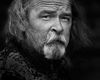
This guy is perfect.
Nov 13, 2013 21:46:45 #
He is perfect in many ways. Not only does his skin texture yearn to be photographed, I just have to call him up and he will come over; and he is free. I have posted some photos of him before. This was last Saturday (a busy day for me and my camera).
Anyway, I have been paying attention to Russ and I attempted to apply some of what he taught me here.
Have at it.
Anyway, I have been paying attention to Russ and I attempted to apply some of what he taught me here.
Have at it.
B&W suits him better.
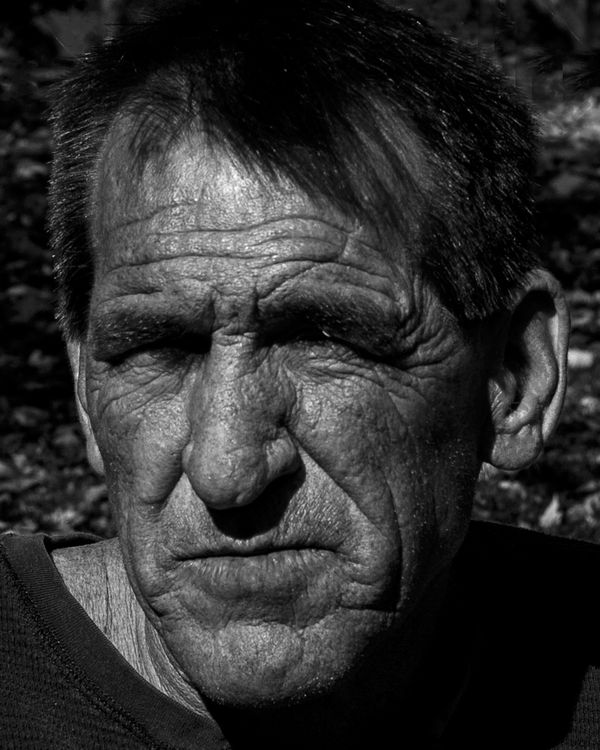
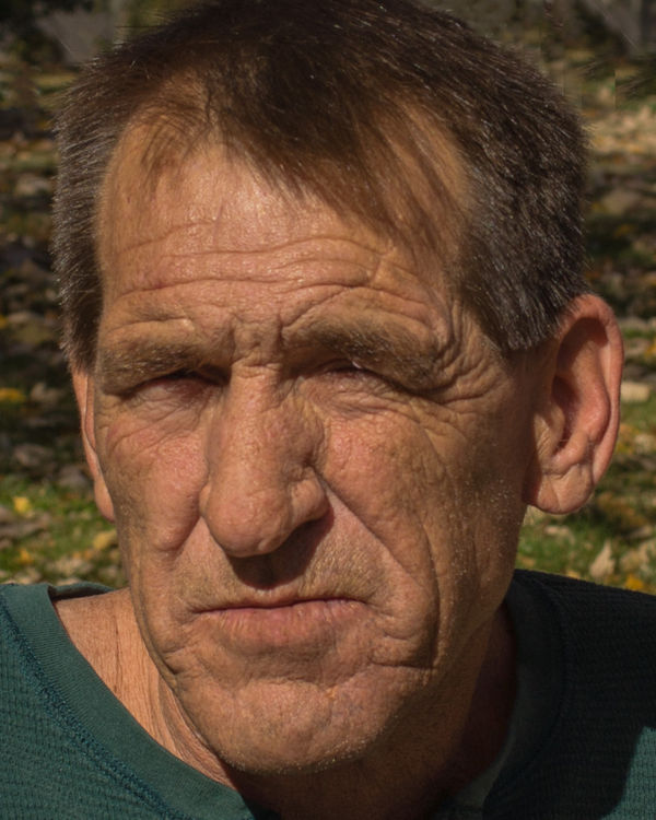
This is what I started with.
Nov 13, 2013 21:58:34 #
I like the overall shot. However, I think the conversion is a bit dark. You've lost a little of the detail in the hair top center. And while you can't see his eyes (eye balls) in the color version, you can see the slits. The shadows around the bridge of his nose hide them in the b&w version. I think the eyes (slits) are very important in this image, and we need to see them.
Nov 13, 2013 21:58:46 #

tainkc wrote:
He is perfect in many ways. Not only does his skin texture yearn to be photographed, I just have to call him up and he will come over; and he is free. I have posted some photos of him before. This was last Saturday (a busy day for me and my camera).
Anyway, I have been paying attention to Russ and I attempted to apply some of what he taught me here.
Have at it.
Anyway, I have been paying attention to Russ and I attempted to apply some of what he taught me here.
Have at it.
The tight crop , indeed, is effective. After a few minutes I have the feeling I know him a bit! Howdahellzathappen? You made a really effective portrait! Light and exposure are strongly complementary.
I suggest that the two bright, almost white spots in the GB just to the right (our right) of his head be burned in or cloned out.
Effect/Impact: 4/5
Composition: 5/5
Technique : 4/5
Dave in SD
Nov 13, 2013 22:27:39 #
Gauss wrote:
Thank you. I could probably fix those areas locally. By making it a bit darker, I thought that I actually brought out his skin texture a little more. I would like more input on this point.I like the overall shot. However, I think the conversion is a bit dark. You've lost a little of the detail in the hair top center. And while you can't see his eyes (eye balls) in the color version, you can see the slits. The shadows around the bridge of his nose hide them in the b&w version. I think the eyes (slits) are very important in this image, and we need to see them.
Nov 13, 2013 22:32:53 #
Uuglypher wrote:
I really liked the way you rated it, Dave. Those spots are easy enough to remove. I am waiting to see if some one mentions the single, white hair on his left eyebrow. I could not decide whether to keep it or remove it. Obviously, I kept it for now.The tight crop , indeed, is effective. After a few minutes I have the feeling I know him a bit! Howdahellzathappen? You made a really effective portrait! Light and exposure are strongly complementary.
I suggest that the two bright, almost white spots in the GB just to the right (our right) of his head be burned in or cloned out.
Effect/Impact: 4/5
Composition: 5/5
Technique : 4/5
Dave in SD
I suggest that the two bright, almost white spots in the GB just to the right (our right) of his head be burned in or cloned out.
Effect/Impact: 4/5
Composition: 5/5
Technique : 4/5
Dave in SD
Nov 13, 2013 22:36:30 #
You did but as stated you lost his eyes, made them even more caverness, the skin tone is great showing his weathered and scarred skin, he definitely has stories to tell,
Nov 13, 2013 22:42:37 #
tainkc wrote:
I really liked the way you rated it, Dave. Those spots are easy enough to remove. I am waiting to see if some one mentions the single, white hair on his left eyebrow. I could not decide whether to keep it or remove it. Obviously, I kept it for now.
I saw it, liked it, and had meant to say so!
Dave
Nov 13, 2013 22:43:23 #
His skin has a slight reddish hue; maybe you could apply a bit of blue or cyan filter to darken and increase contrast on his skin rather than just overall darkening of the image.
Nov 13, 2013 23:00:58 #
Ok Tom,
You know I do these all the time. Here's a list of problems. The list of things below are somewhat subjective. By following what I do you will get a better image.
1) The hot spot on the forehead is two bright. This indicates a light source with a hot spot. I would like to say the light source is ok but not great. The light is soft enough to not cause too many shadows on the face.
2) The ear on camera right is too hot. Another point that draws your eyes away.
3) You have no eyes showing to draw your eye in. I have photos that sometimes only have 1 eye open to draw you in. The no eyes doesn't work.
4) The ear partially breaks the plane of the face on camera left. I usually don't like this. I will also pin ears slightly with the liquify tool in post if there way out there.
5) The white hair over the eye to camera right should have been cloned out. Another bright spot to draw your eye away.
6) You have speckled light in the background of your B*W. I never do this.
7) Overall the light just seems spotty.
Keep the above in mind when taking your photos.
I hope this does not turn into a here's what I can do in PS. My images look different and better because I start off with better light..better backgrounds... better expressions(Eye's open)..better poses.
You can't process and image to make it good if the underlying photo is not already good.(At least I can't) You can process an image to make it world class if the Pose, Expression and light are good.
Hope this info gives some insight.
Keep at it!
Russ Elkins
Nov 13, 2013 23:15:41 #
That looks fantastic in B&W.Bet he likes it.
Those two big black spots obviously have detail to be brought out. If you select them you may find you can get that by simply increasing (decreasing? - I give up. Changing!) the exposure in them. I use CS5 but you should be ok in any editor. I'd make the selections (both together if you want the exposures to come up equally but that probably doesn't matter). Image > Adjustments > Exposure, turn the slider up a bit.
I sometimes find that when I see a difference I do it again to a smaller selection that's still black: OK > CTRL + D on your keyboard to deselect. Then start again. That way you might get your result without sending some of it too grey.
Or maybe start by lightening the whole image then do all that. You may be able to see better what you're doing and darken the whole thing again at the end. Same with the forehead highlight?
Or even start it all with the colour version and convert afterwards.
I'd love to see your results.
Mike.
Nov 13, 2013 23:17:57 #
DugE wrote:
O.k. good.You did but as stated you lost his eyes, made them even more caverness, the skin tone is great showing his weathered and scarred skin, he definitely has stories to tell,
Nov 13, 2013 23:19:58 #
Gauss wrote:
Yeah, his skin is like that. I did a test print and it was really apparent. I could have played with the filters a little more but I knew I was going to convert to B&W. Thanks!His skin has a slight reddish hue; maybe you could apply a bit of blue or cyan filter to darken and increase contrast on his skin rather than just overall darkening of the image.
Nov 13, 2013 23:33:13 #
PalePictures wrote:
Thank you Russ. I did the half moon thing as you suggested and pushed the contrast. The light thing was a bit of a problem It was a natural 55000k light place up and behind my left about 94 million miles away with no filters. Those are leaves in the background. So much for that.Ok Tom, br You know I do these all the time. Here'... (show quote)
I never thought of pinning the ears. Easy enough to do. I suppose I could improve the spot on his forehead in post, but like you said, if it is not a good photo to begin with, why bother? He has normally beady eyes, but I can get him to open them up some.
What is nice is that I can practice with him all I want. He is the other grandfather to my grandkids and he is more than willing to help.
I have a huge yard with which to work. I also have a nice park nearby. I can kill two birds with one stone with that one.
As always, I appreciate your critiques. You speed things up a whole bunch. Thanks, Russ.
Tom
Nov 13, 2013 23:38:16 #
MIKE GALLAGHER wrote:
Thanks, Mike! Fortunately I have lightroom 5 and photoshop cc. Thanks for the advice. But like Russ said, I should probably start over with a better photo. That is easy enough to do.That looks fantastic in B&W.Bet he likes it. ... (show quote)
Nov 13, 2013 23:38:21 #
tainkc wrote:
Thank you Russ. I did the half moon thing as you ... (show quote)
One more note. I have to do one of two thing on just about every street portrait I do.
1) I tell them to close their mouth.
or either
2) I tell them to open their eyes. (Keeping them out of the sun helps here.)
Your expression and the half moon is working!
Regards Russ
If you want to reply, then register here. Registration is free and your account is created instantly, so you can post right away.