Critique Till You Drop!
Nov 12, 2013 17:28:47 #

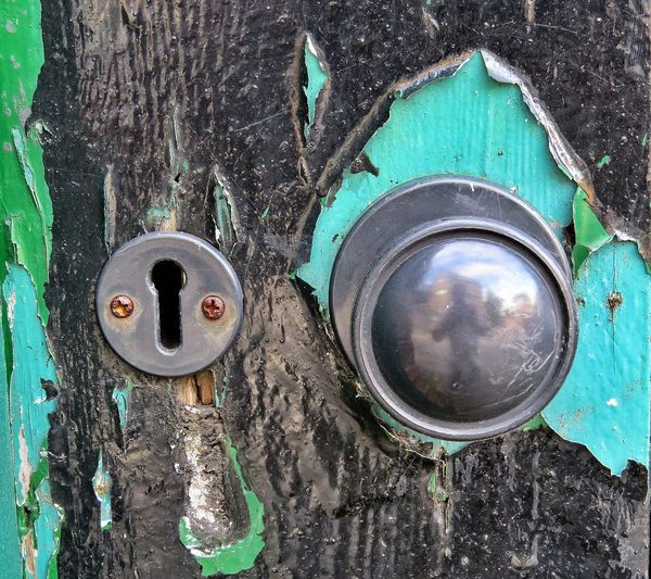
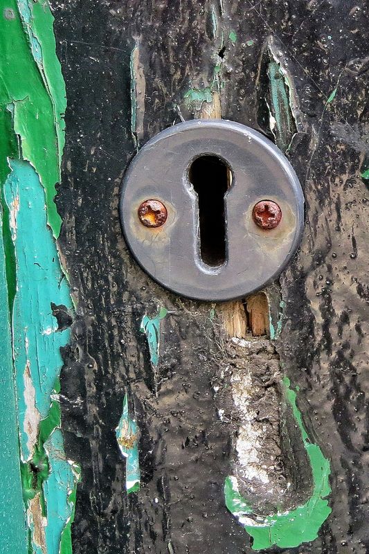
This section needs some new fuel for the fire. Okay, three images, the last two are crops of the first so they are all related, hope that's allright. I have zero attachment to the images so whether an amateur or professional have as much fun as you want. I won't divulge which one I may like, if any, until after some critique. These are all on the chopping block though, so may not last the week in my files.
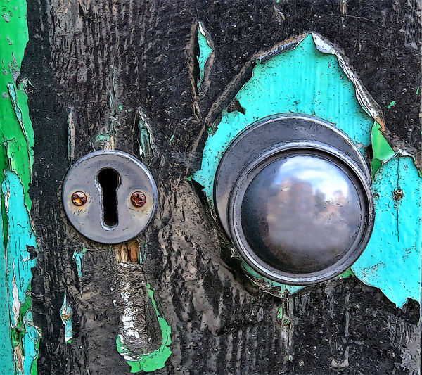
The photograph was shot during the Kelby Photowalk and was taken of a door on Ashton Lane, Glasgow, Scotland....not that this means much as this could have been photographed anywhere.
Anyway.....settings were ISO 640, 74mm, f/4.5, at 1/50 of a second. Natural light, late afternoon and I think it was sunny at the time. Oh yeah, that's my reflection in the door knob.
Critique away! Thanks 8-)
Nov 12, 2013 17:48:56 #

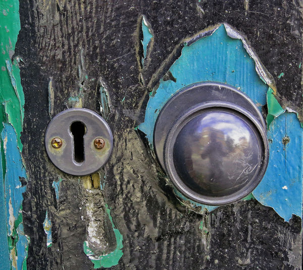
Hi Bmac, Of these, I like the first one best. I couldn't think of anything bright to do to it, but the turquoise color was so bright it was hurting my eyes. I moved the turquoise toward blue, and darkened highlights a little bit. Nothing earthshaking...
Nov 12, 2013 17:56:00 #
Heirloom Tomato wrote:
Hi Bmac, Of these, I like the first one best. I couldn't think of anything bright to do to it, but the turquoise color was so bright it was hurting my eyes. I moved the turquoise toward blue, and darkened highlights a little bit. Nothing earthshaking...
First of all, I like your play on words......"anything bright to do" "color was so bright"...so thanks for brightening the afternoon for me. :)
The edit is okay, but I think it's too blue now. Thanks for being the first here and commenting Heirloom. 8-)
Nov 12, 2013 17:57:47 #
lighthouse
Loc: No Fixed Abode
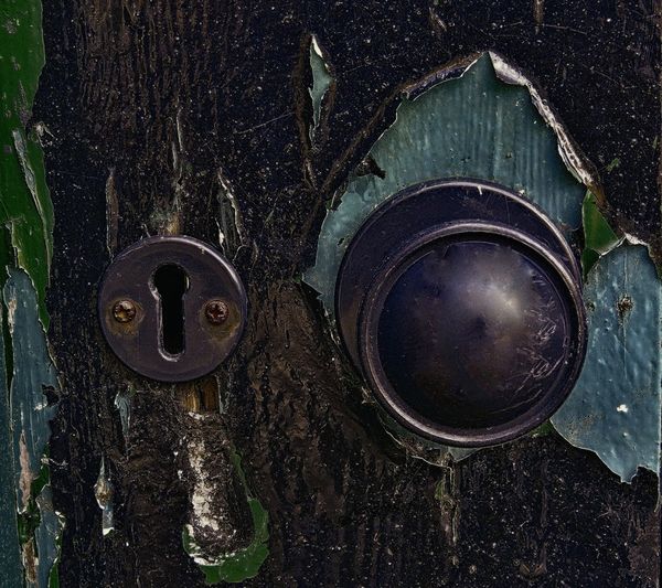
I like them all, although #2 is my personal choice.
It is more pleasing to my eye and doesn't have you reflected back in it like the other two do.
I would not further edit any of these and would not trash them either.
Keepers.
Edit:
Found something to be picky about that I didn't notice at first.
I would remove/magic away the little bit of wooden door that i can see on the right inside of the keyhole.
Nov 12, 2013 18:08:38 #
lighthouse wrote:
I like them all, although #2 is my personal choice.
It is more pleasing to my eye and doesn't have you reflected back in it like the other two do.
I would not further edit any of these and would not trash them either.
Keepers.
Edit:
Found something to be picky about that I didn't notice at first.
I would remove/magic away the little bit of wooden door that i can see on the right inside of the keyhole.
It is more pleasing to my eye and doesn't have you reflected back in it like the other two do.
I would not further edit any of these and would not trash them either.
Keepers.
Edit:
Found something to be picky about that I didn't notice at first.
I would remove/magic away the little bit of wooden door that i can see on the right inside of the keyhole.
Hey, what's wrong with me being reflected back. :mrgreen:
I agree about the reflection, it bothers me a bit also. As for your edit remarks, I never noticed that until you pointed it out, and even then had to look twice to find it. Good eyes.....you using a bloody magnifying glass? :D
Thanks for the critique Lighthouse. 8-)
Nov 12, 2013 18:47:40 #

Bmac wrote:
This section needs some new fuel for the fire. Oka... (show quote)
I like the second one. The doorknobs bother me for the same reason that the doorknobs I shoot bother me - (1) the photographer's reflection is a distraction and (2) the shape of the thing combined with reflection kind of makes it appear that the front or (with some of mine) the sides is out of focus whether it is or not.
Now the keyhole one, to my taste, is a good graphic image, with the keyhole itself enough off center to give it some extra weight without being boring. Tack sharp, pleasing cool color palette (just that one bit of rust for contrast), interesting patterns in the peeling paint and texture hiding underneath. Very nice. If you wanted to get even more graphic (or a little silly) with it, put it through one of the Topaz filters. I like Topaz for that crumbly architecture/old car type of thing.
Nov 12, 2013 18:56:41 #
minniev wrote:
I like the second one. The doorknobs bother me for... (show quote)
Thanks for your detailed critique and opinion, appreciate it. 8-)
Nov 12, 2013 20:59:07 #
Bmac wrote:
First of all, I like your play on words......"anything bright to do" "color was so bright"...so thanks for brightening the afternoon for me. :)
The edit is okay, but I think it's too blue now. Thanks for being the first here and commenting Heirloom. 8-)
The edit is okay, but I think it's too blue now. Thanks for being the first here and commenting Heirloom. 8-)
Never let it be said that I give up easily on these things. :P
I turned it back to the original turquoise color, disappeared your reflection, healed away a few spots, and applied an effect. Even if you don't like it, it was fun to do. Thanks for posting a transformable image.
Nov 12, 2013 21:08:46 #

Call it a self portrait and don't worry about the reflection in the door knob. I think I like your original best. I like the square crop, though if there is room might play with it a bit and throw the subject to the left a little. I love the textures and contrast of peeling paint to shiny knob. I like the old splintery wood poking through the paint under the keyhole.
The more I look at this the better I like it. I can see it on a wall someplace. Have you thought about B&W?
Have to add. I love the bright color of the original.
The more I look at this the better I like it. I can see it on a wall someplace. Have you thought about B&W?
Have to add. I love the bright color of the original.
Nov 12, 2013 21:20:02 #
I like the shots. Fun to abuse. I thought the first one was too bright. Here it is after a serious roll through Topaz. :-D
Nov 12, 2013 21:29:07 #
RicknJude wrote:
I like the shots. Fun to abuse. I thought the first one was too bright. Here it is after a serious roll through Topaz. :-D
I like that one. A visit to the dark side.
Nov 12, 2013 21:31:29 #
Heirloom Tomato wrote:
Never let it be said that I give up easily on these things. :P
I turned it back to the original turquoise color, disappeared your reflection, healed away a few spots, and applied an effect. Even if you don't like it, it was fun to do. Thanks for posting a transformable image.
I turned it back to the original turquoise color, disappeared your reflection, healed away a few spots, and applied an effect. Even if you don't like it, it was fun to do. Thanks for posting a transformable image.
Not bad at all Heirloom, but next one perhaps post the original above your edit so it's easy to compare, and I do like it, except for you removing my reflection of course. :-)
Nov 12, 2013 21:33:51 #
Country's Mama wrote:
Call it a self portrait and don't worry about the ... (show quote)
Thanks Judy for your detailed critique. Never did think about trying a black and white on this, have a go at it if you like, or I will try and post one tomorrow. 8-)
Nov 12, 2013 21:35:30 #
RicknJude wrote:
I like the shots. Fun to abuse. I thought the first one was too bright. Here it is after a serious roll through Topaz. :-D
Hmm, well thanks for the edit but I don't care very much for this one, no offense. Perhaps if it was a door to a haunted house. :D
Nov 12, 2013 21:37:08 #
Heirloom Tomato wrote:
I like that one. A visit to the dark side.
Yeah, you would. :hunf: :-) :D :lol:
If you want to reply, then register here. Registration is free and your account is created instantly, so you can post right away.