Stationary !
Nov 12, 2013 14:37:19 #
Picked this one up while delving into the archives, (the excuse being that I am sorting my images, but spend more time reminiscing), than actual sorting.
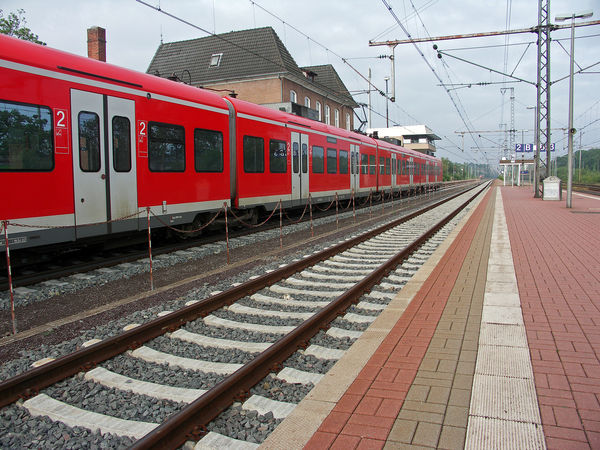
It was taken over 7 years ago with my mighty 8MP Minolta Dimage. I liked it then and looking again I thought "Is it just me that thinks it's a reasonable shot, am I too sentimental, or is it OK). It was taken in Germany as I worked there for a few months. So, get going on it, feel free to download and play if you wish - then again, maybe discard. I am interested in composition, colours, etc.
After second look, posted ex camera. Realistic C & C then. Sorry
LINES

Nov 12, 2013 15:03:12 #

The composition is strong and the red of the train helps lead the eyes down the leading line of the track. I wouldn't delete this one. Like it. 8-)
Nov 12, 2013 15:09:04 #
Bmac wrote:
The composition is strong and the red of the train helps lead the eyes down the leading line of the track. I wouldn't delete this one. Like it. 8-)
That is so kind of you. If one other person likes it, I'm winning!!
Nov 12, 2013 16:53:24 #
I'm the other person. I looked at it in download and found that I was intrigued by the multiple sets of parallel lines. First there is the obvious pair of the train and the empty track next to it. Then I noticed the lines in the paving are also parallel. Finally I was drawn to the overhead electrical lines. Good title for the image and I think it is a strong composition. I might play with the sky a bit if it were mine; but over all this is a good image.
Nov 12, 2013 16:57:34 #
ebrunner wrote:
...............
Good title for the image and I think it is a strong composition.
.........
Good title for the image and I think it is a strong composition.
.........
This would be a great example to use in a photography class discussing leading lines. Leading lines galore. :D
Nov 12, 2013 17:12:44 #
ebrunner wrote:
I'm the other person. I looked at it in download and found that I was intrigued by the multiple sets of parallel lines. First there is the obvious pair of the train and the empty track next to it. Then I noticed the lines in the paving are also parallel. Finally I was drawn to the overhead electrical lines. Good title for the image and I think it is a strong composition. I might play with the sky a bit if it were mine; but over all this is a good image.
Thanks for the kind comments. Two fans now? Maybe I'll go pro! Lol
Play with it as much as you like, remember it's only 8 mb. The leading line was the attraction for me because we seldom manage to fit in a 'direct' line. All the others of course are complementary. This was my departure from Germany, so no second opportunity for a second try. thank you for taking the time to comment. It is appreciated.
Nov 12, 2013 17:14:21 #
Bmac wrote:
This would be a great example to use in a photography class discussing leading lines. Leading lines galore. :D
I think you are right. You may freely distribute to your students! I appreciate you looking and taking the time to comment.
Nov 12, 2013 17:41:44 #
nairiam wrote:
I think you are right. You may freely distribute to your students! I appreciate you looking and taking the time to comment.
I would, except I have no students. Hell, if I did I wouldn't be able to hang out in here all winter. :-D
Nov 12, 2013 17:46:40 #
Bmac wrote:
I would, except I have no students. Hell, if I did I wouldn't be able to hang out in here all winter. :-D
:lol: :lol:
Nov 12, 2013 18:11:22 #

nairiam wrote:
Picked this one up while delving into the archives... (show quote)
I really like all the lines going to your vanishing point, and it's a great photo to help remember your trip. I thought it could use a little massaging to intensify the color.... more saturation, and to bring highlights down a little. Posting for your opinion:
Nov 12, 2013 18:41:10 #
Heirloom Tomato wrote:
I really like all the lines going to your vanishing point, and it's a great photo to help remember your trip. I thought it could use a little massaging to intensify the color.... more saturation, and to bring highlights down a little. Posting for your opinion:
My first posting was similar. Just made the colours pop a little. Then I thought that as it was submitted for C and C, I should post ex camera.
I like what you have done. I wondered if the 'uprights' on the RHS should be cloned out, and likewise the chimney on the LHS. I value all input and am pleased that so far we all appear to see the same image.
Thank you so much for the input.
I did think of the title "Infinity, where parallel lines meet" since that was what we were taught in school. (I can just remember that far back!)
Nov 12, 2013 20:45:53 #
lighthouse
Loc: No Fixed Abode
This shot for me is all about the converging perspective of the lines on the platform and maybe the train tracks.
Anything else, the train, the wires and poles, the buildings are just clutter and it would be good to minimise these as much as possible.
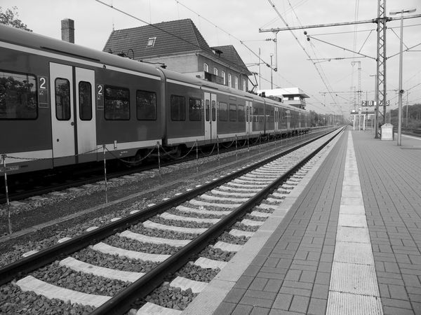
If you got down low over the lines on the platform with an ultrawide, (set at its widest) and turned the image b&w, it would minimise all these other elements and strengthen the lines streaming away to convergence. I suggest symmetry or thirds coming in from the bottom corners.
Anything else, the train, the wires and poles, the buildings are just clutter and it would be good to minimise these as much as possible.
If you got down low over the lines on the platform with an ultrawide, (set at its widest) and turned the image b&w, it would minimise all these other elements and strengthen the lines streaming away to convergence. I suggest symmetry or thirds coming in from the bottom corners.
nairiam wrote:
Picked this one up while delving into the archives... (show quote)
Nov 13, 2013 01:48:15 #

Nov 13, 2013 05:08:45 #
lighthouse wrote:
This shot for me is all about the converging persp... (show quote)
Thanks for looking and commenting. I like the idea of monochrome. I have a shot that would complement this one, taken early morning from upstairs hotel bedroom. It is in colour but almost monochrome in effect. A 'moody' shot but this C and C is single shot only. My last reply also suggested removing uprights. It's wrong to say minimalist, but effectively only having leading lines. Wish I had the skill to carry out all suggestions so far. Let me again express my appreciation of the time taken to view and comment.
Nov 13, 2013 05:45:49 #

YES, leading lines, wow, such an example. A rare find in demonstrating the concept. So, C&C, or at least C, is to either crop out the vertical power structures or clown them out because they distract from the converging lines theme. The other C that I have to suggest is, as mentioned, richen and darken the colors to taste as it appears a middle of the day, harsh light kind of shot that could benefit from brighter and darker.
If you want to reply, then register here. Registration is free and your account is created instantly, so you can post right away.