Just Walk on by? The Soft Version
Nov 11, 2013 10:03:44 #

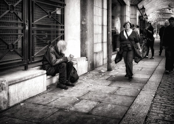
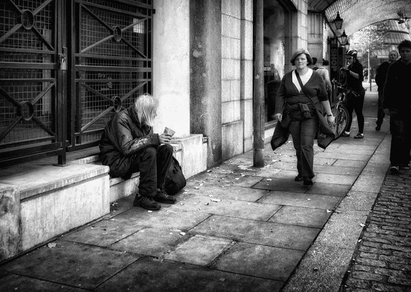
I'm not at all happy with it, perhaps it's too soft? I await your opinions with bated breath.
Graham
Graham
Nov 11, 2013 10:39:21 #

I agree with you Graham.I like the first one.It reaches out and grabs you. [no pun intended]
Nov 11, 2013 10:43:22 #
Graham Smith wrote:
I'm not at all happy with it, perhaps it's too soft? I await your opinions with bated breath.
Graham
Graham
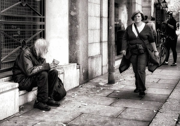
In this version, my eye is drawn to the white column to the right of the homeless man. It seems to be too white, and he kind of blends into it (his hair and face). Maybe try toning it down?
Nov 11, 2013 11:30:10 #

Graham Smith wrote:
I'm not at all happy with it, perhaps it's too soft? I await your opinions with bated breath.
Graham
Graham
Graham,
Just a personal opinion. I think the overall image is much too contrasty. B&W usually needs a lot of contrast, but sometime the subject can use less contrast, and some dodging and burning.
Try lowering the overall contrast (make the images somewhat dull. Then lighten up the woman a touch, and make the gentleman more lighter. The object here is to use light as part of the composition allowing the woman to lead the eye into the old gentleman, all without causing distractions with the remaining supportive elements in the image.
Your final adjustment could be to adjust the brightness/contrast ratio to make the overall image pleasing to the eye.
Michael G
Nov 11, 2013 11:38:30 #
Armadillo wrote:
Graham, br br Just a personal opinion. I think t... (show quote)
Thanks Michael, I wont be doing anything with this image, I posted it because some folks wanted to see a version that was softer than the original I posted.
Graham
Nov 11, 2013 12:03:11 #
I honestly am not a fan of the "glow"ing effect you did here. I prefer most street photography that I view to be a bit more gritty than this. Just my personal tastes.
Nov 11, 2013 12:10:55 #
Musket wrote:
I honestly am not a fan of the "glow"ing effect you did here. I prefer most street photography that I view to be a bit more gritty than this. Just my personal tastes.
Mine too Musket. I wanted to prove that point.
Graham
Nov 11, 2013 12:21:03 #

Graham Smith wrote:
I'm not at all happy with it, perhaps it's too soft? I await your opinions with bated breath.
Graham
Graham
It doesn't do anything for me, Graham. I like the other version better. Having said that, this one is not one of my favorites and I can't quite figure out why. Too much going on? I don't know. I can't quite place it.
Nov 11, 2013 13:25:36 #
Graham Smith wrote:
Thanks Michael, I wont be doing anything with this image, I posted it because some folks wanted to see a version that was softer than the original I posted.
Graham
Graham
Graham,
That is OK. I wanted to give you a differ rent point of view on what I was looking at. Everyone sees images differently.
Keep up with the experiments.
Michael G
Nov 11, 2013 14:33:38 #

Sensei, like some others I found the column on the right to be too bright, as I did the bench to the left. I took it into Silver Efex Pro and toned them down a bit, but with limited success on the column - the base of it seems to be blown out.
Variation on Walk on by, the Soft Version
Nov 11, 2013 15:05:43 #
Bob Yankle wrote:
Sensei, like some others I found the column on the right to be too bright, as I did the bench to the left. I took it into Silver Efex Pro and toned them down a bit, but with limited success on the column - the base of it seems to be blown out.
Hello Bob, you are correct, the base of the column is blown out. In the original file it is just borderline, it is acceptable, but when I gave this version a soft glow it blew out.
Graham
Nov 11, 2013 15:57:41 #
Again, I think it could do with some cropping. It has much more impact. I'll post an example of what I mean if you say OK.
Nov 11, 2013 16:05:04 #
RMM wrote:
Again, I think it could do with some cropping. It has much more impact. I'll post an example of what I mean if you say OK.
That's OK RMM. But do note that I posted this image as a comparison to my harder version. I do note like this one, I wanted to demonstrate that the more gritty version told the story better.
Graham
Nov 11, 2013 16:27:15 #
Graham Smith wrote:
That's OK RMM. But do note that I posted this image as a comparison to my harder version. I do note like this one, I wanted to demonstrate that the more gritty version told the story better.
Graham
Graham
Duly noted.
Nov 11, 2013 16:35:30 #
RMM wrote:
Duly noted.
Thanks RMM,
To me your crop has removed the element of menace from the picture, could those shadowy figures be a reason for the woman to be striding forward as she is?, is she intimidated by them?
Graham
If you want to reply, then register here. Registration is free and your account is created instantly, so you can post right away.