Tranquil
Nov 10, 2013 15:57:18 #

I would appreciate any comments and suggestions.
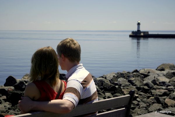
Side note: cute couple, they worked for competing TV stations and came to the lake for lunch and to enjoy its peace & quiet.
Side note: cute couple, they worked for competing TV stations and came to the lake for lunch and to enjoy its peace & quiet.
Young Couple
Nov 10, 2013 16:08:59 #

Nov 10, 2013 16:10:48 #

This is nice, but I notice two things that would improve it. More depth of field so that the lighthouse would be in sharp focus as well as the people. Also, if you would have tapped them on the shoulder and asked them to turn the other way to look at the lighthouse, your composition would be better. :P
Nov 10, 2013 16:17:42 #
Nov 10, 2013 16:21:43 #
Heirloom Tomato wrote:
This is nice, but I notice two things that would improve it. More depth of field so that the lighthouse would be in sharp focus as well as the people. Also, if you would have tapped them on the shoulder and asked them to turn the other way to look at the lighthouse, your composition would be better. :P
Thank you! @ the time I didn't want the lighthouse in focus but looking @ it now I agree it would add to image.
Nov 10, 2013 16:23:10 #
pelirrojo wrote:
Thank you! @ the time I didn't want the lighthouse in focus but looking @ it now I agree it would add to image.
There will be a next time! :-P
Nov 10, 2013 16:30:02 #

pelirrojo wrote:
I would appreciate any comments and suggestions.
Side note: cute couple, they worked for competing TV stations and came to the lake for lunch and to enjoy its peace & quiet.
Side note: cute couple, they worked for competing TV stations and came to the lake for lunch and to enjoy its peace & quiet.
Two things immediately strike me. Firstly, the couple are looking out of the frame, it would be much better if they were looking toward the lighthouse. Secondly, the girl is in shadow with the boy brightly illuminated. This last problem could be reduced by dodging and burning. I have edited a copy if you would like me to post It? Obviously I couldn't do anything about them looking the wrong way :-)
Graham
Nov 10, 2013 16:32:36 #

Hi pelirrojo
Nice enough shot.
As to improving it -
The guy's elbow is a little too close to bottom of frame. A fraction more below would have been better and would have given you a little more of a lead along line at the top of bench to have the eye follow.
Couple look a little soft - agree with Heirloom Tomato, but feel you were just a fraction out to have all couple sharp. Would leave lighthouse slightly oof as is just suggesting the Bg / scene and you want focus on couple.
Finally a little fill flash would have brought out some detail in shadow area of both heads of your subject.
Nov 10, 2013 16:32:48 #
pelirrojo wrote:
Thank you! @ the time I didn't want the lighthouse in focus but looking @ it now I agree it would add to image.
I'm happy enough with the lighthouse being out of focus, to me it is about the couple.
Graham
Nov 10, 2013 16:36:36 #
. I have edited a copy if you would like me to post It? Obviously I couldn't do anything about them looking the wrong way :-)
Graham[/quote]
Yes Graham, please post it.
Graham[/quote]
Yes Graham, please post it.
Nov 10, 2013 16:45:43 #
pelirrojo wrote:
. I have edited a copy if you would like me to post It? Obviously I couldn't do anything about them looking the wrong way :-)
Graham
Graham
Yes Graham, please post it.[/quote]
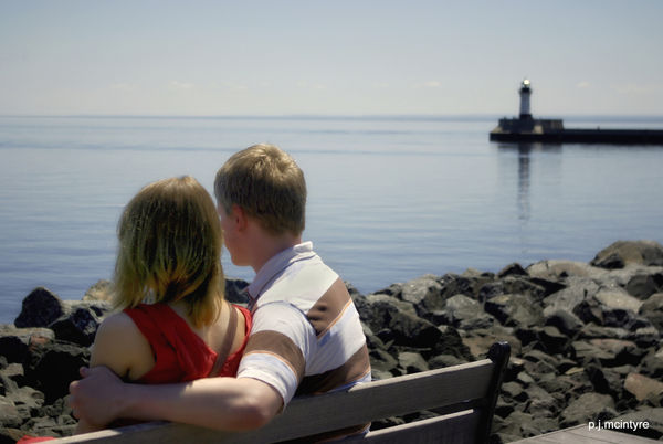
The girls hair could use a bit more tidying up, I've given the whole image a "glow" and dealt with the noise that came from lightening the girl's shoulder.
Graham
EDIT: I should have reduced the warmth in it boys face a touch.
Nov 10, 2013 16:48:27 #
[quote=h2]Hi pelirrojo
Nice enough shot.
As to improving it -
The guy's elbow is a little too close to bottom of frame. A fraction more below would have been better and would have given you a little more of a lead along line at the top of bench to have the eye follow.
Thank you for the suggestions, even thought it's under 40 degs people are still sitting along the lake; may I'll get another chance next weekend.
Nov 10, 2013 16:56:30 #
Graham Smith wrote:
The girls hair could use a bit more tidying up, I've given the whole image a "glow" and dealt with the noise that came from lightening the girl's shoulder.
Graham
Graham
That sure brought her out of the shadows; think her hair need a brushing before you lightened it. Thanks for the edit.
Nov 10, 2013 16:59:16 #
pelirrojo wrote:
That sure brought her out of the shadows; think her hair need a brushing before you lightened it. Thanks for the edit.
I think that the hair issue is caused by the camera not being able to record the detail in the darkest areas.
Graham
Nov 10, 2013 21:17:54 #
Graham Smith wrote:
The girls hair could use a bit more tidying up, I've given the whole image a "glow" and dealt with the noise that came from lightening the girl's shoulder.
Graham
EDIT: I should have reduced the warmth in it boys face a touch.
Graham
EDIT: I should have reduced the warmth in it boys face a touch.
Very nice edit, Graham. I don't mind the OOF lighthouse or the couple looking the other way anymore. You are the master of light and dark.
If you want to reply, then register here. Registration is free and your account is created instantly, so you can post right away.