C&C on this monochrome
Nov 9, 2013 18:53:44 #

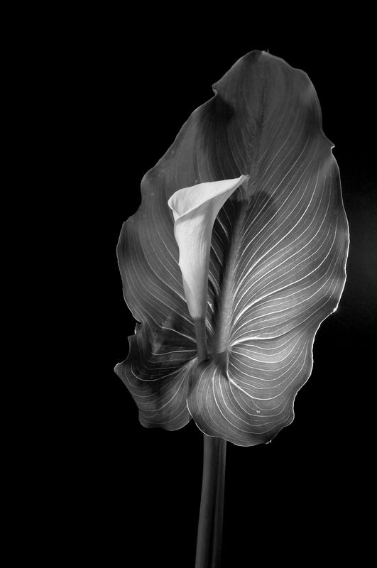
I have been playing around with monochrome for this Calla Lily. Have at it.
And any suggestion for printing.... paper surface. It's for a local non-juried exhibit.
Thanks
And any suggestion for printing.... paper surface. It's for a local non-juried exhibit.
Thanks
Nov 9, 2013 19:29:34 #

I love this. I like the fact that its monochrome. I think color would distract one from the geometry of the subject. This would be a great glossy print.
Nov 9, 2013 20:06:51 #
Don't think I can improve on what you have. I think it is nice and I agree with glossy.
Nov 9, 2013 20:21:27 #
I like this one much more than the first Calle image you posted. IIRC, the leaf was illuminated from behind in the other one. I think this lighting works better. None of the leaf is in shadow, nor is the flower. So we get to see the interesting patterns of the leaf veins, and the gentle texture of the flower petals. Nicely done.
Sorry, I don't know much about best paper types or finishes. Hopefully you can find something that can display all the subtle tones you've captured.
Sorry, I don't know much about best paper types or finishes. Hopefully you can find something that can display all the subtle tones you've captured.
Nov 9, 2013 20:44:37 #

LoneRangeFinder wrote:
I have been playing around with monochrome for this Calla Lily. Have at it.
And any suggestion for printing.... paper surface. It's for a local non-juried exhibit.
Thanks
And any suggestion for printing.... paper surface. It's for a local non-juried exhibit.
Thanks
Wow! I just can't keep from staring at this photo. I love everything about it.
Nov 9, 2013 21:36:48 #
LoneRangeFinder wrote:
I have been playing around with monochrome for this Calla Lily. Have at it.
And any suggestion for printing.... paper surface. It's for a local non-juried exhibit.
Thanks
And any suggestion for printing.... paper surface. It's for a local non-juried exhibit.
Thanks
Hey, LoneRangeFinder. Love the shot. I think glossy is the only way to go with this one.
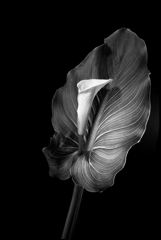
You said have at it, so I did. I bumped up the brightness and contrast using NIK ColorFX Pro4. Also gave it a little more structure in the white flower and the shadowed areas on the leaf and stem. I then rotated it slightly.
Let me know what you think.
Al
Nov 9, 2013 22:29:26 #
xphotog1 wrote:
Hey, LoneRangeFinder. Love the shot. I think glossy is the only way to go with this one.
You said have at it, so I did. I bumped up the brightness and contrast using NIK ColorFX Pro4. Also gave it a little more structure in the white flower and the shadowed areas on the leaf and stem. I then rotated it slightly.
Let me know what you think.
Al
You said have at it, so I did. I bumped up the brightness and contrast using NIK ColorFX Pro4. Also gave it a little more structure in the white flower and the shadowed areas on the leaf and stem. I then rotated it slightly.
Let me know what you think.
Al
I like what you did. I've been thinking of getting Nik Silver Efex. You might have just pushed me over the edge!. I edited this in Aperture-- and I don't pretend to be "pro" at post. Thanks. This was the sort of input I wanted.
Nov 9, 2013 22:35:18 #
LoneRangeFinder wrote:
I like what you did. I've been thinking of getting Nik Silver Efex. You might have just pushed me over the edge!. I edited this in Aperture-- and I don't pretend to be "pro" at post. Thanks. This was the sort of input I wanted.
Glad you liked it. Don't stop at just Silver Efex, get the whole bundle if you can afford it. That's six programs for $149 instead of $49 each. You won't be sorry.
Al
Nov 9, 2013 23:02:08 #
xphotog1 wrote:
Glad you liked it. Don't stop at just Silver Efex, get the whole bundle if you can afford it. That's six programs for $149 instead of $49 each. You won't be sorry.
Al
Al
Yeah, that's the package I was thinking of.
Nov 9, 2013 23:44:09 #
LoneRangeFinder wrote:
Yeah, that's the package I was thinking of.
:thumbup: You can download a trial version if you want to. Good for 30 days. Full work version.
Nov 10, 2013 08:39:51 #
LoneRangeFinder wrote:
I have been playing around with monochrome for this Calla Lily. Have at it.
And any suggestion for printing.... paper surface. It's for a local non-juried exhibit.
Thanks
And any suggestion for printing.... paper surface. It's for a local non-juried exhibit.
Thanks
Others have said glossy. I concur, or at least a semigloss (I don't know anything about the modern printing papersI still think wet darkroom and the crisp aroma of hypo). The more gloss a paper has the more snap it has, and this picture to me says "snap!" Glossy paper gives the richest black and brightest white. The more matte a paper has the more diluted the blacks get. I always study carefully the brightest white to see if detail is still there, and it is. I love your monochrome calla lilies regardless. They're great. They have that looooong scale that I look for. :thumbup:
Nov 10, 2013 09:25:51 #

LoneRangeFinder wrote:
I have been playing around with monochrome for this Calla Lily. Have at it.
And any suggestion for printing.... paper surface. It's for a local non-juried exhibit.
Thanks
And any suggestion for printing.... paper surface. It's for a local non-juried exhibit.
Thanks
OK I do not know much about printing and paper selection, but I have the impression that a glossy paper would provide some reflections of light like windows do (am I wrong?).
I think this photograph would be very nice if printed on a paper that does not reflect light off its surface like windows.
I think you would want to have the affect of a "black velvet" painting and select a paper based on that.
I hope this is clear..
Nov 10, 2013 10:17:30 #
dave sproul wrote:
OK I do not know much about printing and paper selection, but I have the impression that a glossy paper would provide some reflections of light like windows do (am I wrong?).
I think this photograph would be very nice if printed on a paper that does not reflect light off its surface like windows.
I think you would want to have the affect of a "black velvet" painting and select a paper based on that.
I hope this is clear..
I think this photograph would be very nice if printed on a paper that does not reflect light off its surface like windows.
I think you would want to have the affect of a "black velvet" painting and select a paper based on that.
I hope this is clear..
My experience is limited to wet darkroom days, going back to when we printed on "F" paper, which stood for "F_Ferrotype," and was glazedliterallyon hot chrome tins that gave a literal mirror gloss, very bright, which indeed reflected light off the surface like a mirror. It could interfere with seeing the image if the light glanced off it. The upside of that was that the blacks in the image were super rich and deep. Full glossy prints were once mandatory for photomechanical reproduction. You could dry an F-surface paper without glazing it to a smooth semigloss, which still gave a lot of snap but not nearly as much as if you glazed it. When the first resin-coated papers arrived, they were offered in what was called an F-surface which was "pre-glazed," but most workers complained that they lacked the true deep black of an uncoated paper, which was true. The blacks looked "smoky" somehow, but over time they improved. I don't know what the photo papers made for inkjet printers look like now, but you are correct that a high-gloss (if they make one) will reflect light, but the tradeoff is deeper blacks. A "velvet" surface will not have as crisp a black. It becomes a matter of the look you want, and I guess the only way to see it is to print it different ways. :-)
Nov 10, 2013 11:10:07 #
Chuck_893 wrote:
My experience is limited to wet darkroom days, goi... (show quote)
Thanks for all the input. I am thinking now about printing it two ways. I'll think of it as the cost of "research"-- kinda like all of that film I burned through in the 80s....
Nov 10, 2013 11:13:06 #
xphotog1 wrote:
Hey, LoneRangeFinder. Love the shot. I think glossy is the only way to go with this one.
You said have at it, so I did. I bumped up the brightness and contrast using NIK ColorFX Pro4. Also gave it a little more structure in the white flower and the shadowed areas on the leaf and stem. I then rotated it slightly.
Let me know what you think.
Al
You said have at it, so I did. I bumped up the brightness and contrast using NIK ColorFX Pro4. Also gave it a little more structure in the white flower and the shadowed areas on the leaf and stem. I then rotated it slightly.
Let me know what you think.
Al
I like the small but effective change in perspective.
If you want to reply, then register here. Registration is free and your account is created instantly, so you can post right away.