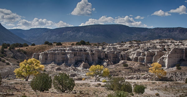
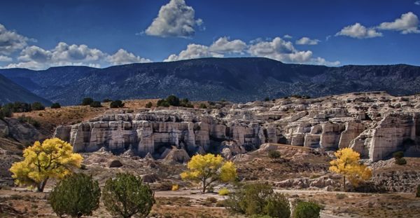
Three Trees
Nov 9, 2013 17:41:33 #

Another one from a couple of weekends ago. I like this but the picture seems very complex to me. I want the three yellow trees to be where the eye goes. I would like your opinions on whether this works, of if not, then what I can do to make this a better picture.
Nov 9, 2013 17:53:35 #

Actually my eyes are drawn to the white face cliffs. Much more prominent in the photo and I think this should be the subject at hand. The color of the trees are nice but with out a heavy crop I think they are to small and just part of the over all scene. Photo seems to lack contrast or something I can't put my finger on. You have a photo here, just hope someone can help bring it forward. Do you mind if I take a swing at it??
Nov 9, 2013 18:07:25 #

I see possibilities in this photo. If the trees were in sharp focus they would be a great subject. Charryl, you could probably edit out the green ones. As shot though, I am not sure what you would do. I love those three trees. How could one get close enough to have them all in focus, and still get them all in one shot? I wouldn't want to lose the mountains in the background either. All this...IMNO (in my newbie opinion) :-D
Nov 9, 2013 18:08:55 #
fstop22 wrote:
Actually my eyes are drawn to the white face cliffs. Much more prominent in the photo ...
I agree, the brightness and size of the badland formation competes with the yellow trees. I don't think the formation is too bright; the exposure is good, plenty of detail in the light tones. There just isn't enough color contrast between the trees and the light rock. I think the "something's missing" issue is the mid afternoon light; it often steals the vibrancy of a scene's colors. Maybe try warming the colors a bit, as they might be in the morning or early evening light.
If you crop, you could cut through the background mountains or go shorter and go through the formation. Pairing this with increasing the saturation and warmth of the trees might help.
Nov 9, 2013 18:12:26 #

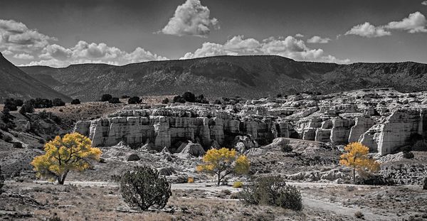
I like this landscape pretty much as is .... it's well composed, as is. I would usually never advocate what I'm about to suggest, but I suppose you "could" reduce this to monochrome, then selectively return color to just the yellow trees Alternatively, lower the contrast and color on the background, desaturate it until the colors are merely pastels, but keep the yellow trees at full strength, perhaps increasing color and contrast. And lastly, there are some "spotlight" effects you could utilize.
My personal opinion is that none of these should be done. I like the original too much to muck with it.
My personal opinion is that none of these should be done. I like the original too much to muck with it.
Nov 9, 2013 18:50:54 #

charryl wrote:
Another one from a couple of weekends ago. I like this but the picture seems very complex to me. I want the three yellow trees to be where the eye goes. I would like your opinions on whether this works, of if not, then what I can do to make this a better picture.
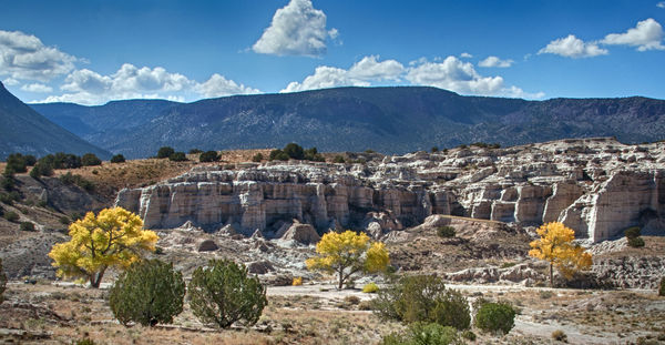
Curious, I used PSE11 to first apply "saturated slide film effect" and then upped saturation by 9 percent. I think it made the yellow trees pop right out and it pulls the eyes where you want them to go. What do you think? Cool photo!
Nov 9, 2013 19:02:00 #

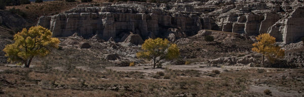
It appears that the tree more or less align. If its possible circle around to the left and frame the trees so that they are in tighter proximity to each other. As a group I think they would make a better subject.
Nov 9, 2013 19:04:44 #
Heirloom Tomato wrote:
Curious, I used PSE11 to first apply "saturated slide film effect" and then upped saturation by 9 percent. I think it made the yellow trees pop right out and it pulls the eyes where you want them to go. What do you think? Cool photo!
An effective solution I'd say.
Nov 9, 2013 19:05:09 #
Not sure if this works, but I was thinking
(which isn't always a good thing)
Since our eyes are drawn to the brightest part of the scene or objects, I tried to bring up the brightness and saturation of the leaves, and color burn the foreground at 27% opacity and then adjusted levels a bit.
in PS CS6
Since our eyes are drawn to the brightest part of the scene or objects, I tried to bring up the brightness and saturation of the leaves, and color burn the foreground at 27% opacity and then adjusted levels a bit.
in PS CS6
Nov 9, 2013 21:25:40 #
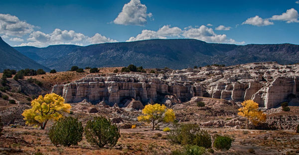
Brightened the cliffs, darken areas around them and brought the trees up just a bit.
Not sure this helped.
Not sure this helped.
Nov 9, 2013 21:33:37 #
Thanks everyone for all your comments, suggestions, and reworks. Heirloom Tomato and Bermbustere, I think you nailed it... Darkening helped "pop" the trees. Will I ever learn to see!?
Nov 9, 2013 21:34:35 #
fstop22 wrote:
Brightened the cliffs, darken areas around them and brought the trees up just a bit.
Not sure this helped.
Not sure this helped.
And you too. Yours is an improvement over my original. Thank you.
Nov 9, 2013 22:06:37 #
charryl wrote:
Another one from a couple of weekends ago. I like this but the picture seems very complex to me. I want the three yellow trees to be where the eye goes. I would like your opinions on whether this works, of if not, then what I can do to make this a better picture.
I tried something bold. You wanted the trees as the focal point. With that in mind, the entire top half of the photo competes with your trees for attention. So I decided they needed some help. This is my solution. It might not be what you had in mind, and the crop does mess up your original ratio. This is just a thought.
came out darker than I wanted.
Nov 10, 2013 07:33:47 #
You could just try selecting the yellow trees and making a layer with that colour then turning rest of shot into b&w and blend the yellow trees back in.
This is a very hurried job:)
This is a very hurried job:)
Nov 10, 2013 07:40:02 #

charryl wrote:
Thanks everyone for all your comments, suggestions, and reworks. Heirloom Tomato and Bermbustere, I think you nailed it... Darkening helped "pop" the trees. Will I ever learn to see!?
Curious which sky in the re-works you prefer....?
If you want to reply, then register here. Registration is free and your account is created instantly, so you can post right away.