WPC 1344 - Tattoos ANALYSIS
Nov 9, 2013 11:09:46 #

fad2000 has graciously volunteered the WPC 1344 - Tattoos entry for critique and analysis to find out what they could have done to make it better. Be nice, but be honest as this will help everyone with their craft. Thank you fad2000 and thank you everyone!
from WPC 1344 - Tattoos RESULTS http://www.uglyhedgehog.com/photo_contest_ratings.jsp?pcnum=87
from WPC 1344 - Tattoos RESULTS http://www.uglyhedgehog.com/photo_contest_ratings.jsp?pcnum=87
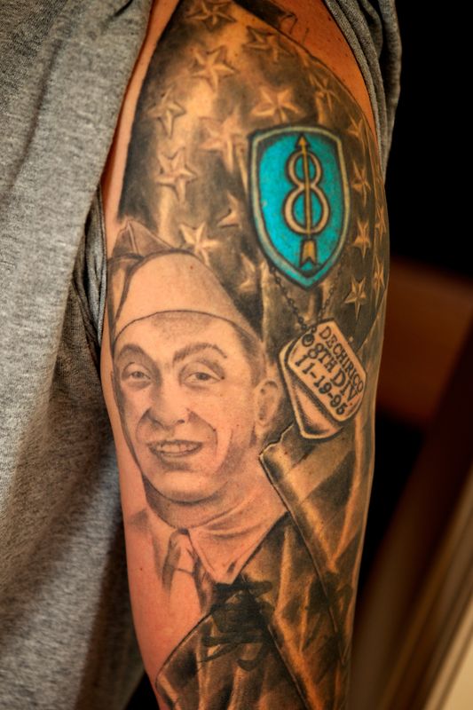
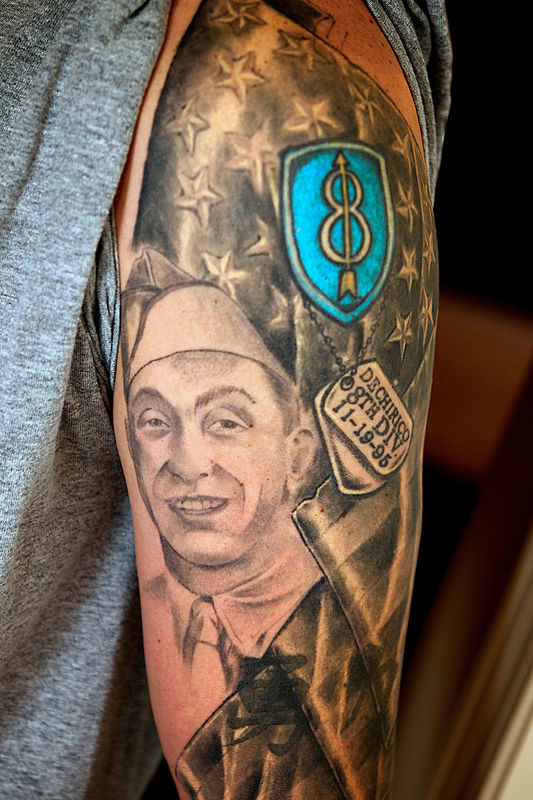
RIP Poppy - The Best Grandpa
Nov 9, 2013 12:10:05 #

It's a good photo. The message is incomplete without the caption, explaining it's a tribute to a loved one. The subject matter itself is personal and therefore of limited impact to a general audience. If the contest theme were "honoring our veterans," for example, it might hit the bulls eye.
Nov 10, 2013 08:25:17 #

I did some fix on the photo and ran a high pass filter to sharpen it some .. that being said .. The face of the art work is very good . .I like the idea of the draping flag but felt the flag and the stars on it looks to flat to me. I think if it was made to pop a little more would have added to the over all vision and view. The 8th Division art work could use a little touch up to make it pop also .
I also feel what LPigott says is right on target .. Some times the art works name .. makes the art work remembered because you connect with the masses not just local family ..
I also feel what LPigott says is right on target .. Some times the art works name .. makes the art work remembered because you connect with the masses not just local family ..
St3v3M wrote:
fad2000 has graciously volunteered the WPC 1344 - Tattoos entry for critique and analysis to find out what they could have done to make it better. Be nice, but be honest as this will help everyone with their craft. Thank you fad2000 and thank you everyone!
from WPC 1344 - Tattoos RESULTS http://www.uglyhedgehog.com/photo_contest_ratings.jsp?pcnum=87
from WPC 1344 - Tattoos RESULTS http://www.uglyhedgehog.com/photo_contest_ratings.jsp?pcnum=87
Nov 10, 2013 11:50:53 #
Having little knowledge of tattoos, my comments are limited. The tattoo is nicely framed by the gray clothing on one side and the dark background on the other side. The skin tone looks a bit too red/orange. My monitor may display differently from others.
If you want to reply, then register here. Registration is free and your account is created instantly, so you can post right away.