First C&C Submission
Nov 8, 2013 00:06:41 #
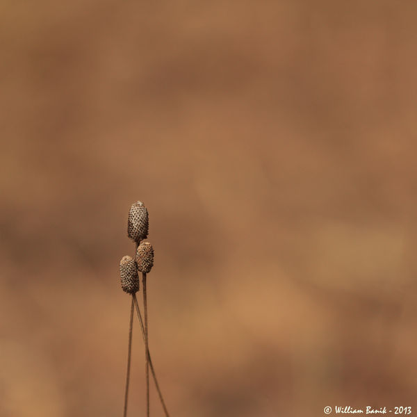
I am really enjoying the forum. I am learning from all those that have taken the time to post and C&C, thank you. My main passion is macro photography but I'm starting to venture out a bit. These three parched cone flower heads stood out amongst a dried mown field.
T2i - 180mm - f2.8 - iso 100 - 1/1250. Minimal PP, square crop, some sharpening, and cloning of some odd twigs at the bottom of the frame.
T2i - 180mm - f2.8 - iso 100 - 1/1250. Minimal PP, square crop, some sharpening, and cloning of some odd twigs at the bottom of the frame.
Nov 8, 2013 00:40:03 #

A-PeeR wrote:
I am really enjoying the forum. I am learning from all those that have taken the time to post and C&C, thank you. My main passion is macro photography but I'm starting to venture out a bit. These three parched cone flower heads stood out amongst a dried mown field.
T2i - 180mm - f2.8 - iso 100 - 1/1250. Minimal PP, square crop, some sharpening, and cloning of some odd twigs at the bottom of the frame.
T2i - 180mm - f2.8 - iso 100 - 1/1250. Minimal PP, square crop, some sharpening, and cloning of some odd twigs at the bottom of the frame.
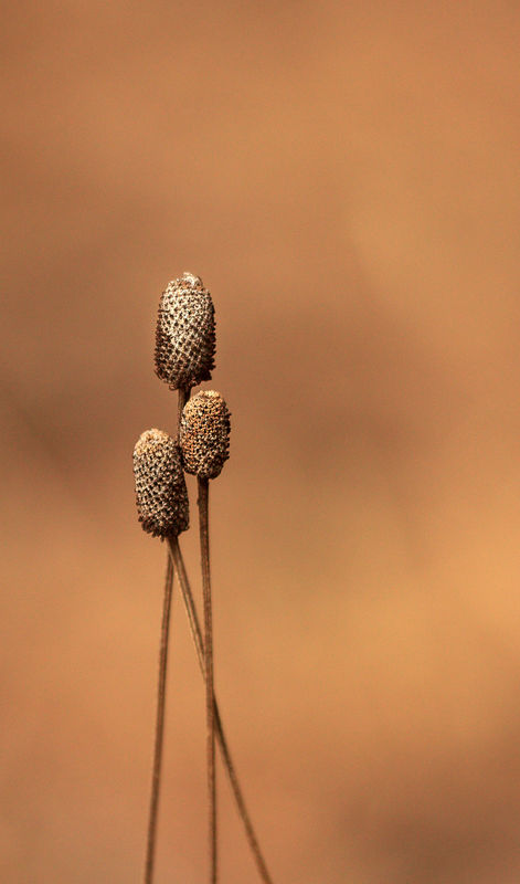
This is a nice image, but it seems that the small cones look a little lonely. I tried cropping and brightening to offer you another variation, just for your consideration.
Nov 8, 2013 01:18:23 #

I like the idea of brightening a bit, but I REALLY like this with the negative space. With the right mat/frame combo, I'd hang this for sure.
Nov 8, 2013 07:48:03 #

A-PeeR wrote:
I am really enjoying the forum. I am learning from all those that have taken the time to post and C&C, thank you. My main passion is macro photography but I'm starting to venture out a bit. These three parched cone flower heads stood out amongst a dried mown field.
T2i - 180mm - f2.8 - iso 100 - 1/1250. Minimal PP, square crop, some sharpening, and cloning of some odd twigs at the bottom of the frame.
T2i - 180mm - f2.8 - iso 100 - 1/1250. Minimal PP, square crop, some sharpening, and cloning of some odd twigs at the bottom of the frame.
I think this is a perfect example of negative space. Thank you, A-PeeR
Nov 8, 2013 08:11:25 #

Welcome to the C&C section. I am glad to see you here.
I agree with Nightski, very nice example of negative space. You subject is nicely positioned. Your image is sharp and clear. I love the blurred background and the subtle colors. I would not change a thing.
I agree with Nightski, very nice example of negative space. You subject is nicely positioned. Your image is sharp and clear. I love the blurred background and the subtle colors. I would not change a thing.
Nov 8, 2013 09:46:18 #
Country's Mama wrote:
Welcome to the C&C section. I am glad to see you here.
I agree with Nightski, very nice example of negative space. You subject is nicely positioned. Your image is sharp and clear. I love the blurred background and the subtle colors. I would not change a thing.
I agree with Nightski, very nice example of negative space. You subject is nicely positioned. Your image is sharp and clear. I love the blurred background and the subtle colors. I would not change a thing.
What Mama said! :D (And never forget, if Mama ain't happy, ain't nobody happy!)
Nov 8, 2013 10:20:43 #

I find it to be an extremely interesting, pleasing image. Don't crop it! And speaking of negative space, check out this week's contest theme: Minimalism. Yours is a perfect example, IMO :)
Nov 8, 2013 11:06:00 #

Linda From Maine wrote:
I find it to be an extremely interesting, pleasing image. Don't crop it! And speaking of negative space, check out this week's contest theme: Minimalism. Yours is a perfect example, IMO :)
Yep. :thumbup:
Although I like Heirloom's vertical crop also. Two good images for the price of one. 8-)
Edit: Might look good on B&W also.
Nov 8, 2013 11:25:36 #

A-PeeR wrote:
I am really enjoying the forum. I am learning from all those that have taken the time to post and C&C, thank you. My main passion is macro photography but I'm starting to venture out a bit. These three parched cone flower heads stood out amongst a dried mown field.
T2i - 180mm - f2.8 - iso 100 - 1/1250. Minimal PP, square crop, some sharpening, and cloning of some odd twigs at the bottom of the frame.
T2i - 180mm - f2.8 - iso 100 - 1/1250. Minimal PP, square crop, some sharpening, and cloning of some odd twigs at the bottom of the frame.
This isn't criticism of what you have done: obviously it works for some people. It is simply relating my impression. While it appears technically fine to me I don't find it interesting or attractive. That's probably why I don't understand some of the ratings my camera club gives to images.
Nov 8, 2013 21:53:16 #
Thank you all for your comments. I really liked the scene when I saw it with my eyeballs. Truth be told the background came out better than I envisioned. I do go back and forth on the color as the hue is close to the subject.
BMac - I think I'll give B&W a go.
MtnMan - I understand your sentiment. While I like minimalist photography, simplicity is the beauty, I understand it's not everyone's cup of tea. I was concerned others would find it a boring photo as you have.
BMac - I think I'll give B&W a go.
MtnMan - I understand your sentiment. While I like minimalist photography, simplicity is the beauty, I understand it's not everyone's cup of tea. I was concerned others would find it a boring photo as you have.
If you want to reply, then register here. Registration is free and your account is created instantly, so you can post right away.