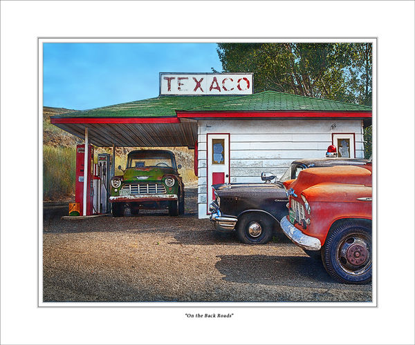
On the Back Roads
Nov 7, 2013 18:20:08 #
OK, another new image I'm working on. This one is one of my "photo-digital art" pieces. This one uses a healthy dose of the post-processing technique I have developed based on the work of Susan Bloom. Going for a bit of a pastel pencil effect. Canvas textures and selective saturation used throughout.
Again, I'm after a general reaction, with comments as to anything that immediately may have bothered you. As with the B&W I posted the other day, I'll probably enter this in my club competition next week.
Again, I'm after a general reaction, with comments as to anything that immediately may have bothered you. As with the B&W I posted the other day, I'll probably enter this in my club competition next week.
On the Back Roads: Palouse, Washington
Nov 7, 2013 18:45:05 #

Nov 7, 2013 19:11:00 #

Nov 7, 2013 20:12:59 #

Photographer Jim wrote:
OK, another new image I'm working on. This one is... (show quote)
Jim, really like the PP that you did on this shot and it does say Back Roads, enter it and good luck.
Nov 7, 2013 20:51:13 #
I think it is very good. I like the pp and it has a nice look to it. Do you think the judges might take off some points because the corner of the station in the back is cut off. I don't think this is bothersome; but I wonder what a judge might think?
Nov 7, 2013 21:12:56 #
Photographer Jim wrote:
OK, another new image I'm working on. This one is... (show quote)
Beautifully done, really like your process. The only thing I noticed was that there isn't much of the canvas texture present.
Nov 8, 2013 01:14:36 #
Photographer Jim wrote:
OK, another new image I'm working on. This one is... (show quote)
Jim, everyone is telling you what a great shot this is - and they are right. But please don't be offended if I tell you I have a problem with the image you posted. Simply put, I think the film is over-processed. The colors are too vivid and the image is too sharp. You're right, it's a contest winner, but I think it could be if it was a bit more subtle.
Nov 8, 2013 09:34:00 #
Mogul wrote:
Jim, everyone is telling you what a great shot this is - and they are right. But please don't be offended if I tell you I have a problem with the image you posted. Simply put, I think the film is over-processed. The colors are too vivid and the image is too sharp. You're right, it's a contest winner, but I think it could be if it was a bit more subtle.
I (for once) don't think it's overprocessed, and I often do find things a little "overcooked." For me it works like crazy. I love the pop of the colors. I can put out a hand and feel the rust and peeling paint. The one thing I see is nitpicky as heck and just one of my personal bugaboos: to my eye it looks ever-so-slightly tipped to the right. I'm certain that the roof line is dead level, but maybe it's just me. Yeah, it's just me. :-D Forget it.
Nov 8, 2013 09:47:16 #

Photographer Jim wrote:
OK, another new image I'm working on. This one is... (show quote)
I like this look. I think it pops. I feel like there is no way this photo was taken in this day, takes me way back in time.
Have to tried this in B & W? I think it might look just as good just and evoke a different feel.
Nov 8, 2013 12:04:35 #
Chuck_893 wrote:
I (for once) don't think it's overprocessed, and I often do find things a little "overcooked." For me it works like crazy. I love the pop of the colors. I can put out a hand and feel the rust and peeling paint. The one thing I see is nitpicky as heck and just one of my personal bugaboos: to my eye it looks ever-so-slightly tipped to the right. I'm certain that the roof line is dead level, but maybe it's just me. Yeah, it's just me. :-D Forget it.
Chuck, I think it is a combination of the levee (hill) to the left and that the gravel in the parking area seems to flow to the right. If I stare at it long enough it takes on the appearance of slipping slightly to the right.
Nov 8, 2013 12:53:39 #
Memphis
Loc: Seattle
I like this very much...especially since I have a soft spot for old pickups...generally I don't go for the artful rendering of photos as it often seems overdone...but there is nothing that bothers me about this...in fact, I like the effect very much...you have opened my eyes to new possibilities. Thanks for posting.
Nov 8, 2013 14:22:05 #
Photographer Jim wrote:
OK, another new image I'm working on. This one is... (show quote)
Photographer Jim,
First I would be proud to call this photograph my own? How much editing are you allowed to do in the contest? This suggestion might be pretty far out. I would like the photograph a bit more if it were flipped horizontally. That would require some work on the sign so that it would not be reversed too. That way the fronts of the trucks would lead the eye into the photograph. Too picky, right?
Cheryl
Nov 8, 2013 14:58:03 #
ebrunner wrote:
I think it is very good. I like the pp and it has a nice look to it. Do you think the judges might take off some points because the corner of the station in the back is cut off. I don't think this is bothersome; but I wonder what a judge might think?
Thanks for the comment, ebrunner. You ask a good question. I guess it is one I won't have an answer to until I hear the judge's critique. When I shot it, I couldn't really include anything more on the right due to a pole that would be more distracting.
Nov 8, 2013 15:05:27 #
UP-2-IT wrote:
Beautifully done, really like your process. The only thing I noticed was that there isn't much of the canvas texture present.
Hi UP-2-IT,
The canvas textures are pretty subtle, and really show best in the full size print. They are meant to add to the painterly effect, but they are not meant to make the image look like it is done on canvas, if that makes sense.
To see the effect, zoom in on the front fender of the orange car. You should be able to see them a bit.
Thanks for the comment!
Nov 8, 2013 15:19:08 #
Mogul wrote:
Jim, everyone is telling you what a great shot this is - and they are right. But please don't be offended if I tell you I have a problem with the image you posted. Simply put, I think the film is over-processed. The colors are too vivid and the image is too sharp. You're right, it's a contest winner, but I think it could be if it was a bit more subtle.
No offense taken in any way, Mogul. Always open to honest reactions offered in a helpful manner.
Your reaction is actually one I get from some viewers. I specifically attempt to straddle the line between a "straight" photo and "digital art". Were I going for the former, I would definitely tone things down a bit. As a "photo-digital" piece, I'm after an effect that comes over a bit like a 50's illustration. The saturation helps with that, in my mind. This is definitely a matter where personal taste is important, and I realize and accept that many photographers will not prefer the approach I take. Thanks for weighing in.
BTW, I'm still hoping that a bunch of us local, NorCal UHHers can meet up sometime in the future. Would very much enjoy meeting in person.
If you want to reply, then register here. Registration is free and your account is created instantly, so you can post right away.