Partial shade
Nov 7, 2013 07:22:13 #

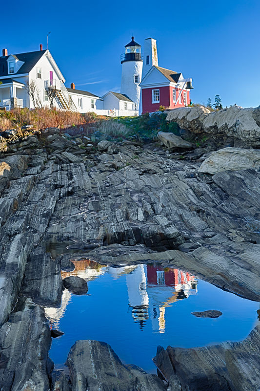
Recently, I've taken this Pemaquid Lighthouse photo in Maine. I am having difficulties in processing it to my satisfaction because part of the image (lighthouse) is in direct sun while the rest of it (reflection) is in shade. Any suggestion are greatly appreciated.
Nov 7, 2013 07:27:51 #

The difference in the shading is what makes it appear round. I'd leave it alone. Nice photo.
Nov 7, 2013 07:29:21 #
I think what bothers my eyes the most is the ugly grey color of the rocks in shade.
djtravels wrote:
The difference in the shading is what makes it appear round. I'd leave it alone. Nice photo.
Nov 7, 2013 07:42:45 #

IzzyKap wrote:
I think what bothers my eyes the most is the ugly grey color of the rocks in shade.
The grey color is not bad. It's that line between shadow and light. I don't like it in my photos either. I just cropped out a part of a photo that I liked, but that line bothered me. You could:
Take this shot at a different time of day.
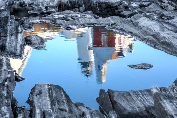
Crop the everything but the rocks and see what you have with just the rocks and reflection. It might be kind of cool. You could always cntrl-z.
Nov 7, 2013 08:04:32 #
Thanks. I wish I could take it over again at different time of the day but that would require another trip to Maine (on my To Do list as Maine is very photogenic). I did have cropped version of this image already (see attached), but I am not sure that I like it any better.
Nightski wrote:
The grey color is not bad. It's that line between shadow and light. I don't like it in my photos either. I just cropped out a part of a photo that I liked, but that line bothered me. You could:
Take this shot at a different time of day.
Crop the everything but the rocks and see what you have with just the rocks and reflection. It might be kind of cool. You could always cntrl-z.
Take this shot at a different time of day.
Crop the everything but the rocks and see what you have with just the rocks and reflection. It might be kind of cool. You could always cntrl-z.
Nov 7, 2013 08:22:53 #
IzzyKap wrote:
Recently, I've taken this Pemaquid Lighthouse photo in Maine. I am having difficulties in processing it to my satisfaction because part of the image (lighthouse) is in direct sun while the rest of it (reflection) is in shade. Any suggestion are greatly appreciated.
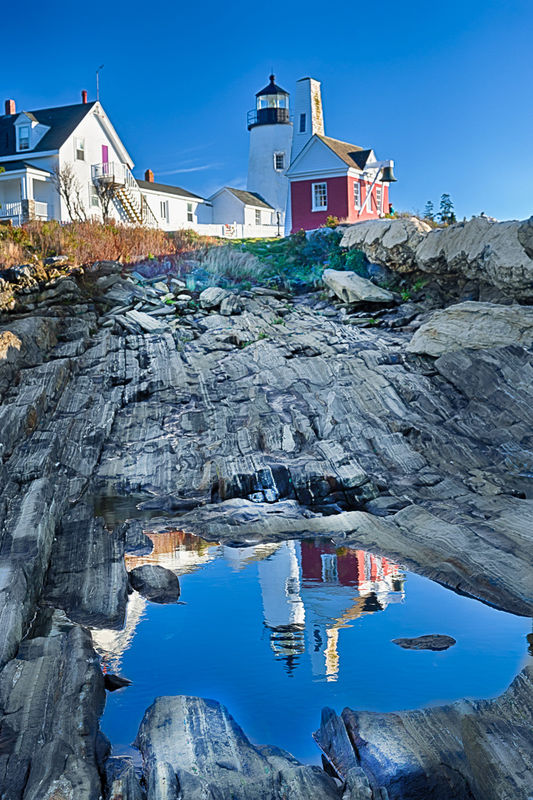
I played with your image for a bit. I used doge and burn tools plus a bit of cloning in photoshop. More could be done with the bright area in the white walls. Is this what you had in mind?
edited in photoshop
Nov 7, 2013 08:45:00 #
Thanks, it's better. But I think that the grey still bothers me. It just doesn't seem to my eyes to belong there.
ebrunner wrote:
I played with your image for a bit. I used doge and burn tools plus a bit of cloning in photoshop. More could be done with the bright area in the white walls. Is this what you had in mind?
Nov 7, 2013 08:53:13 #

Nov 7, 2013 08:58:09 #

This might be a good question for our friends over at Post-Processing.
http://www.uglyhedgehog.com/s-116-1.html
The composition of this is beautiful. This would have been a great HDR photo.
http://www.uglyhedgehog.com/s-116-1.html
The composition of this is beautiful. This would have been a great HDR photo.
Nov 7, 2013 09:04:01 #
lighthouse
Loc: No Fixed Abode
The reflection isn't in the shade.
The reflection is in full sun.
The processing in the spot where the shadow joins the light troubles me. Looks like there is a red blob straddling the changeover.
The skyline features look oversharpened.
The composition is quite ordinary.
Its an OK snapshot but I'm not sure what the image is meant to be of, what part of the image is the actual subject?
Nov 7, 2013 09:20:54 #
lighthouse wrote:
The reflection isn't in the shade.
The reflection is in full sun.
The processing in the spot where the shadow joins the light troubles me. Looks like there is a red blob straddling the changeover.
The skyline features look oversharpened.
The composition is quite ordinary.
Its an OK snapshot but I'm not sure what the image is meant to be of, what part of the image is the actual subject?
The reflection is in full sun.
The processing in the spot where the shadow joins the light troubles me. Looks like there is a red blob straddling the changeover.
The skyline features look oversharpened.
The composition is quite ordinary.
Its an OK snapshot but I'm not sure what the image is meant to be of, what part of the image is the actual subject?
How would you have composed this differently?
Nov 7, 2013 09:32:41 #
lighthouse
Loc: No Fixed Abode
Country's Mama wrote:
How would you have composed this differently?
This particular image, with the delete button.
The scene, I do not know, I cannot see enough from this one image. I would like to walk around a bit and look at angles.
I do like the idea of using the reflection in the foreground.
Maybe I would do as Nightski did, and make the reflection the full image.
Nov 7, 2013 10:37:37 #
IzzyKap wrote:
Recently, I've taken this Pemaquid Lighthouse photo in Maine. I am having difficulties in processing it to my satisfaction because part of the image (lighthouse) is in direct sun while the rest of it (reflection) is in shade. Any suggestion are greatly appreciated.
IzzyKap wrote:
I think what bothers my eyes the most is the ugly grey color of the rocks in shade.
:D Not a geologist, are you? :lol: That Ugly Gray Rock is an absolutely Gorgeous Granite Schist, a banded schist, yummy stuff! That said, it seems to me that it's not the rock you hate but the color, which I suspect is a function of it reflecting the sky so it picks up a blue cast, which to my eye is to die for, but YOU hate it so Maybe select just the rock shield and fiddle with the color?
Lighthouse has it right that the reflection is in the same full sun as the lighthouse (hmLighthouse=lighthouse :lol: ). I notice some fringing on the lighthouse itself, maybe some overprocessing? I personally love the picture! I also love them delicious rockx!!! The world is made up of them. Don't diss the rocks! :lol:
Nov 7, 2013 10:45:29 #
You are absolutely right. I like the rocks but not the color. Grey doesn't seem to fit in the color scheme here very well, in my opinion, and it also reminds me of ugly grey office cabinets and furniture. Actually, their color was more bluish from reflection and use of polarizer but I desaturated them. Bluish rocks seem unnatural to me. BTW, this is an HDR image. While the image is far from ideal, I would like to salvage it as best as possible.
Chuck_893 wrote:
:D Not a geologist, are you? :lol: That Ugly Gray ... (show quote)
Nov 7, 2013 12:17:06 #

I love this photo as it is, but if you have a dislike for "office cabinet" grey, I fully understand why it makes you unhappy. It's gorgeous in color, but your uneasy feeling might vanish if you convert this to b&w, as suggested by others.
If you want to reply, then register here. Registration is free and your account is created instantly, so you can post right away.