Iris
Nov 5, 2013 16:55:06 #
Nov 5, 2013 20:29:42 #

Macromad wrote:
All Constructive cc welcome.
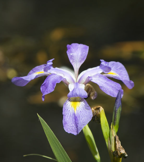
Well, Mac, it's going to be a little brutal here. Here's what I noticed in order.
-The flower looks overexposed.
-It needs some sharpening. (Try manual focus)
-It has some purple fringing. (shoot when the sun is not so bright if you have a lens that doesn't handle bright sunlight)
-It's a good idea to get rid of the dead blossoms and leaves before shooting.
-You have lots of noise in your background. (If it's a sunny day, get that ISO down to 100)
-I think you need a little more stem if you are going to include the stem.
-Luckily, there is always another flower to shoot, and you can try again for free. :-)
Nov 5, 2013 20:47:12 #

Not picking on anyone, but very large flower, so you should expect DOF to fall off some. I like your separation from the background, but way to centered for me. Don't be afraid to clean the flower up before the shot. I like these type of flowers as you have three sides you can pick from depending on the background and lighting. I normally photograph these in the wild either early mourning or evening when no direct sun is hitting the flower allowing the rich, even colors to come thru. We call this the Florida Flag Flower down here. If you find a patch of these, look close as the colors will vary from light to very dark.
Nov 5, 2013 21:02:47 #

If I could add one comment to those above it would be think about your background as well your subject. The yellow highlights in your background are just a little distracting.
Nov 5, 2013 22:45:23 #
I Can take brutal this was put up just to see what people would say.
As For the dead flowers hard to remove without a pair of waders.
As For the dead flowers hard to remove without a pair of waders.
Nightski wrote:
Well, Mac, it's going to be a little brutal here. ... (show quote)
Nov 5, 2013 22:50:46 #
Only position to take the shot, the brown dead leaves I think are producing a reasonable natural bokeh.
Nov 6, 2013 08:42:20 #
The first thing I noticed (at all critically) was that the flower is dead center in the frame, so there's a lot of "dead air" above it, which is generally a compositional no-no. Otherwise, on my monitor it is not at all overexposed; there is good detail in all but a couple of specular reflections in water drops. I don't think that it needs sharpening; your focus is bang on the central, foreground petal, and I'd rather have it sharp than not. It could use greater depth-of-field, but the main focus is right where I'd have put it. It might be a little noisy, and sharpening sharpens the noise as well, although I am not one to worry about noise. To me, noise is just grain, and I've never minded grain. It's what pictures are made of. You don't usually get your nose right up to a big print or monitor enlargement, you back away, so grain (noise) to me is relative. I agree that the dead stuff should have gone away but you already said you couldn't reach it. All in all, I think it's not bad, but as Nightski says, there's always another to shoot, and it's free!!! :mrgreen:
Nov 6, 2013 11:59:45 #

My experience is that flowers like this are very hard to shoot, not because they're not beautiful or colorful, but because they are by their very creation top heavy and large and complex. So then we add to our challenge the multiple compositional choices we have, the many angles to best capture the beauty of the flower, balancing the composition so it's not uncomfortably top heavy, making sure that our background compliments and doesn't compete with our main subject, and finally, finding a real center of interest in the flower itself. So, I think you have done a credible job compositionally because it doesn't feel top heavy because you have included some greenery on the bottom to help balance the flower - that being said, I think you should crop some if the dead space of the top, like others have mentioned. When I first opened and looked at his photo, I was distracted by the background color - I don't know if it was the brownish shade or the yellow patches or what, it just didn't look good to me. On the flower itself, I liked the clear focus on the front petal and didn't mind at all the DOF falloff on the back petals, I didn't see any fringing, at least on my monitor, but most of all, I kept looking and looking and I wanted to see some small focal point that would have anchored my eye to it, like a bee or a bug somewhere that would have become my focal point, rather than the big front petal. Also, I found the dead stuff distracting and if it were my shot, I would have tried to remove it, but I know you said you couldn't. Finally, I probably would try to avoid middle of the day lighting 'cuz as you know, it's hard to get interesting shots in that don't flatten. Anyway, one man's opinion. Thanks for posting.
Nov 6, 2013 14:07:33 #
Thank you for your comments well done. Exposure on my screen not overexposed either, those who see it that way should be adjusting there monitors. Could put moere space above as usual as still have original but posted as a test to see how good this section is.
Could remove the dead bud immediately between the petals, the others stay as they show the different stages of life.
the picture above when I selected the flower and did adjustment did not realise the dead bud near flower was included in my selection, when I do the final it will go.
Once again thank you.
Chuck_893 wrote:
The first thing I noticed (at all critically) was ... (show quote)
Nov 6, 2013 14:10:20 #
Thank you for your comments cheers.
jonsommer wrote:
My experience is that flowers like this are very h... (show quote)
Nov 6, 2013 14:42:38 #

A tad of crop on either side and the background needs more height .
Nov 6, 2013 19:37:54 #
Nightski
your criticism interests me. Could you explain what you mean, and point out why, by:
1 - Over exposed, 2 sharpening, 3 - purple fringing, 4 - noise. I dont see any of that.
I accept that the photo is what it is a picture of a flower with some dead petals or leaves. Then it needs to be presented and in doing so it may need a bit of tidying up first. I see only one thing that would make a difference there and so far it hasnt been mentioned by anyone.
Perhaps Im judging the photo without the use of a magnifying glass?
Mike.
Nov 7, 2013 06:59:48 #
MIKE GALLAGHER wrote:
Nightski br your criticism interests me. Could ... (show quote)
So now I'm intrigued: What's your one thing? Mine was crop, i.e. too much "dead air" above the flower. Otherwise I didn't see what Nightski saw either, except the dead stuff which, with a lot of persistence could be cloned out. The more I look at it the better I like it, except for what I perceive as too much dead space at the top. I should mention that I am NOT a fan of the "Rule of Thirds." I prefer to call it the Suggestion of Thirds, and it wouldn't work with this nohow anyway.
So what do you see, Mike? :D
Nov 7, 2013 11:01:04 #
MIKE GALLAGHER wrote:
Nightski br your criticism interests me. Could ... (show quote)
Like you, I don't see all the things seen by Nightski. Perhaps it is time to spend another $1000 and improve my monitor. Since doing mostly landscapes, there are many things that I have learned to reevaluate. Dead buds may detract from someone's idea of a perfect picture, but they are the part of the scene - and that is what many are trying to capture. Backgrounds can be somewhat distracting, but the one here was thrown out of focus - that is what it is. Different photographers like more and some like smaller areas of focus.
We all have different artistic view points and different thoughts on composition. I like points of interest to be off center, but couldn't care less about rules of thirds or the golden mean. In square formats, dead center points of interest often work. It is consistant with the equal sides of the total image.
Often shooting at a difficult time of day is the only real option. Coming back to redo the photo can be ludicrous. In landscapes, you plan the best you can, but what you get is not always what you wanted. You have limited control over the lighting and the physical environment. And how many lens options and how much lighting equipment can we carry around. Some of us are big and strong, some are dainty.
My only criticism, and it is my opinion - not a point of fact - is that there is too much space above the iris. I would have done more in post, but that is what I would have done; I would be very reluctant to suggest that the image is less than ideal because someone chose not to.
I am not one to throw around needless compliments, but this forum isn't very old and I see way to much of people making criticisms based on what they would like to see - not on the reality of the capture and what the original artist saw and can achieve.
Nov 8, 2013 20:40:49 #
Well this was an experiment to see how good and constructive, the comments and criticism in this new forum would be. My thanks to those of you who took the time not just to rip it aprt but to explain the whys and how you would have improved it. The original image is way bigger and can be cropped somewhat better.
there are two areas that definitely need time, the white blur near the centre above the left petal and the dead bud to the right of the centre of the flower.
The two other dead buds if removed leave a rarther dead and boring picture, as I have worked in horticulture for many years I appreciate the way plants grow and develop and these help to show just that, one in flower, one in bud and two spent.
I hope that in future those who started this branch will take the time to put more effort into their comments otherwise we would be as well to stay with the already established format.
If you want to reply, then register here. Registration is free and your account is created instantly, so you can post right away.