Car Show
Nov 4, 2013 19:48:44 #

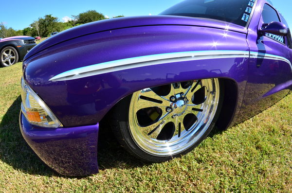
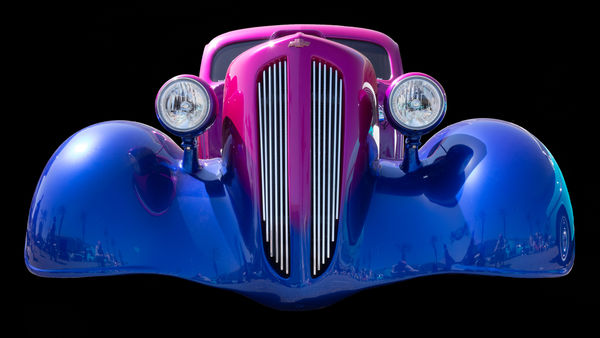
Any and all help appreciated. Taken with Nikon D5100, 10-17 Tokina fisheye lens.
Low Rider
Nov 4, 2013 19:55:14 #
juicesqueezer wrote:
Any and all help appreciated. Taken with Nikon D5100, 10-17 Tokina fisheye lens.
Wow! Really like the first one eye-popping it is. Is she laying on the ground? It would have been nice to have shown the roof line with a bit of blue sky above, other than that perfect.
Nov 4, 2013 20:02:52 #
Nov 4, 2013 20:17:56 #
John Muehling wrote:
Wow! Really like the first one eye-popping it is. Is she laying on the ground? It would have been nice to have shown the roof line with a bit of blue sky above, other than that perfect.
She's on the ground, as was I. Agree, wish I had got more of the sky. Thanks for the critique.
Nov 4, 2013 20:18:34 #
gmcase wrote:
Love the moon shot! :thumbup:
Thank you. Thought it would make for an interesting shot.
Nov 4, 2013 20:42:12 #
I was in a Lake Havasu City, AZ, a notable hot rod town. I was struggling with capturing the "art" of body work. I used it to learn layers and masks in Photoshop Elements.
Attached are the "before" and "after" where I got rid of everything that was not part of the "body art".
The prints are far better than what you can see here.
"One Sweet Ride" would look wonderful without the background "noise".
Attached are the "before" and "after" where I got rid of everything that was not part of the "body art".
The prints are far better than what you can see here.
"One Sweet Ride" would look wonderful without the background "noise".

Nov 4, 2013 20:53:57 #
Kinda confused which one were you looking for a critique on
then the step on....
like the first picture, wish it wasn't cropped on top second one nice but maybe a little more centered on the logo, third one nice shot
as for the step on picture....like the effect, maybe losing the car next to it on the fender in the rendering would be better
then the step on....
like the first picture, wish it wasn't cropped on top second one nice but maybe a little more centered on the logo, third one nice shot
as for the step on picture....like the effect, maybe losing the car next to it on the fender in the rendering would be better
Nov 4, 2013 21:09:43 #
bsprague wrote:
I was in a Lake Havasu City, AZ, a notable hot rod town. I was struggling with capturing the "art" of body work. I used it to learn layers and masks in Photoshop Elements.
Attached are the "before" and "after" where I got rid of everything that was not part of the "body art".
The prints are far better than what you can see here.
"One Sweet Ride" would look wonderful without the background "noise".
Attached are the "before" and "after" where I got rid of everything that was not part of the "body art".
The prints are far better than what you can see here.
"One Sweet Ride" would look wonderful without the background "noise".
Very nice job on that rod. I like it. Unfortunately, I don't have PP yet. Still running XP. Guess I will have to upgrade soon. Looking for something better than Win8. lol
Nov 4, 2013 21:11:12 #
DugE wrote:
Kinda confused which one were you looking for a critique on
then the step on....
like the first picture, wish it wasn't cropped on top second one nice but maybe a little more centered on the logo, third one nice shot
as for the step on picture....like the effect, maybe losing the car next to it on the fender in the rendering would be better
then the step on....
like the first picture, wish it wasn't cropped on top second one nice but maybe a little more centered on the logo, third one nice shot
as for the step on picture....like the effect, maybe losing the car next to it on the fender in the rendering would be better
Thank you! Still learning and growing. Appreciate the recommendations.
Nov 4, 2013 22:43:27 #
DugE wrote:
Kinda confused which one were you looking for a critique on
then the step on....
like the first picture, wish it wasn't cropped on top second one nice but maybe a little more centered on the logo, third one nice shot
as for the step on picture....like the effect, maybe losing the car next to it on the fender in the rendering would be better
then the step on....
like the first picture, wish it wasn't cropped on top second one nice but maybe a little more centered on the logo, third one nice shot
as for the step on picture....like the effect, maybe losing the car next to it on the fender in the rendering would be better
Step on? Come on. I was offering an approach to car photography! The OP asked for ideas! I showed one.
But, next time I'll know to keep my ideas to myself.
Nov 5, 2013 06:05:03 #
bsprague wrote:
Step on? Come on. I was offering an approach to car photography! The OP asked for ideas! I showed one.
But, next time I'll know to keep my ideas to myself.
But, next time I'll know to keep my ideas to myself.
You're naughty! Come over here and stand next to me......
Nov 5, 2013 07:16:42 #
Sorry everyone; Nightski sent me a PM on the rules and I should have only posted 1 photo for C&C. Won't happen again. And yes, I would have kept the low rider up there. I knew it was needing something else. Had the right idea, just didn't go far enough.
Thanks again.
Thanks again.
Nov 5, 2013 09:58:43 #
Juicesqueezer,
If I offended you, I apologize. I thought by showing an example of eliminating the background it might emphasize the reflections from the car. I also thought the purpose for this section was to develop techniques.
If I offended you, I apologize. I thought by showing an example of eliminating the background it might emphasize the reflections from the car. I also thought the purpose for this section was to develop techniques.
Nov 5, 2013 20:54:24 #
bsprague wrote:
Juicesqueezer,
If I offended you, I apologize. I thought by showing an example of eliminating the background it might emphasize the reflections from the car. I also thought the purpose for this section was to develop techniques.
If I offended you, I apologize. I thought by showing an example of eliminating the background it might emphasize the reflections from the car. I also thought the purpose for this section was to develop techniques.
You certainly did not offend me. I thank you for your input. I like what you did with that car. I wish I had photoshop, but like I said earlier, I still use XP. lol
Nov 5, 2013 22:01:18 #
Bram boy
Loc: Vancouver Island B.C. Canada
bsprague wrote:
I was in a Lake Havasu City, AZ, a notable hot rod town. I was struggling with capturing the "art" of body work. I used it to learn layers and masks in Photoshop Elements.
Attached are the "before" and "after" where I got rid of everything that was not part of the "body art".
The prints are far better than what you can see here.
"One Sweet Ride" would look wonderful without the background "noise".
Attached are the "before" and "after" where I got rid of everything that was not part of the "body art".
The prints are far better than what you can see here.
"One Sweet Ride" would look wonderful without the background "noise".
all great photos juice . you learned well .
If you want to reply, then register here. Registration is free and your account is created instantly, so you can post right away.