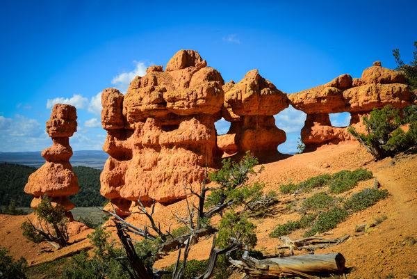
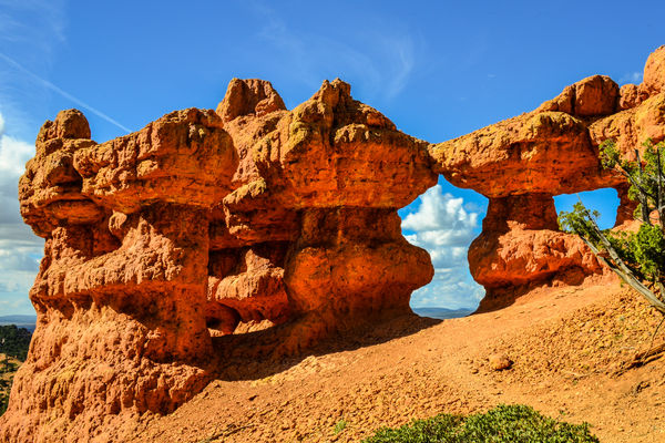
Red Canyon
Nov 4, 2013 15:04:09 #

And one more candidate for your evaluation and recommendation, including visual feedback.
Nov 4, 2013 15:05:51 #

Beautiful subject. Brilliant colors....maybe a little too brilliant? I would suggest desaturating some.
Nov 4, 2013 18:01:53 #
charryl wrote:
Beautiful subject. Brilliant colors....maybe a little too brilliant? I would suggest desaturating some.
Thanks. In my rememberance that is the real color. It was relatively early light. I never increase saturation but do use clarity and luminance and have the camera set to vivid to start with. I love the colors.
Nov 4, 2013 20:20:51 #

MtnMan wrote:
Thanks. In my rememberance that is the real color. It was relatively early light. I never increase saturation but do use clarity and luminance and have the camera set to vivid to start with. I love the colors.
I love the colors, too. And the photo. Good one!!
Nov 5, 2013 12:55:00 #
It looks much better on the download, but those spots in the sky should be cloned out, they could be birds in the distance, but they look like dust on the sensor.
Nov 5, 2013 15:02:36 #
The only thing I can nitpick about is the dust spots. Other than that, its a good image.
Nov 5, 2013 15:04:45 #
Bushpilot wrote:
It looks much better on the download, but those spots in the sky should be cloned out, they could be birds in the distance, but they look like dust on the sensor.
Pretty sure they are dust. I think I have it cleaned now but need to go back and clean up on some pics.
Nov 5, 2013 22:30:10 #
Brian in Whitby
Loc: Whitby, Ontario, Canada
Nice composition, well exposed, good use of complimentary colours. An interesting foreground but maybe a bit busy. You might try a slightly different point of view to try to find some logs that point toward the rocks. (leading lines)
The foreground is a bit out of focus. The rocks are tack sharp. Perhaps focusing a point a little closer to the camera would help.
Generally landscapes are expected to be sharp from foreground to the distant background. If something has to be out of focus slightly, it will be more acceptable to the viewer if it is the background. You obviously had lots of light so a smaller aperture would help. Wide angle lenses are often used for landscapes partly to make use of their greater depth of field.
Please don't feel I have been overly critical. I love the photo so the only things I really have to say are small points. I mention the suggestions for you to consider next time you are in a similar situation.
Well done!
Nov 6, 2013 08:42:47 #
MtnMan wrote:
And one more candidate for your evaluation and recommendation, including visual feedback.
The only thing I might suggest is to crop the log out of the foreground, and this is nitpicking.
A very nice and interesting photo.
Jim D
Nov 6, 2013 08:49:29 #
oldtool2 wrote:
The only thing I might suggest is to crop the log out of the foreground, and this is nitpicking.
A very nice and interesting photo.
Jim D
A very nice and interesting photo.
Jim D
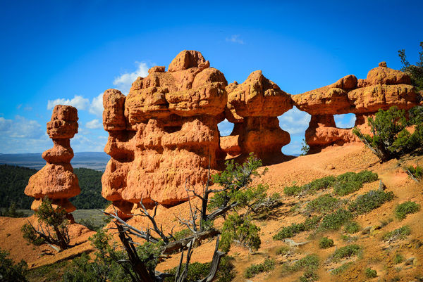
Thanks to you and others. I have a number of these. I liked this one best because of the log. For me it provides a nice contrast to the rock.
This one is at f20, as I think the others are.
I see the upload didn't carry along the shooting conditions because I exported it in reduced size. Here's a bit larger size without the tree.
Nov 6, 2013 08:57:19 #
MtnMan wrote:
Thanks to you and others. I have a number of these. I liked this one best because of the log. For me it provides a nice contrast to the rock.
This one is at f20, as I think the others are.
I see the upload didn't carry along the shooting conditions because I exported it in reduced size. Here's a bit larger size without the tree.
This one is at f20, as I think the others are.
I see the upload didn't carry along the shooting conditions because I exported it in reduced size. Here's a bit larger size without the tree.
I like the first photo better. Your right, the log might add interest.
Jim D
Nov 6, 2013 09:12:14 #
MtnMan wrote:
Thanks to you and others. I have a number of these. I liked this one best because of the log. For me it provides a nice contrast to the rock.
This one is at f20, as I think the others are.
I see the upload didn't carry along the shooting conditions because I exported it in reduced size. Here's a bit larger size without the tree.
This one is at f20, as I think the others are.
I see the upload didn't carry along the shooting conditions because I exported it in reduced size. Here's a bit larger size without the tree.
I was thinking of something more like this.
Changes made in PSE 10 using the stamp tool.
Jim D
Nov 6, 2013 09:40:25 #
oldtool2 wrote:
I was thinking of something more like this.
Changes made in PSE 10 using the stamp tool.
Jim D
Changes made in PSE 10 using the stamp tool.
Jim D
Thanks. I do like keeping the left column. But I still kinda miss the tree trunk...
Nov 6, 2013 09:47:49 #
MtnMan wrote:
Thanks. I do like keeping the left column. But I still kinda miss the tree trunk...
I just thought it distracted from the columns. It is your photo, you do what YOU like. That is what really counts!!
No matter what, I like it! It is a very good shot!
Jim D
Nov 6, 2013 15:00:26 #

MtnMan wrote:
And one more candidate for your evaluation and recommendation, including visual feedback.
Before long you may think I'm picking on you but it's because you and I photograph some of the same places in similar ways so I feel comfortable thinking through your photos. Is this Canyonlands? Red rock country is very bright with those wonderful complementary colors straight off the color wheel. They do look oversaturated in real life, and get more so if you use a polarizer, so it is worth dialing it down a bit to see if you can tame it. The colors look very different on my laptop and desktop, too, so it depends on the computer as well. These can be challenging to print and get "just right".
Lovely formation, and you've got a good layering effect going on in composition, with foreground, main subject and two backgrounds before you get to the sky. This gives a sense of depth. The nice slant (left/right, down/up) adds to it. The part of the foreground that is half lopped off is a bit of a distraction, as amputated elements often are. You probably can't rush back out there to re-shoot, but what if you'd crawled over that first woodpile, scrambled down the hill to the left a few steps, sat yourself down, and shot wide and slightly up and to the right with the second woodpile as a close-up foreground element. You'd also have salvaged more of that pretty puffy cloud in the background.
The vignetting is a little too much for me, I think it crowds the rock formations too much.
But as you know it is a pretty place, and you have a nice capture of it.
If you want to reply, then register here. Registration is free and your account is created instantly, so you can post right away.