Blasted freezing on the surf this week
Nov 4, 2013 09:02:05 #
Nov 4, 2013 10:04:58 #

I have used capital letters so my words stand out. I am not shouting.
I included the critique guideline to guide me along.
When critiquing photos here are some guidelines that may be helpful.
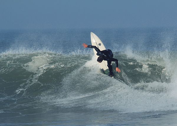
1) Is there a clear center of interest? In a strong photo, the viewer can immediately identify the subject. YES!
2) Is the image composed well? In a strong photo, there should be a sense of overall organization. YES
Composition rules or guidelines are a helpful starting point.
- Fill the frame. Filling the frame helps establish the center of interest, and, simultaneously, it helps exclude competing background details. You can fill the frame by moving closer to the subject or by using a longer focal length (or zooming in). FRAME US FILLED
- Organize elements. In composition, the Rule of Thirds is often used to organize elements in a composition. IMAGES IS OFFSET.
- Control the background. A non-distracting background is a composition tool to help bring attention to the subject of the photo. THE SPRAY MINIMIZED THE BACKGROUND
- Keep it simple. The fewer the elements in a photo, the stronger the statement the image makes. THIS IS SIMPLE
3) Is the focus crisp and is the exposure appropriate? YES
4) Does the lighting enhance the subject and message? YES, IT DOES
I glad you included the slice in the wave that was created by the surf board. Right area of surf board. He was cutting deep!
Exposure, perfect for me as the whites on the board and spray look right. Good reflections on the surfers wet suit.
Pat
I included the critique guideline to guide me along.
When critiquing photos here are some guidelines that may be helpful.
1) Is there a clear center of interest? In a strong photo, the viewer can immediately identify the subject. YES!
2) Is the image composed well? In a strong photo, there should be a sense of overall organization. YES
Composition rules or guidelines are a helpful starting point.
- Fill the frame. Filling the frame helps establish the center of interest, and, simultaneously, it helps exclude competing background details. You can fill the frame by moving closer to the subject or by using a longer focal length (or zooming in). FRAME US FILLED
- Organize elements. In composition, the Rule of Thirds is often used to organize elements in a composition. IMAGES IS OFFSET.
- Control the background. A non-distracting background is a composition tool to help bring attention to the subject of the photo. THE SPRAY MINIMIZED THE BACKGROUND
- Keep it simple. The fewer the elements in a photo, the stronger the statement the image makes. THIS IS SIMPLE
3) Is the focus crisp and is the exposure appropriate? YES
4) Does the lighting enhance the subject and message? YES, IT DOES
I glad you included the slice in the wave that was created by the surf board. Right area of surf board. He was cutting deep!
Exposure, perfect for me as the whites on the board and spray look right. Good reflections on the surfers wet suit.
Pat
Nov 4, 2013 10:14:10 #
I really think this forum will work, thank you for your comments
I have no issue with cap letters, there is a right and wrong time to use them.
I use them to mace certain words stand out, "bold" is not available here neither are italics so caps are used. It is only when they are used throughout or in the titles I object.
If the general great start..
HOWEVER I did throw in a "deliberate" mistake that I always pick up others on, and YES it was deliberate, (and if you believe that.....)
.............. what is it ???????????
Nov 4, 2013 10:22:23 #
JR1 wrote:
I really think this forum will work, thank you for... (show quote)
I finally, found it. It did not stand out to me and therefore not important in this image.
Pat
Nov 4, 2013 10:24:40 #
Jay Pat wrote:
I finally, found it. It did not stand out to me and therefore not important in this image.
Pat
Pat
Well what
Nov 4, 2013 10:26:21 #

Nov 4, 2013 10:29:06 #

Nov 4, 2013 10:30:39 #
Nov 4, 2013 10:35:49 #
Nov 4, 2013 12:19:01 #
I was tempted to use a slanted horizon in my Wild Wind posts, but thought better of it. I do believe a slant adds to the overall feeling of raw power (of the ocean), and excitement of the moment. This guy is about to feel just how cold that can be.
Nov 4, 2013 13:22:56 #
Nov 4, 2013 22:10:20 #
Nice photo. I like how the dof and mist subdue the background. Really makes the surfer and his board stand out.
He's welcome to come here to Minnesota and surf. Maybe work one of the big storms rolling big ones into Duluth harbor.
------------
Note that you can use bold, italics, and underline in your posts. Wrap the desired text in b, i, or u tags the same way you wrap quotes.
He's welcome to come here to Minnesota and surf. Maybe work one of the big storms rolling big ones into Duluth harbor.
------------
Note that you can use bold, italics, and underline in your posts. Wrap the desired text in b, i, or u tags the same way you wrap quotes.
Nov 5, 2013 15:48:37 #
lighthouse
Loc: No Fixed Abode
I don't know what you usually complain about but I would like to see the white water as white in any shot.
It seems to be a muddy grey/blue in this shot.
It seems to be a muddy grey/blue in this shot.
JR1 wrote:
Spot the difference, what do I constantly complain about
If you want to reply, then register here. Registration is free and your account is created instantly, so you can post right away.