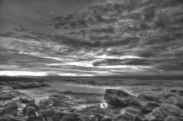
Coastal Monochrome
Nov 3, 2013 14:46:19 #

Looking for work-flow/processing suggestions from the "Masters of Monochrome" I'm thick-skinned-- so you can let me have it...
I've been listening to the tutorials on Silver Efex-Pro-- but don't have the program.... Original was in color....
I've been listening to the tutorials on Silver Efex-Pro-- but don't have the program.... Original was in color....
Nov 3, 2013 15:29:02 #

Is it Masters only......or do you want my opinion :-) .
Until the big guns get here, I can give you my take. The sky is great, the setting is great and suitable for B&W. However, I'd say the lighting is a bit off - I'd say the rocks could be darker and the waves could be brighter. Please feel free to ignore until the experts get here :-) .
Until the big guns get here, I can give you my take. The sky is great, the setting is great and suitable for B&W. However, I'd say the lighting is a bit off - I'd say the rocks could be darker and the waves could be brighter. Please feel free to ignore until the experts get here :-) .
Nov 3, 2013 15:35:40 #

R.G. wrote:
Is it Masters only......or do you want my opinion :-) .
Until the big guns get here, I can give you my take. The sky is great, the setting is great and suitable for B&E. However, I'd say the lighting is a bit off - I'd say the rocks could be darker and the waves could be brighter. Please feel free to ignore until the experts get here :-) .
Until the big guns get here, I can give you my take. The sky is great, the setting is great and suitable for B&E. However, I'd say the lighting is a bit off - I'd say the rocks could be darker and the waves could be brighter. Please feel free to ignore until the experts get here :-) .
I think you have it right, but I would state it more simply. It would be a very nice image if the tonal range were greater. How it would be done is a matter preference.
Nov 3, 2013 15:36:42 #

LoneRangeFinder wrote:
Looking for work-flow/processing suggestions from the "Masters of Monochrome" I'm thick-skinned-- so you can let me have it...
I've been listening to the tutorials on Silver Efex-Pro-- but don't have the program.... Original was in color....
I've been listening to the tutorials on Silver Efex-Pro-- but don't have the program.... Original was in color....
Would you mind if I posted my edits to your picture?
Graham
Nov 3, 2013 15:39:30 #

I like the scene. I'm not sure it wouldn't be better in color.
Nov 3, 2013 15:49:59 #
Graham Smith wrote:
Would you mind if I posted my edits to your picture?
Graham
Graham
Not at all-- I was hoping you would check in...
Nov 3, 2013 15:52:46 #
R.G. wrote:
Is it Masters only......or do you want my opinion :-) .
Until the big guns get here, I can give you my take. The sky is great, the setting is great and suitable for B&E. However, I'd say the lighting is a bit off - I'd say the rocks could be darker and the waves could be brighter. Please feel free to ignore until the experts get here :-) .
Until the big guns get here, I can give you my take. The sky is great, the setting is great and suitable for B&E. However, I'd say the lighting is a bit off - I'd say the rocks could be darker and the waves could be brighter. Please feel free to ignore until the experts get here :-) .
I value ALL input-- didn't mean to exclude anyone-- I just know I'm no expert. My weakness is PP. I played around with several variations-- and agree about the darker tones for the rocks. I would probably shoot this differently, if I had a do over.
Nov 3, 2013 15:53:32 #
LoneRangeFinder wrote:
Looking for work-flow/processing suggestions from the "Masters of Monochrome" I'm thick-skinned-- so you can let me have it...
I've been listening to the tutorials on Silver Efex-Pro-- but don't have the program.... Original was in color....
I've been listening to the tutorials on Silver Efex-Pro-- but don't have the program.... Original was in color....
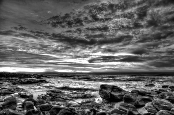
Hello LoneRangeFinder, I'm rather chary about responding to this because of your reference to "Masters" I will limit my comments to the results of the conversion to B&W. Overall I like the picture,the sky is quite good so I have only worked on the sea and rocks which are very flat, the surf needs to be much brighter with some actual whites. The rocks are very lacking in contrast with no deep blacks and no highlights. I think one problem may be that the original had some blown highlights. This is a q&d edit, with more time taken it could be improved further. All was done with contrast adjustment, dodging and burning and sharpening.
Workflow wise I edit the colour original in Lightroom, export to PS and convert in silver Efex Pro then do the final adjustments in PS.
Graham
Nov 3, 2013 16:02:12 #
Graham Smith wrote:
Hello LoneRangeFinder, I'm rather chary about resp... (show quote)
Thanks. This was more in line with what I "saw"-- and I'll drop the "Masters" references in the future.
;-)
After watching four or five tutorials on Silver Efex Pro-- it looks like it may be the way to go for monochrome-- and yes there were highlights blown in the original exposure. I was intrigued from the tutorials on the piece about zones with an aim toward printing. Essentially, he was saying that zone ten was fine for viewing-- but that for printing one would want some ink on all parts of the print.... Which leads to this question: Do you print your monochromes-- and if so which paper do you recommend?
Nov 3, 2013 16:14:40 #
LoneRangeFinder wrote:
br After watching four or five tutorials on Silve... (show quote)
I'll defer to others regarding the printing of images. I still struggle with it. Getting out and about to take the pictures, actually taking the pictures and the post processing are what I enjoy most. I do like to share my pictures on the internet and taking part in the the resultant dialogue, as you've probably noticed :-)
Graham
Nov 3, 2013 16:32:37 #
Graham did what I was going to suggest. Add some contrast. He went a step further and did some dodging. That seems like a great idea as well.
Nov 3, 2013 17:40:09 #

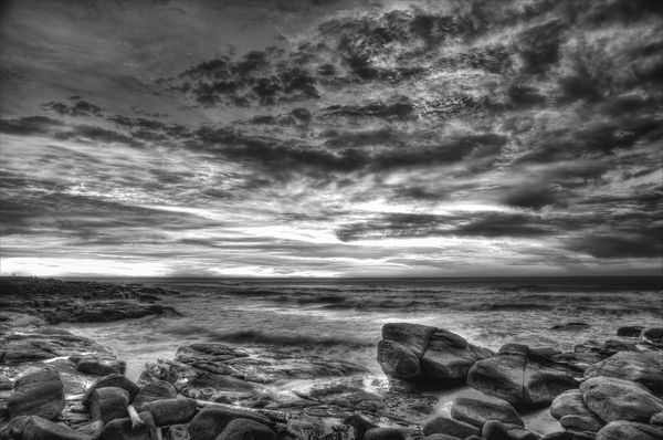
This is my least exercised skillset - dealing in greyscale. I've read a great deal, but haven't learned all the intricacies. I DO however, own Silver Efex Pro 2, and that will handle all the heavy lifting for me. This was created using the Full Dynamic Contrast (Soft) preset with a few control points added in when I wanted to emphasize structure (as in the waves rolling ashore), and deemphasize others (as in lessening the contrast in the dark clouds). I also used Color Efex Pro 4 Darken/Lighten center to place an off-center source of light with fade away to a darker border (not quite a vignette, but the same idea - adds a 3 dimensional feel).
Variation on Coastal Monochrome
Nov 4, 2013 12:43:55 #

The edits of both Graham and Bob have improved this well composed and interesting image by LoneRangeFinder in my humble opinion. Kudos to the photographer and editors. :)
Nov 4, 2013 12:46:42 #

LoneRangeFinder wrote:
Looking for work-flow/processing suggestions from the "Masters of Monochrome" I'm thick-skinned-- so you can let me have it...
I've been listening to the tutorials on Silver Efex-Pro-- but don't have the program.... Original was in color....
I've been listening to the tutorials on Silver Efex-Pro-- but don't have the program.... Original was in color....
Well I know it isn't what you asked but I'm not interested in this as a monochrome. I'd bet it could be beautiful in color.
Nov 4, 2013 12:50:21 #

LoneRangeFinder wrote:
Looking for work-flow/processing suggestions from the "Masters of Monochrome" I'm thick-skinned-- so you can let me have it...
I've been listening to the tutorials on Silver Efex-Pro-- but don't have the program.... Original was in color....
I've been listening to the tutorials on Silver Efex-Pro-- but don't have the program.... Original was in color....
LoneRangeFinder,
"Looking for work-flow/processing suggestions..."
Your example of the capture may have been improved at the very beginning of your processing, the moment before exposure. Taking lessons from film photography, some subjects are better captured in B&W, and some in color, but not both.
One thing you might try with a similar scene is to set your camera to Monochrome (just like loading Pan-X into our 35mm cameras). Don't bother to set the camera's on-board filters, they do very little to effect the exposure.
Look for the old fashioned B&W colored filters (red, green, yellow) to absorb colors before they reach the sensor. You may be able to find a Red Polar filter (Cokin) so you can adjust the effect for the scene as you would a ND Polar filter.
Digital sensors are much like film in the way they capture and react to light. Like Ansel Adams who made striking B&W prints, he also used colored filters in front of his camera lens.
Happy shooting,
Michael G
If you want to reply, then register here. Registration is free and your account is created instantly, so you can post right away.