Anything I could have done different?
Nov 3, 2013 08:31:28 #

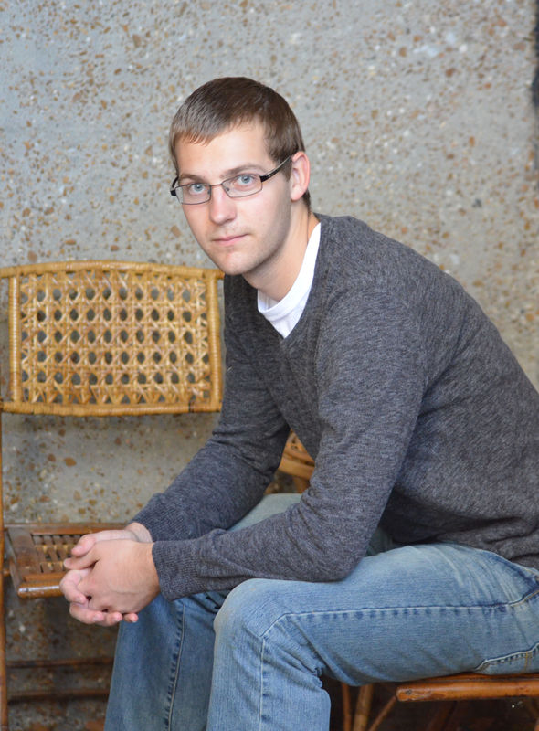
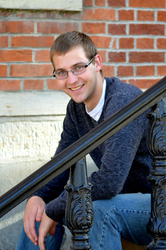
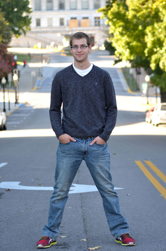
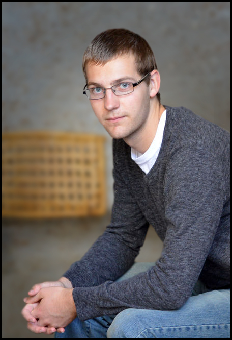
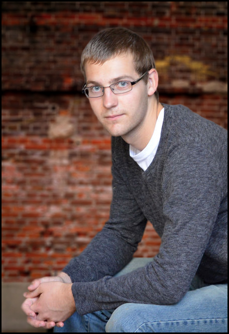
Took a few shots of my nephew, what do you all think? I am pretty proud of these but if anyone has any suggestions on how to make them better please let me know.
Nov 3, 2013 08:40:04 #
The exposure is spot on in all of these. Now understand, I am not really a people photographer.
1. I would use a much tighter crop or pull back so that none of the subject is cut off.
2. The hand rail cutting across in such a prominent way completely distracts from the main subject.
3. A much shallower f/stop to throw the BG in to a full blur would vastly improve this shot. What lens was used in this shot? If it was a lens around 50mm I would use f/1.8 or f/1.4. A telephoto lens with a low f/stop, coupled with the inherent image compression that goes with it would have been my choice for this shot. I would have used my 150mm prime with an f/stop of 2.8 to f4.
I also would also would have a bit more room below the subjects feet.
Nov 3, 2013 08:44:33 #
Good excessive - suggest google Posing the Male and General posing guidelines - I benefited from these selections.
Nov 3, 2013 09:06:31 #
A few observations that may prove to be satisfying for the next time.
1. The chair and table in the background are distractions that should be removed. If possible, put more room between the subject and a background like this. With more room you could use a much more shallow depth of field. That would likely make for a more pleasant result.
2. I agree with Thunder o b, the railing is too prominent the way it was used. Perhaps with your nephew standing and leaning on the rail then the shot taken from either a higher or lower perspective would have produced a more desired image. A shallow Depth of Field here may have eliminated the distraction of the bricks.
3. I am also in agreement with Thunder o b regarding the depth of field here. To draw attention directly to the subject, a completely blurred background by using a very narrow depth of field would have improved this shot.
With all that being said, the images are still very good. The model is in sharp focus and available light was well used. In most close portraits the Depth of Field being shallow makes for a better image.
Good job.. keep shooting, evaluating, and trying new things. However, never lose the most important factor in photography... shoot what YOU like.. impress yourself and don't worry as much about what others may think.
Nov 3, 2013 12:13:29 #

I would get rid of the distracting items in the background in the first one (clone them out) and darken the background and add contrast to the subject in the 3rd one
Nov 3, 2013 15:04:19 #

XKaliber wrote:
A few observations that may prove to be satisfying... (show quote)
Great comments, I agree with these.
Nov 4, 2013 06:52:22 #
Heirloom Tomato wrote:
Great comments, I agree with these.
Second that. They ARE good, but can be better !
Nov 4, 2013 15:59:13 #

Emmasmom wrote:
Took a few shots of my nephew, what do you all think? I am pretty proud of these but if anyone has any suggestions on how to make them better please let me know.
I agree with most of the comments here. Good start! I've played with your first image to see if I could show you how it would look with some of the "crop" and "DOF" suggestions above.
Hope these help.
Cropped and background blurred
Background changed to "grunge"
Nov 4, 2013 22:53:53 #

Emmasmom wrote:
Took a few shots of my nephew, what do you all think? I am pretty proud of these but if anyone has any suggestions on how to make them better please let me know.
First let me say that you have a very handsome nephew. Your composition is good but if you have and can use a post processing software to remove some of the background, such as the wicker chair in the first photo, then the eye would go directly to your nephew. If you can use a wider f stop such as 1.8 - 2.8 then all objects in the background will be pleasantly blurred out. If possible do a re-shoot with the light on your nephew & watch out for objects in the background.
If you want to reply, then register here. Registration is free and your account is created instantly, so you can post right away.