WPC 1343 - Trick-or-Treat ANALYSIS
Nov 2, 2013 23:45:56 #

jazz7 has graciously volunteered the WPC 1343 - Trick-or-Treat entry for critique and analysis to find out what they could have done to make it better. Be nice, but be honest as this will help everyone with their craft. Thank you jazz7 and thank you everyone!
from WPC 1343 - Trick-or-Treat RESULTS http://www.uglyhedgehog.com/photo_contest_ratings.jsp?pcnum=86
from WPC 1343 - Trick-or-Treat RESULTS http://www.uglyhedgehog.com/photo_contest_ratings.jsp?pcnum=86
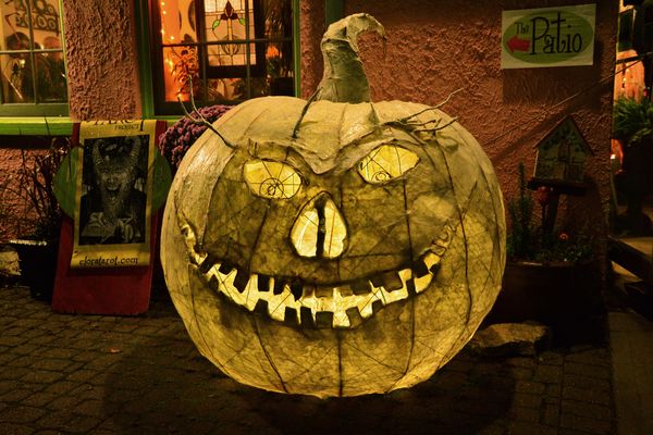
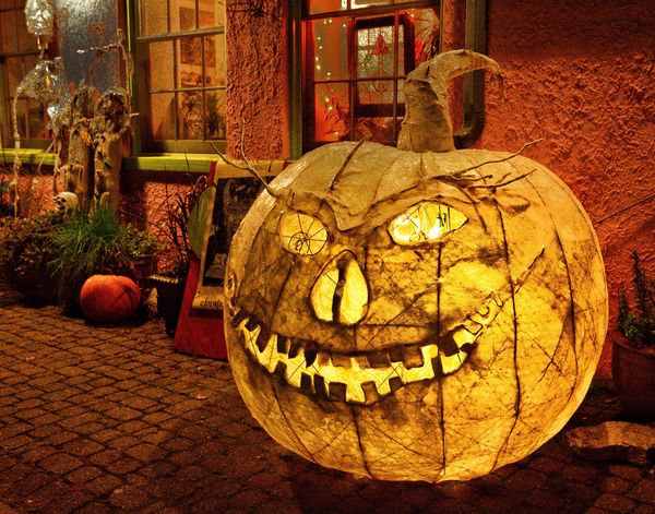
Grin and Bear It! Paper pumpkin - Elora - October 2013
Nov 3, 2013 06:10:09 #
I love it! Personally I may have have moved the pumpkin a little further to the right to show the foilage above it......
Well done and thank you for sharing
kev
Well done and thank you for sharing
kev
Nov 3, 2013 07:40:07 #

I would crop the right side to remove the window light and maybe bring the left side in a little also
Nov 3, 2013 08:16:30 #

I really like and think the pumpkin structure is great and I would experiment around to emphasize it a little more.
I would also have liked to have downloaded pumpkin structure to look at it closer.
With the given photo I would experiment with the following to hi light the pumpkin:
Downplay the back ground lights (windows, steps, left door way?),
Crop out the steps and door way at the left but keeping the patio sign,
Etc.
Just some thoughts
Nov 3, 2013 08:43:58 #

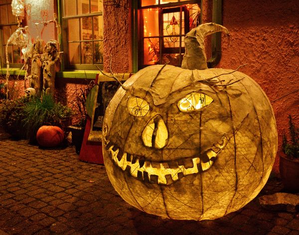
Thank you for your constructive comments :-). Here is another I took at the same time from a slightly different angle, shows the light inside the pumpkin though, which I wasn't too sure about. But the pumpkin is closer to the right edge :-). Thanks again. Jazz7
The second one I shot. Nikon D7100
Nov 3, 2013 09:38:42 #
Impact: :thumbup: :thumbup: :thumbup: :thumbup:
Composition: :thumbup: (Rule 1/3)
Technical Excellence: :thumbup: :thumbup: :thumbup: (Lights in windows distracting)
Point of Interest: :thumbup: :thumbup: :thumbup:
:thumbup:
Overall a unique and enjoyable image.
Composition: :thumbup: (Rule 1/3)
Technical Excellence: :thumbup: :thumbup: :thumbup: (Lights in windows distracting)
Point of Interest: :thumbup: :thumbup: :thumbup:
:thumbup:
Overall a unique and enjoyable image.
Nov 3, 2013 10:17:17 #

I'm going to take a different tack than everyone else. Actually I like both of them. But, I would shorten the depth of field to throw the background out of focus. Although I like the colors and the space of the background, the detail in it detracts from the jack-o-lantern.
Nov 3, 2013 11:35:59 #
I'd respectfully suggest that a decision needs to be made as to the importance of the background. If it's of no particular significance, then throwing it out of focus and repositioning the pumpkin a bit to adhere to the rule of thirds would seem to be appropriate.
The background, however, appears to be rather interesting and if you want to put the pumpkin in its context and surroundings, it would seem logical to include more of the background with good depth of field. A change of perspective
would not, in my opinion, minimize the importance of the main subject. An interesting subject and well executed technically.
Nov 3, 2013 12:16:25 #

St3v3M wrote:
jazz7 has graciously volunteered the WPC 1343 - Trick-or-Treat entry for critique and analysis to find out what they could have done to make it better. Be nice, but be honest as this will help everyone with their craft. Thank you jazz7 and thank you everyone!
from WPC 1343 - Trick-or-Treat RESULTS http://www.uglyhedgehog.com/photo_contest_ratings.jsp?pcnum=86
from WPC 1343 - Trick-or-Treat RESULTS http://www.uglyhedgehog.com/photo_contest_ratings.jsp?pcnum=86
Basically, both pictures of the pumpkin are excellent. Your rule of thirds is appropriate, the sharpness of the shot is excellent. I would love to see the shot with the pumpkin in sharp focus, and the background a little out of focus so that the pumpkin is the main object.
Rich
Nov 3, 2013 12:53:22 #
jazz7 wrote:
Thank you for your constructive comments :-). Here is another I took at the same time from a slightly different angle, shows the light inside the pumpkin though, which I wasn't too sure about. But the pumpkin is closer to the right edge :-). Thanks again. Jazz7
I feel the composition of this image is much better than the first one. It gives more depth to it with the wall fading off in the background.
Swede
Nov 3, 2013 14:15:43 #
Thank you everyone for taking the time to critique my photo, I do appreciate your valid comments. I'm away from home at present so no computer or Lightroom, but I do have my iPad and Snapseed and have darkened the background as much as possible and tried to make the pumpkin "pop" a bit. Good suggestions. Jazz7
Nov 3, 2013 14:31:54 #
Nov 3, 2013 15:36:42 #
Xantoz
Loc: Delaware
I like the composition in the 2nd one. I would darken the background a bit. Especially the light in the window. The pumpkin is great. Excellent detail. Far more interesting than the first!! Thanks for sharing.
Nov 3, 2013 19:10:01 #
Thanks to everyone for their comments, I found it very helpful indeed. Cheers! Jazz7
Nov 4, 2013 00:26:47 #
jazz7 wrote:
Thanks to everyone for their comments, I found it very helpful indeed. Cheers! Jazz7
I played around with them second image using some of the suggestions of others who commented. I separated the pumpkin from the background, blurred the background slightly and darkened it, brightened up the pumpkin, brightened up the window and added a path of light from it. It makes an interesting picture.
Swede
If you want to reply, then register here. Registration is free and your account is created instantly, so you can post right away.