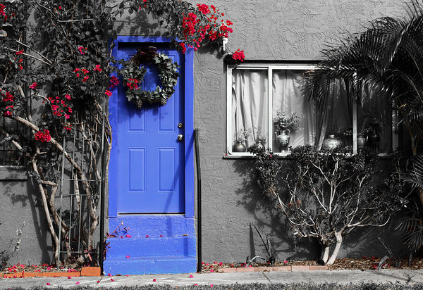
Missing Green
Nov 2, 2013 14:10:45 #

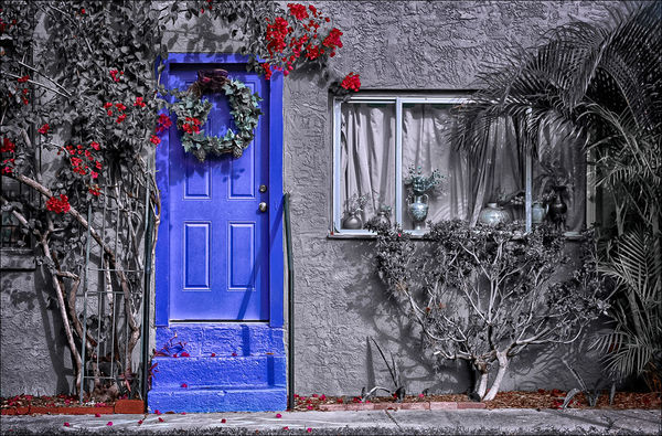
Hi Folks, I took this photo last January while visiting my mother in Gulfport, FL. Details:
D40, 18-55mm at 42mm, aperture priority, f/8 at 1/400, iso 200, raw mode, tripod.
I wanted to experiment with partial de-saturation and chose this image as the subject. I'll post the original, unprocessed jpg, in a reply for reference. You can't do too much with this one as one of the channels is completely gone, but feel free to play with either one.
I'd like to hear whether you think the de-saturation works, but don't hesitate to include comments for general improvement.
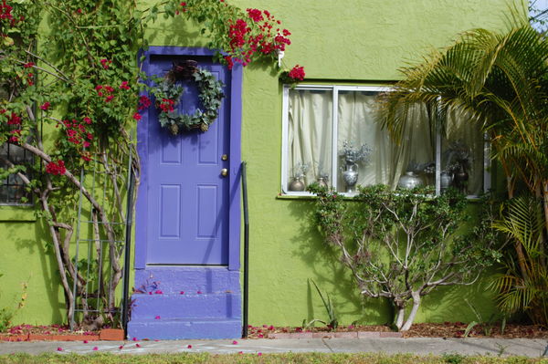
Green Channel Saturation to Zero
Nov 2, 2013 14:16:56 #
Here's the original jpeg straight from the camera. As most (all?) Nikon's do, raw + jpeg forces the lowest quality jpeg. The original in the initial post was processed from raw to tif to jpeg. Note too that this image is quite soft because in-camera sharpening was set to minimum. Refer to the original post for image parameter details.
Original basic quality jpeg
Nov 2, 2013 14:25:05 #

From someone who has no clue about de-saturation, I really like the desaturated photo. It's very pleasing to look at and the blue area in the upper right corner of the original has been corrected. The original to me, is a boring shot. To me, your de-saturation presentation is a winner.
Nov 2, 2013 16:02:35 #

Very cool!
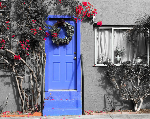
I wonder about cropping a bit off the bottom so that tiny strip of grass is gone?
Re overall scene: wish the wreath wasn't on the door. Something about the right-hand side bothers me, also - too busy maybe.
Thanks for the opportunity to play with a very interesting image.
I wonder about cropping a bit off the bottom so that tiny strip of grass is gone?
Re overall scene: wish the wreath wasn't on the door. Something about the right-hand side bothers me, also - too busy maybe.
Thanks for the opportunity to play with a very interesting image.
Nov 2, 2013 18:21:57 #

This is really cool what you have shown us here, Gauss. I can't wait to get home from work and find something to try this on. :-)
I can't believe how much I am learning today.
I can't believe how much I am learning today.
Nov 2, 2013 20:34:23 #
@ Margo -- Thank you. I agree, that original is bland! I'm so glad I tried this technique on this photo and was able to create something a little more interesting.
@ Linda -- Thanks for the cropping suggestions. I definitely like the cleaner line along the bottom without the grass. On the right, I think I might crop a little more than you did so the edge of the photo falls on the vertical rail on the window sash. I don't have any problems letting go of parts of an image, but I tend not to crop much because don't have that many pixels to start with! :|
@ Sandra -- I'm glad you like it. I usually try to PP for a realistic look, though not necessarily the same as the one I saw and shot. So this was a different thing for me; it's always good to stretch some new muscles. I'll also take this moment to thank you for getting this new forum going. I am enjoying participating in it. This is the first time since I was a teenager that I've shown strangers any of my photos for critique and critiqued other's. Definitely a positive experience.
Nov 3, 2013 00:13:56 #

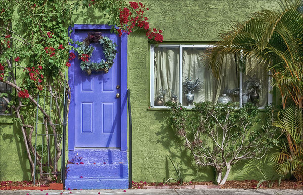
The first thing I noticed in this photo was that it was not level. I downloaded the color version to my hard drive and took it into LR5 so I could level the photo using its lens correction facility, and work on the distortion in the door so that it was vertically aligned. Secondly, while I possess desaturation skills, I became enamored with the original photo, complete with color, and immediately got sidetracked from the original project. I apologize to everyone for not sticking to the script, but at least I stuck to the original photo. To me, the designs and colors in the various collections of foliage just begged to be emphasized, as did the striations in the stucco wall. And then, you've got all that interesting stuff in the window to explore. That being the case, here's the monkey wrench thrown into the mix.
Variation on Missing Green - with Green replaced
Nov 3, 2013 03:15:05 #
OK, I made the claim I could handle desaturation, and I realized I had done the easy part ..... I had talked about it. But talk is cheap, and actions always speak louder than words. This, then, is my actionable rendition of the photo.
I liked Linda's flowers better than mine. And, OBTW, you guys are keeping me up way too late at night with this stuff.
I liked Linda's flowers better than mine. And, OBTW, you guys are keeping me up way too late at night with this stuff.
Missing Green - Coloring inside the Lines
Nov 3, 2013 08:56:30 #

Bob, this is excellent and I learned a lot seeing how this was accomplished from the original photo.
Nov 3, 2013 08:59:24 #
Bob Yankle wrote:
I liked Linda's flowers better than mine. And, OBTW, you guys are keeping me up way too late at night with this stuff.
I liked Linda's flowers better than mine. And, OBTW, you guys are keeping me up way too late at night with this stuff.
Bob, all I did was crop :)
Nov 3, 2013 10:41:00 #
Gauss, other than providing a few examples of the way I interpreted your photo, please let me comment on your original submission. As I said in my first revision, I thought I detected that the photo was not level, but I see in each of my revisions, I didn't get that quite right either.
The photo you submitted of the original had a blue patch in the upper right hand corner that you fixed by cropping. When I saw the photo, I believed that foliage on the right needed to be included in the photo to give it balance, so I used CS6's spot healing brush tool and a bit of cloning to get rid of that distraction. I also cloned a small spot in the upper left hand corner that was a little too bright. The next thing I noticed in your photo was that foliage at the right was a little too dark, with not a lot of discernible detail, so I would recommend you do a selection on that to brighten it up a bit. The white window frame looked a little too bright to me .... it became the center of attention as the eye is drawn to the brightest and sharpest points in a photo. I would tone it down just a bit. As I reviewed my own desaturated example, I notice I have a bit of cyan mixed into the white and would go back and desaturate that as well. And the last comment I had to make was that you did very little with the stucco pattern on the side of the building. I find that that particular expanse of wall is needed to tie together the left hand and right hand sides of the picture.
I can see why you desaturated the green ..... there was just too darn much of it. Once you've done that however, you basically end up with an amalgam of two photographs - one in color, and one in black and white (or greyscale). You can't just quit there, you have to treat the b&w portion like any other, checking out contrast and light levels to blend them all together, or, alternatively, to make some of them pop.
Nov 3, 2013 11:04:48 #

I am not fond of selective colorization and therefore did not comment. I think the original photograph is much more interesting but there was still something that wasn't quite right but I couldn't put my finger on it. After reading all the other posts I think the problem is that there is just too much green. It becomes a study I green sort of except the other colors pop through with large statements of there own. So my suggestion would be to change the color of the wall to a complementary color to green.....say an ochre or yellow. Maybe someone out there will play with this idea.
Nov 3, 2013 11:10:16 #
charryl wrote:
I am not fond of selective colorization and theref... (show quote)
HooBoy, Charryl! That would entail an intricate and detailed selection process, to distinguish the wall color from the foliage (including the shadowed sections of wall). But you're right, I'd love to see it.
Nov 3, 2013 11:18:05 #

Nov 3, 2013 11:43:18 #
Bob Yankle wrote:
Gauss, other than providing a few examples of the way I interpreted your photo, please let me comment on your original submission. ...
Bob, I like both of your edits, and I'm glad you didn't just focus on the desaturating version. I appreciate the time you spent on this and am especially glad you made this in depth follow up. Very helpful. :!: Thank you.
I've got a lot to learn about the aesthetics and mechanics of post processing. Fortunately, for me, it's an enjoyable pastime so I'll enjoy the process regardless of how well I execute it. :-o
I have several other photos of different parts of this building so it will be helpful to apply what I've seen and learned here to those as well.
Thanks again, and don't stay up too late!
If you want to reply, then register here. Registration is free and your account is created instantly, so you can post right away.