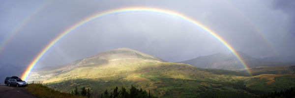
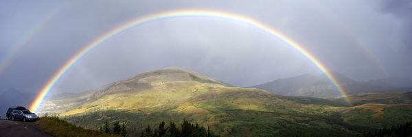
Rainbow panorama in Glacier NP
Oct 31, 2013 19:58:42 #

I posted this once before in the gallery, but I am getting ready to print it and want to get a C&C before doing so. The only thing I won't do is get rid of the car. I like the way the rainbow hits the fender. If you want to play with it that is fine with me, BUT I want details on what you did. Screen shots if that's what it takes to explain.
Oct 31, 2013 20:14:00 #
Oct 31, 2013 20:32:41 #
Nikonian72 wrote:
So, is there a pot of gold in either of the vehicles?
No gold that I know of :-( , but you need to make a comment concerning the quality or lack there of of the photograph per rules of this section.
Oct 31, 2013 20:40:12 #
The colors are more vivid on download & enlargement. My only suggestion is to consider printing on metal stock, instead of paper:
http://www.bayphoto.com/metalprints
http://www.adoramapix.com/app/products/metalprints
http://www.imagewizards.net
Learn more here: http://scottkelby.com/2009/my-first-prints-on-metal
http://www.bayphoto.com/metalprints
http://www.adoramapix.com/app/products/metalprints
http://www.imagewizards.net
Learn more here: http://scottkelby.com/2009/my-first-prints-on-metal
Oct 31, 2013 20:57:42 #

Country's Mama wrote:
I posted this once before in the gallery, but I am getting ready to print it and want to get a C&C before doing so. The only thing I won't do is get rid of the car. I like the way the rainbow hits the fender. If you want to play with it that is fine with me, BUT I want details on what you did. Screen shots if that's what it takes to explain.
That's a beautiful photo, the kind I long to run up on and capture. And even though the cars are a bit weird to have in there, there wasn't/isn't much to do about it so I agree with your decision to make them a part of the composition. You've got great division by layers near to far, good atmosphere/mood with all the subtle color and bright color working together, and you've got a rule of thirds thing happening with the mountains and rainbows. I do think you might like a little brightening of that bottom 1/10 of the frame, where there's not much detail showing (could just be the way it converted to jpeg for posting). You will probably have to do it with an adjustment brush to keep from getting involved with those cars. There's something a little odd going on with the rainbow right over the car's hood that you may want to tinker with, maybe some reflection off that white hill behind it, but it's causing some artifacts. I am not sure how to advise you to fix it, but some processing guru may step forth here, and if not, you could boot it over to the PP group and see how they fare if you want.
Oct 31, 2013 21:01:55 #
Nikonian72 wrote:
The colors are more vivid on download & enlargement. My only suggestion is to consider printing on metal stock, instead of paper:
http://www.bayphoto.com/metalprints
http://www.adoramapix.com/app/products/metalprints
http://www.imagewizards.net
Learn more here: http://scottkelby.com/2009/my-first-prints-on-metal
http://www.bayphoto.com/metalprints
http://www.adoramapix.com/app/products/metalprints
http://www.imagewizards.net
Learn more here: http://scottkelby.com/2009/my-first-prints-on-metal
Thank you for the suggestion and links. I will look into it.
Oct 31, 2013 21:30:15 #
minniev wrote:
That's a beautiful photo, the kind I long to run u... (show quote)
Thank you. I will play a little bit more before sending it off. I am not sure what you are referring to about the artifact over the hood. There is reflection from the rainbow.
Oct 31, 2013 22:31:08 #

My only issue with the picture is that the mountain in the back appears to be a bit washed out. I think it would be much better if that part could be toned down just a bit. But WOW what an awesome capture ! :thumbup:
Oct 31, 2013 22:35:37 #
Old Salt wrote:
My only issue with the picture is that the mountain in the back appears to be a bit washed out. I think it would be much better if that part could be toned down just a bit. But WOW what an awesome capture ! :thumbup:
Thank you. I have thought the same thing but every time I try to correct it it looks worse to me.
Oct 31, 2013 22:56:28 #
Oct 31, 2013 22:57:21 #
Old Salt wrote:
May I try something with it ?
Go right ahead. i just ask that you tell me what and how you did it.
Oct 31, 2013 23:18:17 #
Country's Mama wrote:
Go right ahead. i just ask that you tell me what and how you did it.
This was just a real fast go over but I used the burn tool at 50 % with the midtones and highlights in CS5 just to see what it would do and this is what I got from it .. I am not that good at it but it appears that it would work. I also tried the brush too at 50% flow with 50% opacity to see if I could get the colors up a bit on the trees on the mid upper right side of the slope ..you can see where I missed a thin area to see I did this on purpose to see if it made any difference. I can definitely see where it had been touched up .. but would need to get the color just a tad lighter
Oct 31, 2013 23:20:04 #
It's late ..LOL be nice to add the photo huh ?? LOL :D
Nov 1, 2013 07:34:24 #
Old Salt wrote:
It's late ..LOL be nice to add the photo huh ?? LOL :D
Thank you for the detailed instruction. That makes the rework useful. I think I would like something in between the two. Maybe at 25%. I will play some more.
Nov 1, 2013 17:03:32 #

An interesting photo that leaves you with varied stories. Thank you for posting.
If you want to reply, then register here. Registration is free and your account is created instantly, so you can post right away.