By The Seaside
Oct 31, 2013 15:47:49 #

Did a little PP but would like comment on all aspects. Thank you.
I've asked for it. Go ahead!!
I've asked for it. Go ahead!!
Evening
The Harbour
Oct 31, 2013 15:59:29 #

nairiam wrote:
Did a little PP but would like comment on all aspects. Thank you.
I've asked for it. Go ahead!!
I've asked for it. Go ahead!!
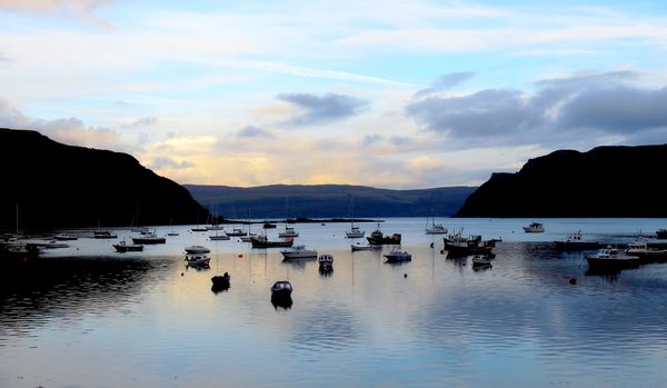
#1) Nice color in the sky and in your reflections. The big dark shadow on the left is distracting. Could you lighten shadows?
#2) There is really no clear subject in this photo. I'm not sure there is really a shot here at all.
Oct 31, 2013 16:07:42 #
The rule is that you only post 1 photo at a time for analysis. This will help keep the section from turning into a photo gallery. I will allow the 2 this time as we are just starting out and getting to know the rules.
Oct 31, 2013 16:15:11 #

nairiam wrote:
Did a little PP but would like comment on all aspects. Thank you.
I've asked for it. Go ahead!!
I've asked for it. Go ahead!!
What I see is a sky that belongs in the middle of the day, and the stillness of the water that belongs just before or at sunset. If the sky was a tad darker and the mountains a tad lighter?
I also wonder if the composition would be improved if you were to crop off the bottom edge of the water, maybe halfway between the boat near the centre and the bottom edge?
What I really like about this photo is the story of a hard day's work or play and the peace at the end of it.
EstherP
Oct 31, 2013 16:19:32 #

nairiam wrote:
Did a little PP but would like comment on all aspects. Thank you.
The sky and reflections are gorgeous. IMO they justify the shot, and the boats add interest and character.
However, the dark land masses on each side are a bit overpowering. Most shots can tolerate some dark areas, but usually there are definite limits to what is going to be acceptable in terms of both the size and darkness of these areas. It's something I try to avoid completely if possible, and if not, I'll try to minimise that kind of darkness.
Oct 31, 2013 16:26:57 #

R.G. wrote:
The sky and reflections are gorgeous. IMO they justify the shot, and the boats add interest and character.
However, the dark land masses on each side are a bit overpowering. Most shots can tolerate some dark areas, but usually there are definite limits to what is going to be acceptable in terms of both the size and darkness of these areas. It's something I try to avoid completely if possible, and if not, I'll try to minimise that kind of darkness.
However, the dark land masses on each side are a bit overpowering. Most shots can tolerate some dark areas, but usually there are definite limits to what is going to be acceptable in terms of both the size and darkness of these areas. It's something I try to avoid completely if possible, and if not, I'll try to minimise that kind of darkness.
I think the land masses lead your eye into the photo. Leading lines? Or am I misunderstanding this. I agree they are too dark, but what if they were lightened a bit?
Oct 31, 2013 16:40:26 #

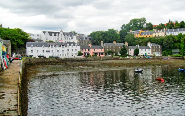
The first photo is a beautiful blue hour image. You might want to enhance the luminous quality of the blues and yellows by making tiny adjustments in Curves (PS) if you have it. But there's nothing wrong with this shot. On the second one, I agree with the poster who said that there is no focal point in the second shot. I wonder if a panorama of the colorful houses would work.
Oct 31, 2013 16:45:31 #
Country's Mama wrote:
I think the land masses lead your eye into the photo. Leading lines? Or am I misunderstanding this. I agree they are too dark, but what if they were lightened a bit?
Yes, I think that lightening them would help - but I think that wouldn't be enough. The best part of the sky and reflection is up the middle, so I think I would try cropping both sides to see what I could get away with. For me it's the reflection that leads my eye up into the picture. Maybe I'm just funny like that.....
Oct 31, 2013 16:55:08 #
R.G. wrote:
Yes, I think that lightening them would help - but I think that wouldn't be enough. The best part of the sky and reflection is up the middle, so I think I would try cropping both sides to see what I could get away with. For me it's the reflection that leads my eye up into the picture. Maybe I'm just funny like that.....
I definitely agree with trying a crop here. It is a great capture.
Oct 31, 2013 17:05:02 #
I tried lightening the shadows, but they've gone to blackout so there's no detail in there to bring out. I didn't want to do too brutal a crop, but perhaps it needed more than what I did here.

Oct 31, 2013 17:07:35 #
R.G. wrote:
I tried lightening the shadows, but they've gone to blackout so there's no detail in there to bring out. I didn't want to do too brutal a crop, but perhaps it needed more than what I did here.
I think you did a nice job, RG.
Oct 31, 2013 17:14:52 #
Nightski wrote:
I think you did a nice job, RG.
Thanks. Maybe when you get up and running with your photoshop, you'll be able to layer in some tree cover or some such :-) .
Oct 31, 2013 17:21:21 #
lighthouse
Loc: No Fixed Abode
#1
To me the waterline looks a little higher on the right side than the left.
The image appears too "half and half". "Thirds" can be a good compositional technique.
The sky appears to be blown on my monitor.
The physical subjects are a little small in the image causing the image to cry out for something to lead into the photo.
But all is not lost, it is a salvageable image even as is.
Post work could help a lot.
I like the balance of the two dark headlands, the colour in the middle is good, and boats and water are always nice.
Cropping could fix the blown sky and the composition.
I would like to see it with the sky cropped just above the tallest headland, and through the bottom boat to turn it into a pano.
The composition will still be "half and half" but panos are much more forgiving on that.
It still doesn't give it lead in lines but I believe it now works as a "flat field" photo.
Recovery and selective darkening of the left hand sky with a soft brush would help the overexposed sky.
If the dark reflection in the left side water becomes too dominant then the sides could be gradually and progressively trimmed until it was not so dominant.
#2
Tough day to get a good photo. The light is flat. It might have been better later or earlier in the day.
The sky is blown and the foreground does not have enough interest.
The left side concrete makes the image appear lopsided.
Stepping back 10 feet may have made this feature lead in better.
But the buildings are great and the flat light shows their detail beautifully.
I would crop the sky and the water out of this shot, although the buildings are on a slight angle and may always look a little "not quite right" because of that.
There is possibly wide angle lens curvature bulging the buildings up in the middle of the image. A little lens correction might bring things back in line.
Oct 31, 2013 17:38:17 #
Please forgive for the lack of an earlier response.
#1. Sorry about the double pic posting.
#2. Thanks to everyone who has posted so far. The comments are appreciated. I don't have PS, (yet) but use 'easyHDR' for some things,although I didn't try it here. I prefer bracketing to use HDR, although some can be processed as singles.
I have been busy doing other things since I posted, but didn't want to go unanswered, so a group thank you is in order.
I will have another go' then maybe ditch them.
A sincere thank you to all.
(As I said in a previous posting, "My mediocrity is profound!" )
Oct 31, 2013 17:55:36 #
nairiam wrote:
Please forgive for the lack of an earlier response.
#1. Sorry about the double pic posting.
#2. Thanks to everyone who has posted so far. The comments are appreciated.
(As I said in a previous posting, "My mediocrity is profound!" )
#1. Sorry about the double pic posting.
#2. Thanks to everyone who has posted so far. The comments are appreciated.
(As I said in a previous posting, "My mediocrity is profound!" )
You're doing great, Nairiam. No problem on the double post. We are all new at this. ;)
If you want to reply, then register here. Registration is free and your account is created instantly, so you can post right away.