Chewin' The Fat Constructive criticism invited
Oct 31, 2013 10:23:09 #


Oct 31, 2013 10:33:47 #
A proper photograph well composed and executed with a subject that makes people want to look
Oct 31, 2013 10:37:53 #
Graham Smith wrote:
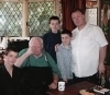
A trio of Brick Lane geezers.
Leica M9P
Graham
Leica M9P
Graham
That is one very nice photograph. I'm not into "people" photographs so I admire those who can execute an excellent one. Yours definitely made the grade!
Swede
Oct 31, 2013 10:38:57 #

Excellent and interesting.
Might you consider darkening the center man's shirt a bit? It is the brightest thing in the photo and in my eyes that may take attention away from the man's face. The wall behind him might also be a little bright, but it's mainly the shirt. Otherwise, what's not to love?
Might you consider darkening the center man's shirt a bit? It is the brightest thing in the photo and in my eyes that may take attention away from the man's face. The wall behind him might also be a little bright, but it's mainly the shirt. Otherwise, what's not to love?
Oct 31, 2013 10:39:10 #
Oct 31, 2013 10:44:21 #
A strong side light would really bring out the center man's wrinkles in his face.
Oct 31, 2013 10:45:08 #
This is the first time I have commented on any UHH photos...altho there have been some really awesome one. But I need to tell you Graham....this is totally awesome....!!! Love the candid pose...
Oct 31, 2013 10:46:02 #
Heirloom Tomato wrote:
Excellent and interesting.
Might you consider darkening the center man's shirt a bit? It is the brightest thing in the photo and in my eyes that may take attention away from the man's face. The wall behind him might also be a little bright, but it's mainly the shirt. Otherwise, what's not to love?
Might you consider darkening the center man's shirt a bit? It is the brightest thing in the photo and in my eyes that may take attention away from the man's face. The wall behind him might also be a little bright, but it's mainly the shirt. Otherwise, what's not to love?
Hi HT, Thanks for the comments, I'm not seeing the shirt as over bright, it is bright but it but not too bright on my monitor. Maybe I have my brightness a little lower than yours? Maybe you have yours a little brighter than mine? It's a perennial problem, the difference between monitors :-)
Graham
Oct 31, 2013 10:46:41 #
also, my eyes go straight to the man in the center, then to the bright areas on the background on either side of him, it takes my attention away from the other two. So if you can darken that metal it would be nice, pretty easy to do in lightroom.
Oct 31, 2013 10:47:19 #
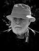
Any community, anywhere, there are old guys sitting on the street, people-watching and shooting the breeze. You've really caught it Graham.
I have no trouble with the bright shirt. The background is part of the ambiance.
Also it's pretty hard to rearrange the light, likely the sun, to better show the wrinkles.
Perfect!!!!!
Pierre
I have no trouble with the bright shirt. The background is part of the ambiance.
Also it's pretty hard to rearrange the light, likely the sun, to better show the wrinkles.
Perfect!!!!!
Pierre
Oct 31, 2013 10:48:15 #
jim quist wrote:
A strong side light would really bring out the center man's wrinkles in his face.
Thanks jim quist, with street photography you can't pick your light, you have to work with what is there. That's one of the things that makes it so challenging.
Graham
Oct 31, 2013 10:50:25 #
Oct 31, 2013 10:51:31 #
jim quist wrote:
did you add a vignette to darken the metal around the edges?
I did jim.
Graham
Oct 31, 2013 10:52:01 #
Graham Smith wrote:
Hi HT, Thanks for the comments, I'm not seeing the shirt as over bright, it is bright but it but not too bright on my monitor. Maybe I have my brightness a little lower than yours? Maybe you have yours a little brighter than mine? It's a perennial problem, the difference between monitors :-)
Graham
Graham
The way it looks on your monitor is what matters. It's hard to find anything to suggest on your photos, they are always so well chosen and photographed and carefully PP'd. :P
Oct 31, 2013 10:53:55 #

I was immediately drawn to the man on the left with the pocketbook hanging off his neck, the expression on his face, then to the ground just below him, looking at all the discarded drink containers, then over to the right and noticed the coffee cup on the ground. This is a very pleasing picture to look at. The man in the middle was the last I looked at, after looking to see that the feet were all included in the picture. I think this is a well composed, well exposed photo. It tells a story. You can linger over it. And it is extremely sharp. I like it very much.
If you want to reply, then register here. Registration is free and your account is created instantly, so you can post right away.