The Chair Maker
Sep 29, 2013 05:33:48 #

Sep 29, 2013 05:47:29 #
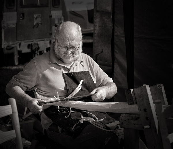
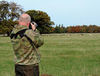
The first is a great shot of a workman, and I believe in colour it just would never work, tone, lighting, focus is spot on, the wood shavings are in 100% just the right place to in fill and the light is in the perfect place.
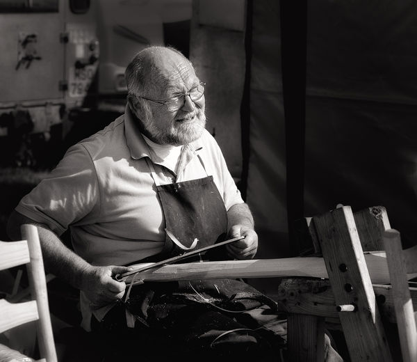
The second, if the first is 100% is 70%, the front of the bench is lit and distracts by about 30% from the chap, not enough shavings and the looks posed. Also the chair to the left is over lit
Hope you don't mind the comments, the top one is soooooo good
The second, if the first is 100% is 70%, the front of the bench is lit and distracts by about 30% from the chap, not enough shavings and the looks posed. Also the chair to the left is over lit
Hope you don't mind the comments, the top one is soooooo good
Sep 29, 2013 06:30:54 #
I don't agree the foot vice to hold the work piece I believe adds to the picture. In the world of wood working this is a part of the history. As usual you have down a outstanding job with the B&W. Nice shots Graham.
Sep 29, 2013 06:51:31 #
Sep 29, 2013 07:32:56 #

Graham Smith wrote:
Great Gransden, Cambridgeshire.
Graham
Graham
Nice captures, Graham.
Sep 29, 2013 07:39:12 #

Sep 29, 2013 12:38:05 #
Froggy
Loc: Guernsey Channel Islands UK
Graham Smith wrote:
Great Gransden, Cambridgeshire.
Graham
Graham
another lovely shot Graham, no 1 for me
Sep 29, 2013 12:40:35 #

Sep 29, 2013 12:46:39 #
Graham Smith wrote:
Great Gransden, Cambridgeshire.
Graham
Graham
Excellent shot of a Bodger even though he is a craftsman. Bodger is the medieval name for a chair maker (just so I don't get slated for being rude)
Sep 29, 2013 12:52:32 #

Love the "experience" & knowledge of chair making shown in these photos. Number one is my pic too. The second's, expression on his face takes away from the "knowledge" for me.
Sep 29, 2013 13:07:45 #
Yes #1 is the best for me too and Ah shave horse work, that's fun too! :thumbup:
Sep 30, 2013 07:01:37 #

Sep 30, 2013 12:16:03 #
JR1 wrote:
The first is a great shot of a workman, and I believe in colour it just would never work, tone, lighting, focus is spot on, the wood shavings are in 100% just the right place to in fill and the light is in the perfect place.
The second, if the first is 100% is 70%, the front of the bench is lit and distracts by about 30% from the chap, not enough shavings and the looks posed. Also the chair to the left is over lit
Hope you don't mind the comments, the top one is soooooo good
The second, if the first is 100% is 70%, the front of the bench is lit and distracts by about 30% from the chap, not enough shavings and the looks posed. Also the chair to the left is over lit
Hope you don't mind the comments, the top one is soooooo good
Thanks for the compliment.
I don't mind you commenting at all, rating the second image at 70% of the first is doing it more credit than it deserves. I posted it so that viewers might get a better idea of what is going on, not as a work of art.
Graham
Sep 30, 2013 12:17:27 #
wonkytripod wrote:
Excellent shot of a Bodger even though he is a craftsman. Bodger is the medieval name for a chair maker (just so I don't get slated for being rude)
I've bodged a few things in my time :-D
Thanks Wonky :thumbup:
Graham
Sep 30, 2013 12:18:35 #
taffthetooth wrote:
What a great shot no:1 is, well done :thumbup:
Thanks taffthetooth, are you a Welsh dentist? ;-)
Graham
If you want to reply, then register here. Registration is free and your account is created instantly, so you can post right away.