WPC 1338 - Album Cover Redux ANALYSIS
Sep 28, 2013 00:58:55 #

cifuent has graciously volunteered the WPC 1338 - Album Cover Redux entry for critique and analysis to find out what they could have done to make it better. Be nice, but be honest as this will help everyone with their craft. Thank you cifuent and thank you everyone!
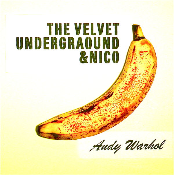
from WPC 1338 - Album Cover Redux RESULTShttp://www.uglyhedgehog.com/photo_contest_ratings.jsp?pcnum=81
from WPC 1338 - Album Cover Redux RESULTShttp://www.uglyhedgehog.com/photo_contest_ratings.jsp?pcnum=81
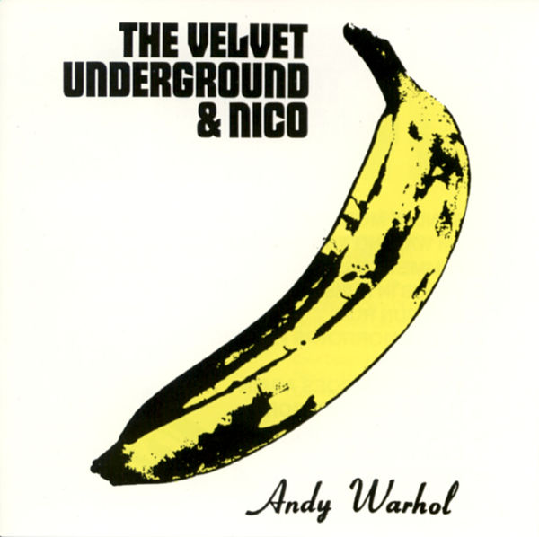
Andy Warhol, for Velvet Underground & Nico, 1967
from http://uploads5.wikipaintings.org/images/andy-warhol/velvet-underground-nico.jpg
Sep 28, 2013 09:47:13 #
Sep 30, 2013 15:39:23 #

St3v3M wrote:
cifuent has graciously volunteered the WPC 1338 - Album Cover Redux entry for critique and analysis to find out what they could have done to make it better. Be nice, but be honest as this will help everyone with their craft. Thank you cifuent and thank you everyone!
from WPC 1338 - Album Cover Redux RESULTShttp://www.uglyhedgehog.com/photo_contest_ratings.jsp?pcnum=81
from WPC 1338 - Album Cover Redux RESULTShttp://www.uglyhedgehog.com/photo_contest_ratings.jsp?pcnum=81
cifuent, I am curious why you chose this album cover. The original cover looks much more like clip art. I think it's extremely hard to produce a clip art looking album cover from a photograph. Also, did you know that you can do a search for fonts on the internet? You can submit a graphic of the font you are looking for at myfonts.com and people will help you figure out what it's called. dafont.com is good place to search for fonts. The Andy Warhol lettering is named Royale. I recognized it right away. The other lettering I would have to do a search for. I would say that if you are going to do an album cover like that, it would be good to get the fonts right. I think you needed a banana that was a little more ripe too, but you could have done that in PP.
Sep 30, 2013 15:55:35 #
Thank you for the information about fonts: I will take good note of it. I was not sure if we were meant to replicate as closely as possible the original or rather keep a relative, creative distance from it. My interest in the cover had to do with the different media: Warhol's banana was a silkscreen of a drawing, although he often worked with photographs; I decided to play with a photograph of a banana and see if I could make it look somewhat painterly. You are right that the banana should have been riper if it were to exactly reproduce Warhol's, and I even thought of using a black magic marker to make it look so, but then, again, it was my banana, not Warhol's. Obviously, though, I did not succeed at creating an intriguing balance between distance and proximity, similarity and difference. Next time, maybe...
Sep 30, 2013 16:07:31 #
cifuent wrote:
Thank you for the information about fonts: I will ... (show quote)
Well, cifuent, you can't judge by the votes you received. You don't know why people vote as they do. You certainly could be right about what was expected. I not good at working "Out of the Box" so to say, so it was my intention to replicate it as closely as possible. And you know? Sometimes I really need to get out of that box to get the great shot, instead of the good shot. So good for you that you didn't feel as confined by the challenge as I did.
Oct 1, 2013 07:07:18 #
[quote=cifuent]Thank you for the information about fonts: I will take good note of it. I was not sure if we were meant to replicate as closely as possible the original or rather keep a relative, creative distance from it. My interest in the cover had to do with the different media: Warhol's banana was a silkscreen of a drawing, although he often worked with photographs; I decided to play with a photograph of a banana and see if I could make it look somewhat painterly. quote]
cifuent, I just got elements 11, and I was watching a tutorial this morning. It has a feature called "comic" that I think would have been perfect for pp'ing your banana. Do you have elements 11? You can get it for a ridiculously low price and it has tons of features. Hope I'm not bugging you, but your album cover came to mind when I saw this feature.
cifuent, I just got elements 11, and I was watching a tutorial this morning. It has a feature called "comic" that I think would have been perfect for pp'ing your banana. Do you have elements 11? You can get it for a ridiculously low price and it has tons of features. Hope I'm not bugging you, but your album cover came to mind when I saw this feature.
Oct 2, 2013 14:43:37 #
You are not bugging me: I am honored that you though of my cover when experimenting with elements 11. I do not have elements. Unfortunately, I have had no time to explore all those fantastic tools. I am limited to taking photographs as best I can and then using (if I need to) the rather elementary resources that come with any Mac computer. If and when I get some more time for photography, I assure you that I will devote it to those other experiments with the computer. In the meantime, many thanks for your thoughtful suggestions, L.
Oct 3, 2013 00:20:40 #

Oct 3, 2013 07:33:27 #
Sunrisepano wrote:
Was the "A" in "UNDERGROUND" intentional?
No! It was a typo! What is worse, I only realized it was there when you mentioned it... Too hasty a job. I have to say that I often find typos telling, but not this one; this one is merely embarrassing...
Oct 3, 2013 12:10:26 #
cifuent wrote:
No! It was a typo! What is worse, I only realized it was there when you mentioned it... Too hasty a job. I have to say that I often find typos telling, but not this one; this one is merely embarrassing...
cifuent, you should have said, "Yes, it was my creativity at work". LOL .... Little humor goes a long way sometimes. I have to laugh at myself many a time. :-D
Oct 3, 2013 13:25:14 #
Oct 3, 2013 21:16:30 #

Funny, I'm a stickler for spelling and grammar, except when I'm being colloquial. I didn't notice it until you mentioned it. I looked at both images several times to see what Ms. Nightski was commenting on and missed it.
Oct 3, 2013 21:21:38 #
English is not my first language, so I try to be especially careful with spelling, but sometimes I just do not see the mistake or the typo (until the third or fourth reading, that is). I often make spelling mistakes that are funny or interesting. At other times, the mistakes are simply embarrassing.
Oct 3, 2013 21:26:37 #
St3v3M wrote:
cifuent has graciously volunteered the WPC 1338 - Album Cover Redux entry for critique and analysis to find out what they could have done to make it better. Be nice, but be honest as this will help everyone with their craft. Thank you cifuent and thank you everyone!
from WPC 1338 - Album Cover Redux RESULTShttp://www.uglyhedgehog.com/photo_contest_ratings.jsp?pcnum=81
from WPC 1338 - Album Cover Redux RESULTShttp://www.uglyhedgehog.com/photo_contest_ratings.jsp?pcnum=81
This image (the first one) is beautiful. If I were to improve something it would be the text. I would make the text in the upper portion a little more in line with the banana.
But other than that it's great! :)
Oct 3, 2013 21:29:37 #
cifuent wrote:
English is not my first language, so I try to be especially careful with spelling, but sometimes I just do not see the mistake or the typo (until the third or fourth reading, that is). I often make spelling mistakes that are funny or interesting. At other times, the mistakes are simply embarrassing.
Hey cifuent, don't worry about it. There are lots of people here that were raised in this country, and they can't spell or write a proper sentence. You're doing just great. :thumbup: Welcome to UHH, by the way. :-D
If you want to reply, then register here. Registration is free and your account is created instantly, so you can post right away.