WPC 1337 - Paper Clips ANALYSIS
Sep 20, 2013 23:35:28 #

Carter Power has graciously volunteered the WPC 1337 - Paper Clips entry for critique and analysis to find out what they could have done to make it better. Be nice, but be honest as this will help everyone with their craft. Thank you Carter Power and thank you everyone!
from WPC 1337 - Paper Clips RESULTS http://www.uglyhedgehog.com/photo_contest_ratings.jsp?pcnum=80
from WPC 1337 - Paper Clips RESULTS http://www.uglyhedgehog.com/photo_contest_ratings.jsp?pcnum=80
Bring on the Bubbly!
Sep 21, 2013 03:18:57 #

Hi All...thanks in advance for sharing your views...perspectives ...suggestions and opinions. I appreciate the chance to compare what I see as the photo's strengths/weaknesses to you views. Thank you. Carter
Sep 21, 2013 10:03:55 #
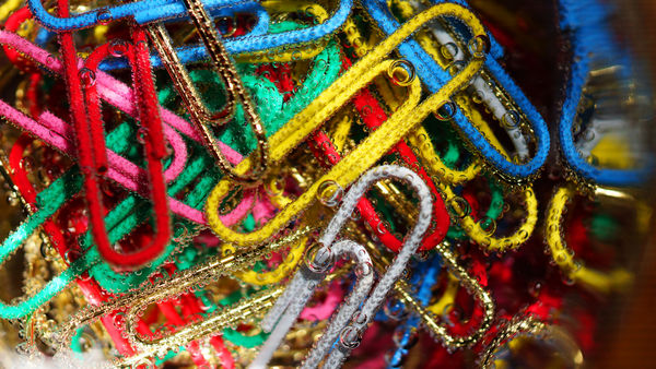
Well, it's a batch of brightly colored paperclips under some sort of viscous liquid. To me the liquid blurs the image and adds nothing. The vignette or blur along the right side and bottom left distracts from rather than benefits the image. That's simple to correct by cropping. While doing that I would place that large yellow clip into a position of even more prominence. I guess overall the photo demonstrates randomness of a pile of clips, but I'd rather either see some sort of pattern or even more disarray.
Sep 21, 2013 10:15:43 #

Please note that these are only my opinions. I enjoy viewing images posted by others in hopes that I will learn something about the "WOW" factor.
After reading the title and viewing your image, my eyes went to the silver paper clip ( at the 11 o'clock position) and then to the lower left hand corner where there is a flare or reflection and then to the extreme right OOF images. ( sorry' I didn't see the bubbles) I had to go to the contest results to "download" image. THAT'S when the WOW factor hit me.
My internet connection is terrible this morning so I was unable to download a complete image but in the upper left hand corner your image is tack sharp and I saw the bubbles. Excellent! What a really neat idea!. From my viewpoint, I would have either done a "macro" type shot or heavily cropped this image so the bubbles are immediately visible. Just my opinion. Hope this helps.
Sep 21, 2013 11:26:23 #

When I look at this image the first thought I have is confusion. What is the subject (without the category I would not know). My suggestion to improve this image is to make the subject more defined. How? The answers are only limited by your imagination. Some suggestions to try: less paper clips in focus, use color as the background instead of mixed with the subject, more detail of one clip is better than no detail of many clips.
Sep 21, 2013 11:27:28 #
I saw the bubbles right away and really like them. I agree that the picture would look better cropped on the right side.
Sep 21, 2013 11:55:16 #

Sep 21, 2013 12:28:12 #

I agree that a tighter crop should be made but do not agree with a poster saying there is no subject. The subject is repeating shapes and color! I like the image. 8-)
Sep 21, 2013 12:54:05 #
lesdmd wrote:
Well, it's a batch of brightly colored paperclips ... (show quote)
Thanks for you comments. I agree that the shot needed the "download" and I felt that was one of the submission's weaknesses.
Sep 21, 2013 12:56:38 #
naturepics43 wrote:
Please note that these are only my opinions. I enj... (show quote)
Thank you for sharing your opinion...much appreciated. I agree with your analysis and realize the bubbles needed to "pop" in the thumbnail and they didn't. I relied on the premise that viewers download more than they do it seems.
Sep 21, 2013 13:00:53 #
chapjohn wrote:
When I look at this image the first thought I have is confusion. What is the subject (without the category I would not know). My suggestion to improve this image is to make the subject more defined. How? The answers are only limited by your imagination. Some suggestions to try: less paper clips in focus, use color as the background instead of mixed with the subject, more detail of one clip is better than no detail of many clips.
Interesting point...the shot is lost in "no man's land". Not a macro but it could easily be one. You saw the random pattern as confusion that needed more focus...I see that now. Thanks for your help. Much appreciated.
Sep 21, 2013 13:03:09 #
dragonswing wrote:
I saw the bubbles right away and really like them. I agree that the picture would look better cropped on the right side.
I decided to leave the blur in to give the shot some context of being in a glass but I guess that didn't come through. Good to know. Thanks for taking the time to look and leave helpful comments.
Sep 21, 2013 13:03:36 #
Sep 21, 2013 13:17:32 #
Bmac wrote:
I agree that a tighter crop should be made but do not agree with a poster saying there is no subject. The subject is repeating shapes and color! I like the image. 8-)
Hi Bmac...the "no man's land" nature of the shot seems to be becoming a theme. A tighter crop would take away the need to download to see the detail. I just checked the original and the shot was not cropped at all. In future, managing the thumbnail vs download needs some improvement on my part. Thanks for taking the time to look and make valuable comments.
Sep 21, 2013 13:44:54 #
Carter Power wrote:
Not sure what that means??
I put a reply without reading the original post well enough.. Since you cannot delete your comment I backed it up and left the smiley.. I did intend on coming back to critique.. :)
If you want to reply, then register here. Registration is free and your account is created instantly, so you can post right away.