Lens distortion removal in PSE11
Sep 9, 2013 16:30:30 #
I took this photo for a club competition and tried to adjust the converging verticals, using PSE11 filters -camera distortion correction. I didn't win and was told that there was too much Pp on it. What is the view of our members, Please.
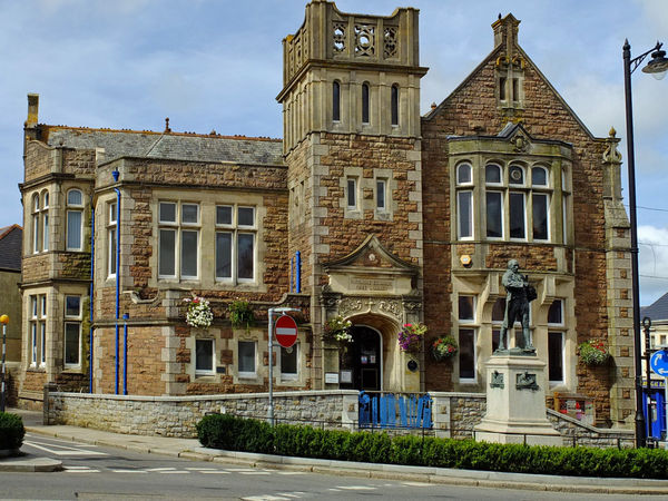
Camborne Library, Cornwall UK.
Sep 9, 2013 16:41:15 #
Well Tony I cant tell whats been done to it (excellent photo) If you had told them beforehand what work you had done to it..well you know what to do next time!!
Sep 9, 2013 16:46:41 #
Doddy wrote:
Well Tony I cant tell whats been done to it (excellent photo) If you had told them beforehand what work you had done to it..well you know what to do next time!!
Thanks Doddy, apart from the verticals it is straight as it came from the camera, not even cropped.The only thing I can think is that I should have aimed the camera slightly higher as it almost looks like the top of the tower is cut off.
Sep 9, 2013 17:17:55 #
Sep 9, 2013 17:37:35 #
The nice thing about amateur photography is that we can take and keep pics that WE like, not what someone else tells us to like.
If you had stood farther away from the building and allowed more "air" around it, the vertical straightening would not have removed the top of the tower and there would be more space on both sides. Perhaps the "gods who rule" would not have noticed and you would have gotten away with it.
You were shortchanged by the system IMHO.
Sep 9, 2013 18:40:05 #
buffoto wrote:
That's purely subjective; excellent image and better luck next time.
Thanks buffoto for taking the time to write and I'll keep on trying.
Sep 9, 2013 18:43:40 #
Kentee wrote:
The nice thing about amateur photography is that we can take and keep pics that WE like, not what someone else tells us to like.
If you had stood farther away from the building and allowed more "air" around it, the vertical straightening would not have removed the top of the tower and there would be more space on both sides. Perhaps the "gods who rule" would not have noticed and you would have gotten away with it.
You were shortchanged by the system IMHO.
If you had stood farther away from the building and allowed more "air" around it, the vertical straightening would not have removed the top of the tower and there would be more space on both sides. Perhaps the "gods who rule" would not have noticed and you would have gotten away with it.
You were shortchanged by the system IMHO.
Thank Kentee, unfotunately my back was against a wall so I couldnt move back any more. I will certainly keep on trying but I didn't understand why I was told 'too much PP used'.
Sep 9, 2013 21:06:31 #

Tony, I sure wouldn't have dinged you for being overly post processed. But if the judges like a style that is less contrasty and saturated then that would be good to know ahead of time. Even though you said it was pretty much sooc it does have the look of a lot of dodging and burning.
If I was one of the judges, I would have like to see a lot of cloning of the busy, unnecessary clutter.
By hte way, you can use the Perspective tool in PSE to correct the perspective of the vertical lines.
I like the shot, like the building.
Finally, don't take what club or online contests do to you too seriously. There are huge biases.
Sep 9, 2013 21:37:44 #
TonyB wrote:
I took this photo for a club competition and tried to adjust the converging verticals, using PSE11 filters -camera distortion correction. I didn't win and was told that there was too much Pp on it. What is the view of our members, Please.
WOW.....I am finding NOTHING wrong with this shot. Looks like it came right out of camera with no PP. Good job......judges can be overly subjective at times. Better luck next time :-D :-D :thumbup: :thumbup: :thumbup:
Sep 9, 2013 22:40:07 #

TonyB wrote:
Thank Kentee, unfotunately my back was against a wall so I couldnt move back any more. I will certainly keep on trying but I didn't understand why I was told 'too much PP used'.
It has a lot of color and is pretty sharp. Maybe they thought you had enhanced the colors too much. Why not ask them and show them the original, untouched Raw file. I suppose once they pass judgement, nothing can be done and they won't care to explain. Oh well. Nice photo.
Sep 9, 2013 22:57:04 #
Winning or loosing a competition is not only about how good your entry is; it is also about how good the competitors are.
That said, if your image is straight out of camera: JPEG is usually implied. That is post processing done in camera and is beyond your fine control. The blues appear to be over saturated because of your JPEG selection.
You may not have had space to back up and diminish some of the keystoning. If you had a wider angle lens, you could have done so. You have at least three areas that were cropped when you made your correction. The pole on the left is a detractor - its ball on top was sliced. The light fixture on the right was also cut. The general guideline is to remove something presented this way - unless what remains is large and significant - it should become an object to determine depth. As mentioned, the top of the tower is obviously cut off. It needs to be in its entirety.
There are many nice things about the image, but your competition may have had less significant deficiencies or more interesting content. You didn't do badly, but there is room to grow.
Sep 10, 2013 10:04:05 #
There are many improvements available for this image. It would be helpful to see org. out of camera to determine "To Much".
Sep 10, 2013 10:38:57 #
Might try the free-download program "ShiftN" to correct perspective. Nice shot as is...can't imagine why the judge said it was over PP'd.
If you want to reply, then register here. Registration is free and your account is created instantly, so you can post right away.