WPC 1334sc - (Speed Challenge) - Round ANALYSIS
Aug 31, 2013 18:01:52 #

ajohnston3 has graciously volunteered their WPC 1334sc - (Speed Challenge) - Round entry for critique and analysis to find out what they could have done to make it better. Be nice, but be honest as this will help everyone with their craft. Thank you ajohnston3 and thank you everyone!
from WPC 1334sc - (Speed Challenge) - Round http://www.uglyhedgehog.com/photo_contest_ratings.jsp?pcnum=76
from WPC 1334sc - (Speed Challenge) - Round http://www.uglyhedgehog.com/photo_contest_ratings.jsp?pcnum=76
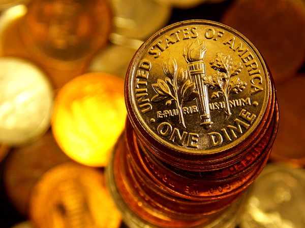
One Out of Many
Aug 31, 2013 18:53:22 #
I love the sharp focus of the top dime compared with the blurred background. Maybe if the coin stack was straighter nearer the bottom and the top few coins curved more to the upper left it would guide the eye round better
Aug 31, 2013 19:30:33 #

A dime should be silver. The Pennies copper
Could use better white balance
Aug 31, 2013 23:55:51 #

I started taking photographs for other than typical family use about 6 months ago, after my wife gave me a new camera for Christmas. I've been trying a bit of everything and really enjoy macro. I know that we all have a unique perspective and appreciate any and all comments.
Sep 1, 2013 00:08:39 #
Sep 1, 2013 00:21:50 #
Sep 1, 2013 00:23:30 #
"A dime should be silver. The Pennies copper"
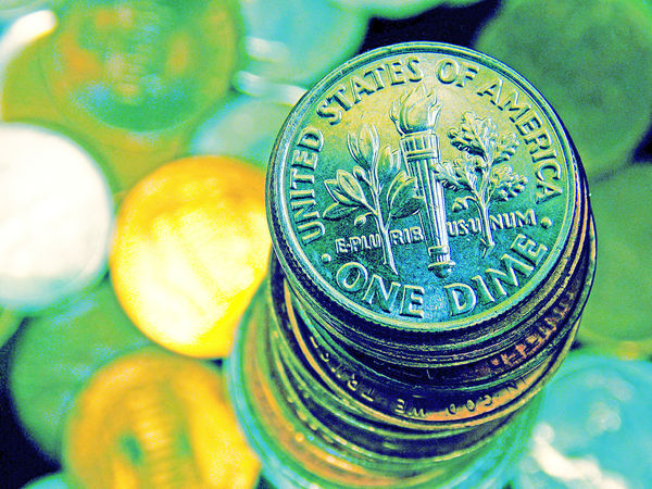
I tried several variations in post production. The dime I used in the shot actually had an unique copper patina. Dimes from 1965 to the present are composed of outer layers of 75 percent copper and 25 percent nickel, bonded to a pure copper core. Every once in a while you will find one like this. I shot this U.S. Quarter using the same initial settings....
I tried several variations in post production. The dime I used in the shot actually had an unique copper patina. Dimes from 1965 to the present are composed of outer layers of 75 percent copper and 25 percent nickel, bonded to a pure copper core. Every once in a while you will find one like this. I shot this U.S. Quarter using the same initial settings....
Sep 1, 2013 08:18:43 #
ajohnston3 wrote:
I tried
I have been taking pictures of coins I sell on eBay for a few years. So, Selling a coin, like me, and winning photo contest judged by a jury of your peers are two separate things.
IMHO:
Your Macro technique is superb.
For Design: This cold be improved by moving the coin stack to the upper left of the rule of thirds. That is the most powerful spot because it is the first place someone looks. There were over 170 superb photos in this contest. Attention grabbing through design is a subject I wish to learn more.
Getting the color right:
The first problem is Tungsten light and copper conspire to make the color golden. There are filters as well as color correction setting, on some cameras, to diminish this spectral amplification. there are a lot of post photo techniques available which others here are familiar with.
Shooting with natural sunlight from a north facing window is another technique but the reflected light coming through the window is a bit diffused. This does not give the best contrast. Then there is getting the full spectrum light to the coins around the camera and lens set soo close to the subject. My solution was to purchase a couple of Full Spectrum portable Ottlights.
I apologies for my ham fisted grab of your work.
Sep 1, 2013 16:50:22 #
No apologizes needed Ken.... I value your input. In retrospect, I think my approach on this shot was a bit too convoluted. The name of the shot is 'One From Many' and I was attempting a triple-etendre. 8~)
Getting the color 'right' is indeed a worthwhile topic. As a novice, I've just started learning how difficult this can be - and how important. The color you see, the color on the camera's display, the color on your computer and the appearance of a final print often seem to have only a passing relation to each other. I purchased several filters early on but now only use a variable ND occasionally. I am more apt to to use color and contrast adjustments on the camera but primarily use post-production. (still learning THAT, as well!) I'm on a budget and use LED's and filters (tissue paper, thin cloth, ect.) for my set-up Macros. Some full-spectrum studio lights are on my wish list for Christmas!
I agree with you on the position of the coin stack. I am now much more likely to use the 'Rule of Thirds' when framing or cropping than I was even a few months ago - when everything HAD to be center field. (unless there is a good reason not to....)
Thanks for your interest and comments.... They are appreciated.
Sep 1, 2013 17:19:06 #
I picked up a couple of portable Ottlights on eBay for under $90 bucks.
Google, Full spectrum portable Ottlights. Later,You will most likely see adds popup that would be of interest to people who grow weed in their basement if you use chrome as your browser.
Google, Full spectrum portable Ottlights. Later,You will most likely see adds popup that would be of interest to people who grow weed in their basement if you use chrome as your browser.
Sep 1, 2013 17:23:15 #

Sep 3, 2013 00:21:36 #
Ken Shilkun wrote:
For Design: This cold be improved by moving the coin stack to the upper left of the rule of thirds. That is the most powerful spot because it is the first place someone looks.
For Design: This cold be improved by moving the coin stack to the upper left of the rule of thirds. That is the most powerful spot because it is the first place someone looks.
For Western culture? Left?
Sep 3, 2013 07:37:15 #
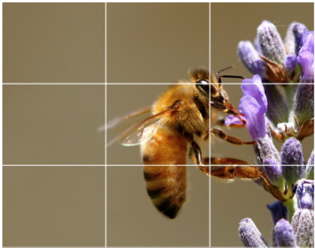
IL86 wrote:
For Western culture? Left?
Yes for western cultures. Even for this excellent example of the rule of thirds. The first block the eye will look at is the top left. In a few microseconds the eye focus on the Bee and Flower. Although the Bee is mostly in the center block, (the least interesting spot) the negative space on the left moves the balance to the Bee, Blossom embrace on the right. Negative space on one side or the other elicits the sensation of movement. The mind will add information. This is a busy bee.
Sep 3, 2013 12:42:57 #
St3v3M wrote:
ajohnston3 has graciously volunteered their WPC 1334sc - (Speed Challenge) - Round entry for critique and analysis to find out what they could have done to make it better. Be nice, but be honest as this will help everyone with their craft. Thank you ajohnston3 and thank you everyone!
from WPC 1334sc - (Speed Challenge) - Round http://www.uglyhedgehog.com/photo_contest_ratings.jsp?pcnum=76
from WPC 1334sc - (Speed Challenge) - Round http://www.uglyhedgehog.com/photo_contest_ratings.jsp?pcnum=76
:thumbup:
Sep 3, 2013 18:36:29 #
Straight to the point on LEFT and RIGHT:
http://users.rider.edu/~suler/photopsy/rulethirds.htm
In an image with a single subject and lots of background or negative space, we might apply the Rule of Thirds by creating twice as much background or negative space as subject. Usually, we would place the subject in the RIGHT third.
Based on how people read, in many cultures the eye moves more naturally from left to right, so the viewer will feel more secure entering the background or space on the left and moving naturally to the subject on the right. The position of the subject will look more grounded.
However, in some shots, we might instead place the subject on the LEFT to create a sense of uneasiness and tension. The eye lands on the subject, trails off into the empty space on the right, and then tries to jump back to the subject, resulting in a shifting feeling.
If you want to reply, then register here. Registration is free and your account is created instantly, so you can post right away.