WPC 1334 - Texture ANALYSIS
Aug 31, 2013 17:34:12 #

Wiskydog has graciously volunteered their WPC 1334 - Texture entry for critique and analysis to find out what they could have done to make it better. Be nice, but be honest as this will help everyone with their craft. Thank you Wiskydog and thank you everyone!
from WPC 1334 - Texture http://www.uglyhedgehog.com/photo_contest_ratings.jsp?pcnum=75
from WPC 1334 - Texture http://www.uglyhedgehog.com/photo_contest_ratings.jsp?pcnum=75
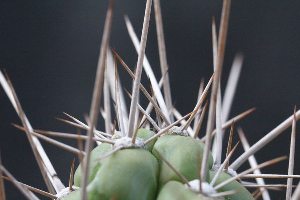
just a liiiiiitle prick!
Aug 31, 2013 18:39:47 #

I think I'd like to see this from a bit further away so the tops of the closest points aren't cut off. Also, the focus could be a little "sharper" :)
Aug 31, 2013 19:55:56 #

Linda From Maine wrote:
I think I'd like to see this from a bit further away so the tops of the closest points aren't cut off. Also, the focus could be a little "sharper" :)
Thanks Linda From Main . I was not sure just how close was close enough. There were so many angles and distances to choose from that I thought I would go sort of in the middle. As for the focus.... I have to blame my eyes. I need glasses and without them I am not so good at focus. Perhaps my DOF could have been deeper to get more in focus? :)
Sep 1, 2013 07:54:26 #

St3v3M wrote:
Wiskydog has graciously volunteered their WPC 1334 - Texture entry for critique and analysis to find out what they could have done to make it better. Be nice, but be honest as this will help everyone with their craft. Thank you Wiskydog and thank you everyone!
from WPC 1334 - Texture http://www.uglyhedgehog.com/photo_contest_ratings.jsp?pcnum=75
from WPC 1334 - Texture http://www.uglyhedgehog.com/photo_contest_ratings.jsp?pcnum=75
I loved this one, though I think Linda from Maine has a good point. I think that's the only thing that would bother me about this photo. I still like it though, and I think it should have placed a little higher at the top.
Sep 1, 2013 07:55:40 #
Wiskydog wrote:
Thanks Linda From Main . I was not sure just how close was close enough. There were so many angles and distances to choose from that I thought I would go sort of in the middle. As for the focus.... I have to blame my eyes. I need glasses and without them I am not so good at focus. Perhaps my DOF could have been deeper to get more in focus? :)
And OMG, I totally get the glasses thing! I am struggling with the whole bifocal thing right now.
Sep 3, 2013 18:44:37 #

[The prompt]This Challenge is looking for Texture not things so a picture of a building with texture is not going to do it. Get in close so we can 'feel it'. No 'things', we want texture!
It is obviously a cactus.
My entry was obviously rocks. I missed the point (pun intended)
What if you came in directly to the rosette of thorns with the green in the DOF. There should be an interesting geometric pattern as well as texture.
It is obviously a cactus.
My entry was obviously rocks. I missed the point (pun intended)
What if you came in directly to the rosette of thorns with the green in the DOF. There should be an interesting geometric pattern as well as texture.
Sep 6, 2013 02:28:44 #
greg vescuso
Loc: Ozark,Mo.
I like it. But I think to show off the texture with this composition a lot more detail would of went along way may be a aperture around 14 -18 .
But if your composition was more of the cactus from twice the distance away focusing on one spot with this dof would of looked cool also.
But if your composition was more of the cactus from twice the distance away focusing on one spot with this dof would of looked cool also.
Dec 19, 2013 22:33:29 #
This is so late but I like your suggestion and yes, I think also that would have been a better idea. Thanks for the input :)
Dec 19, 2013 22:33:29 #
This is so late but I like your suggestion and yes, I think also that would have been a better idea. Thanks for the input :)
Dec 19, 2013 22:37:30 #
greg vescuso wrote:
I like it. But I think to show off the texture with this composition a lot more detail would of went along way may be a aperture around 14 -18 .
But if your composition was more of the cactus from twice the distance away focusing on one spot with this dof would of looked cool also.
But if your composition was more of the cactus from twice the distance away focusing on one spot with this dof would of looked cool also.
I also agree with this analyses. I think everyone else agrees as well. Getting the instruction is important. Understanding it makes the picture better...sometimes. I appreciate all input even thought I don't know how to navigate this site...so...this is very late in coming but I do appreciate it late or not. :) thank you.
If you want to reply, then register here. Registration is free and your account is created instantly, so you can post right away.